being a silly man with a dash of vanity, how could I possibly resist a challenge? Goal, shrink with little or no loss in quality.
I have downloaded your comparison project, and again I’m BAFFLED & FLABBERGAST seeing what you have achieved. There is one thing that needs to be mentioned before I go on:
I have received an e-mail from a another user at the forum (he didn’t want to post his question in public), asking why I needed to “show-off” every time I visualise my arguments with an illustration. "Why else would you bother to make so much out of it, if not to show off your skills?" was what he wanted to know.
Well, it's a timely question, and I don’t deny that wanting to parade creations that I’m proud of is part of the equation,
But showing off like that also serves it's purpose in other ways, one of them being to show what the somewhat underestimated Sunflow Renderer is capable of, and another being to show what a splendid software SH3D really is.
But none of these arguments defeats the main reason:
How can we judge an objects reflection without giving it something to reflect? And the same goes for refraction: If we don’t provide a source that can create an illusion of waveform transmission, we won’t have anything to judge the effect by!
This is the main reason why I bother to create environments and place my objects inside them. But, of course, I enjoy being in a creative state.
Well...
Example:
What does THIS tell us:

Compared to THIS:

Even on a small image like this, we can clearly see the varying effect of the distorted waveform-transmission seen through the two bottles on the right. My HiRes glasses, however, that have been given the correct optical density for glass, in my opinion renders a far more accurate refraction.
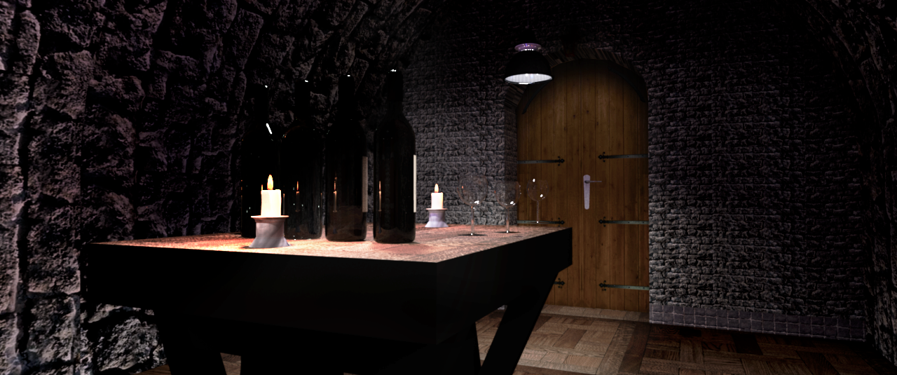
Let me just mention that the barrels are low-poly-creations downloaded from Trimble. They serve only as "decorative" elements.
Here is a shot from the reverse angle, so you can see it's a closed room.
And here is a shot through a HiRes glass:

So much for "show-off".
Time to get down to the dirty business of exposing the hidden hazards of tampering with the contents of a perfectly tempered bottle of Tignanello.
Seems my theories on size and rendering times were not too far off
Not at all. They were spot on. There's a surprisingly tiny difference, a difference really not worth mentioning, unless you are watching close-ups on a screen with 4K resolution (or higher), and at the same time partaking in a nerdy discussion about the pros and cons of object-shrinking, polygon-reduction, removal of normals and heavy compression.
But part from me, I don’t think you’ll find any other geeky graphic-wonks at this forum, and certainly not anyone working on two 43” Phillips 4K monitors.
My arguments here are naturally coloured by the line of work I do.
My last job was retouching a 320" billboard poster (1.88GB), so I’m well trained in detecting almost unnoticeable faults. I have to be, because when the customer is standing next to the finished print – an 8 by 3 meter poster, where every tiny detail becomes visible – he or she had better not find any reason to point a finger at something that can justify any reason to start a negotiation about price-reduction. ;)
The elephant in the file is the .png label, an optimizer shrinks it to 11% without quality loss
Not entirely true.
Not without quality loss.
But you could say; “with little and barely noticeable quality loss.”, and still have kept your words intact.
So where is this loss of quality, you might ask?

Look closely at the labels. You don't see it?
Then look at this image [url=http://ceciliabr.com/Glass/Tigna-comp-project-label.png[/url]
Now you can see that there is a quite visible inconsistency in the black level. Lots of grey spots can be seen – if you look for them.
That said: The label is one of the things I'm not very comfortable with.
I have noticed that you have lifted the contents of the bottle a bit.
As I mentioned when I made this model available for download, that was part of the work that remains. Another important par ( to me) is to make a correct cap, with the right colour and the correct Antinori insignia.
About the refraction:
If you look closely at the base of the models, you will notice the differing quality of the refraction.

If I was to print a high quality image of this bottle, I would rather increase than reduce the resolution of the .obj-file
Just so that there is no room for misunderstanding:
My arguments are mostly for the sake of arguing, and hold no importance to the majority of the users visiting this thread. There's absolutely no need to use a 10MB .obj-file where a reduced 340kb file will do just as well.
Ho-hum.
Consider this:
If you were to drink a bottle of Tignanello 2012, would you be happy to be served a reduced and watered down version?
Cheers!
Cecilia
cec