|
Sweet Home 3D Forum » List all forums » » Forum: Gallery » » » Thread: 1928 Home Builders Catalog Co. house plans |
|
| Print at Dec 16, 2025, 9:30:32 AM | |
| Posted by AeowynFraser at Jul 11, 2017, 1:56:17 AM |
|
1928 Home Builders Catalog Co. house plans 
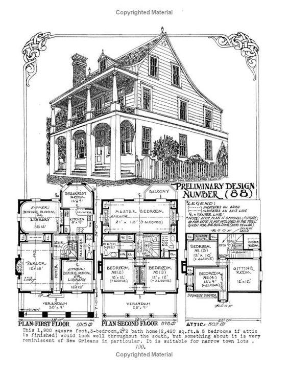
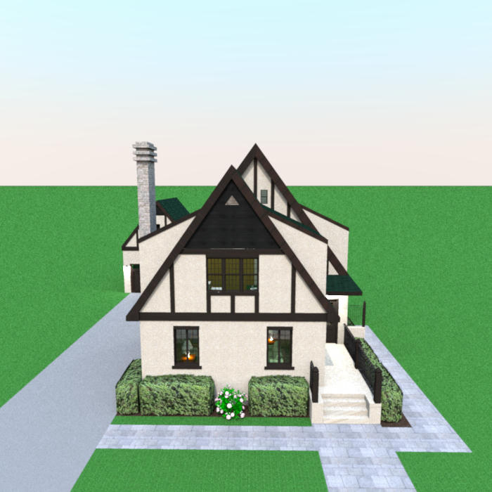
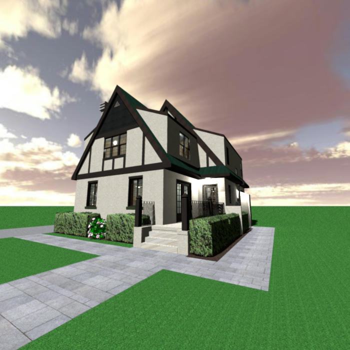
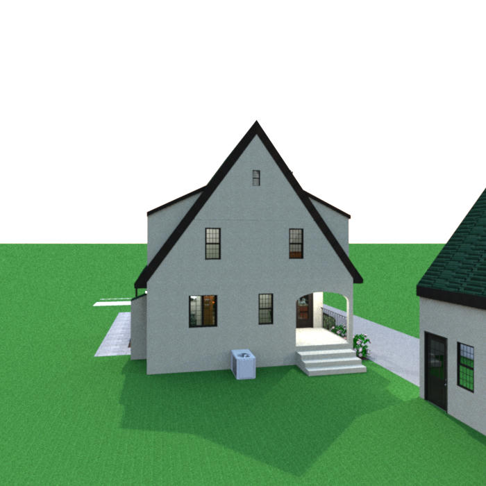
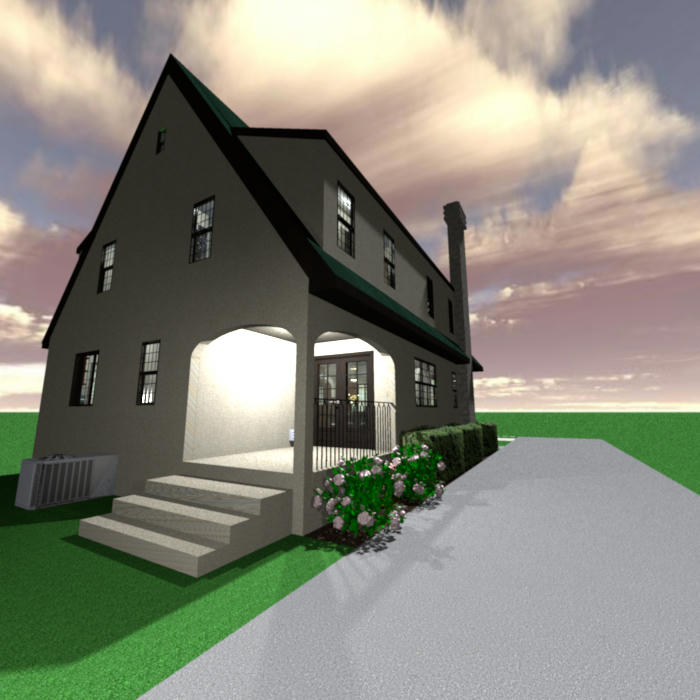
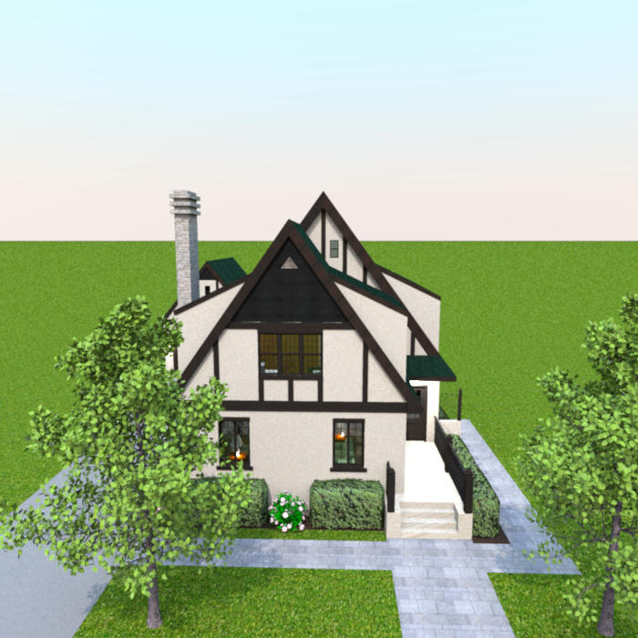
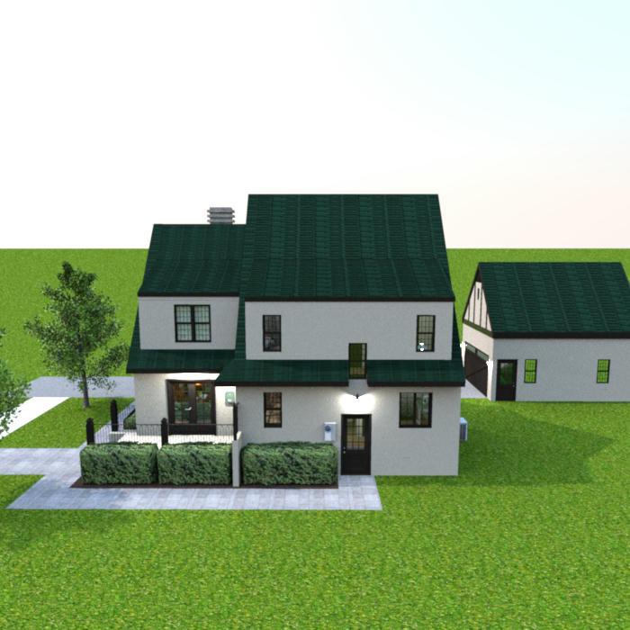
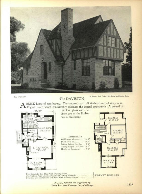
So, I decided to start a thread on the houses I'd found intriguing in the Home Builders Catalog, which seems to be dated 1928. The one I've decided on sharing first is called "The Caruth" as it's the one I've done the most work on (with "The Chesepeake" a close second). For those who aren't sure what I'm talking about, and you'd like some additional information, just click here. 
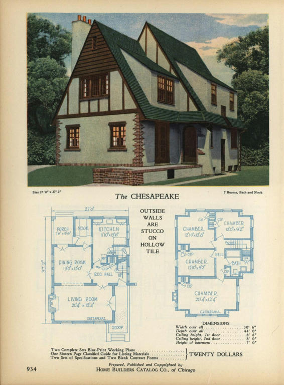
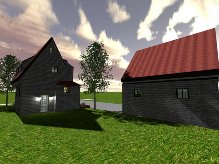
The original advertisement in the book for this house plan, one option with a basement and one option without. I've been working on the option without a basement, for the sole reason that where I live (California desert) basements aren't usual. 
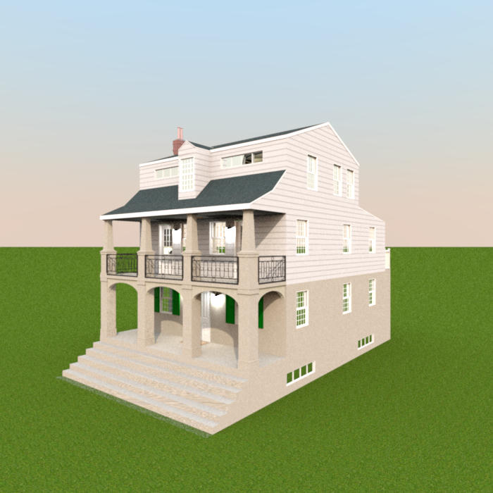
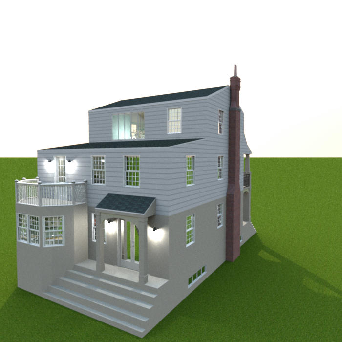
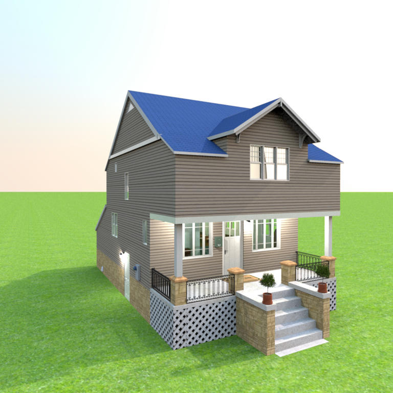
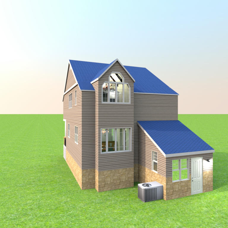
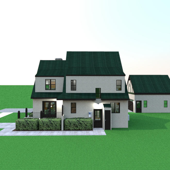
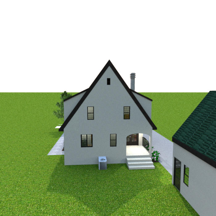
Linked here (The Caruth) is the Sweet Home 3D file of what I've been working on, so far. It's furnished and the exterior almost complete (no walkway, and no roof yet - what looks like roofing in the following picture is actually walls I'm using as a general guide for when I do put on the roof, although I'm not quite sure how I'm going to add the curved roof over the front porch). 
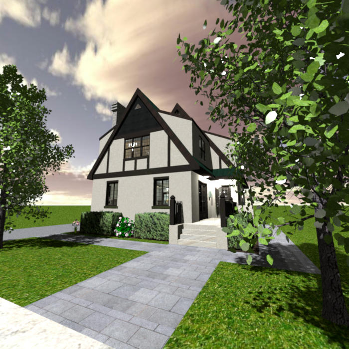
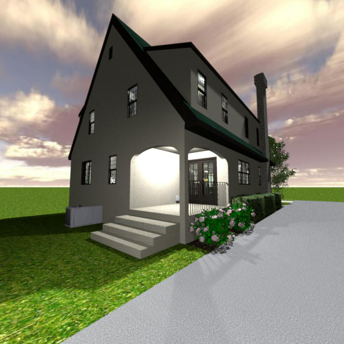
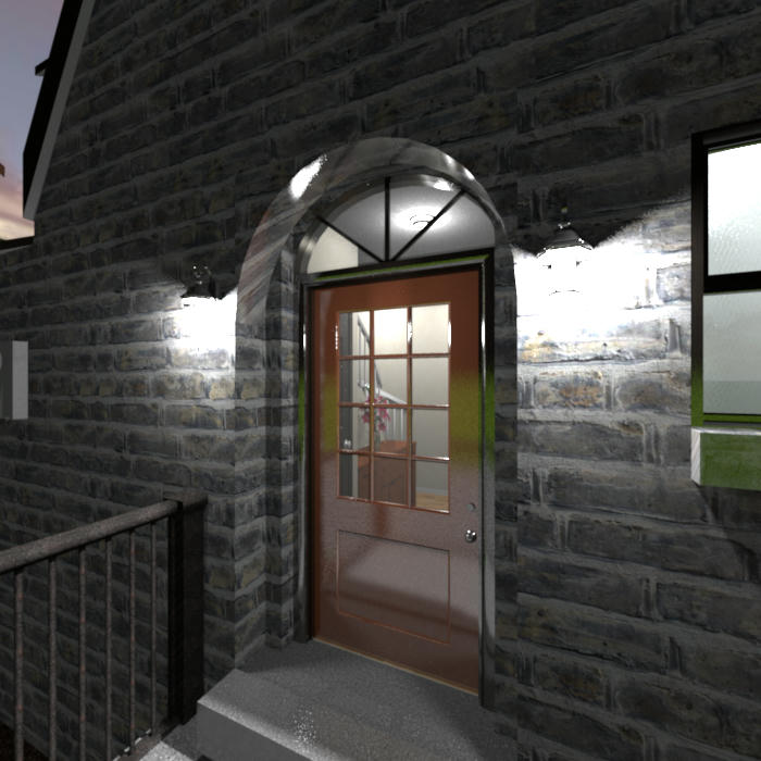
I couldn't figure out how to put the brick arch over the front, like it is in the original, so I did it as close as I could. (Just picture in your mind that I was able to do so 
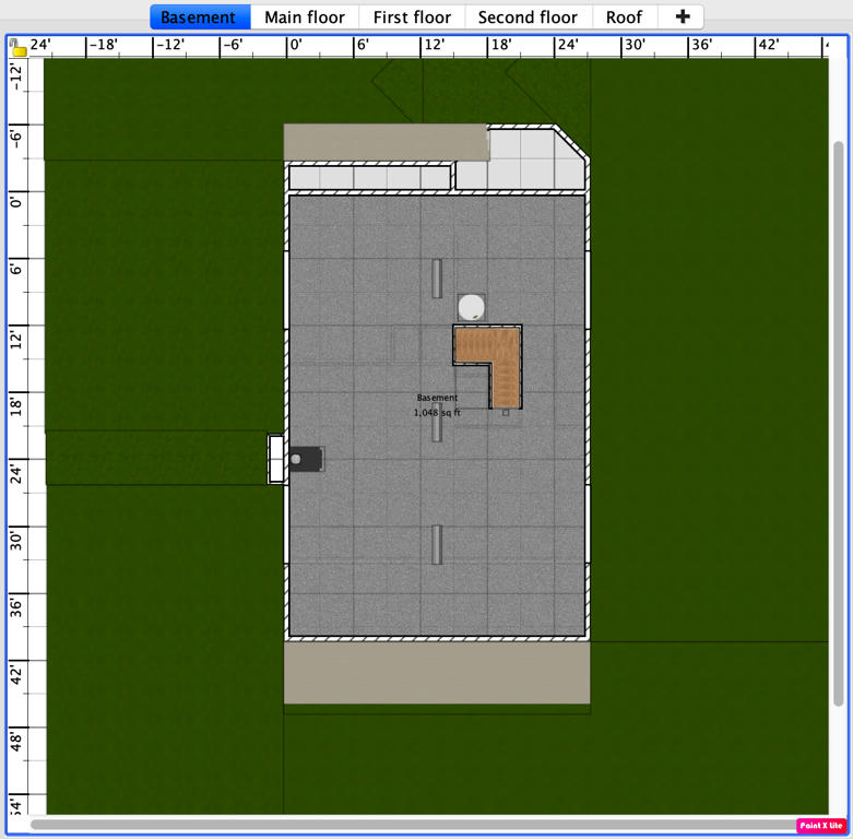
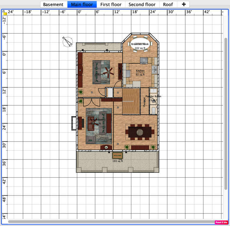
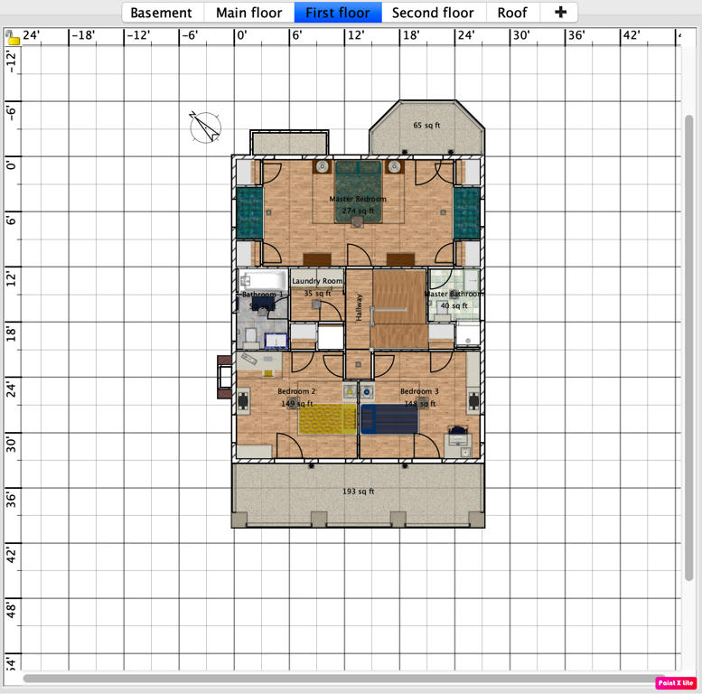
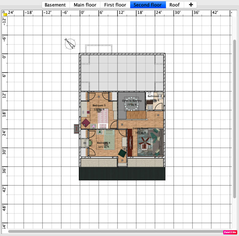
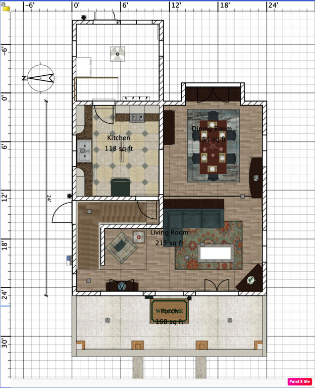
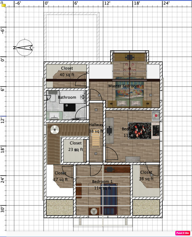
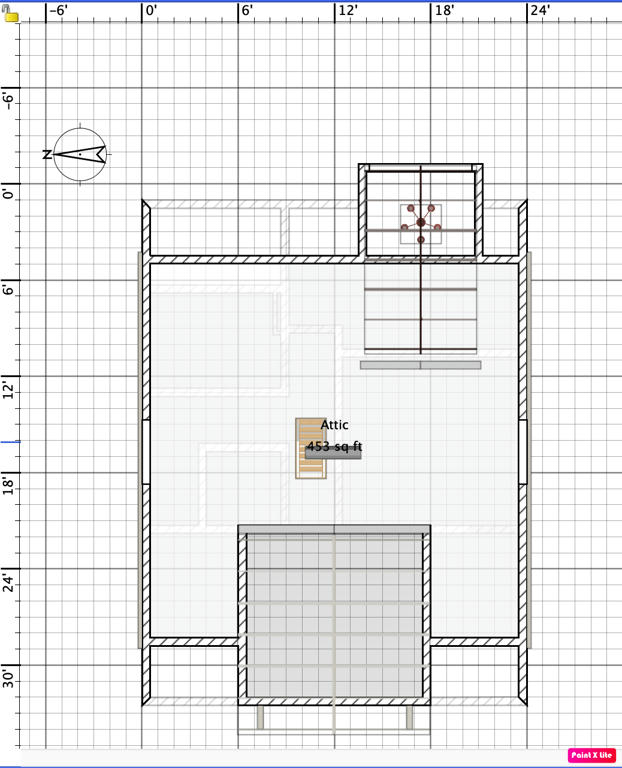
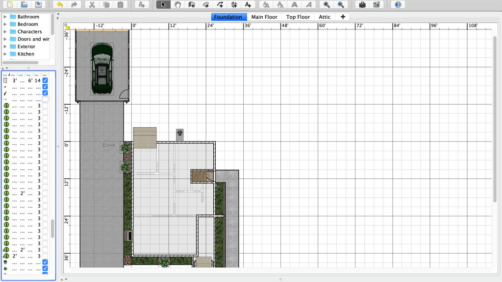
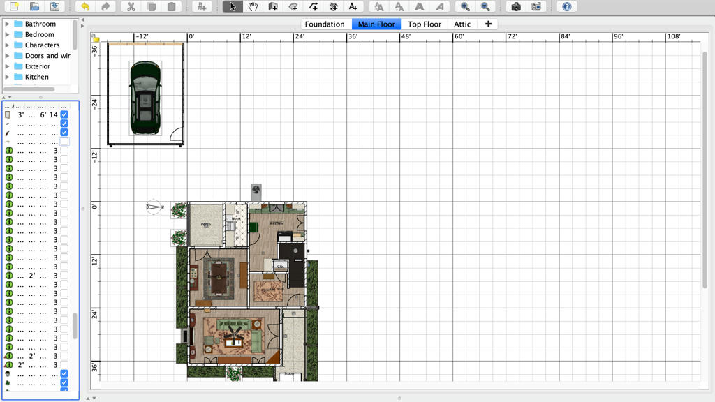
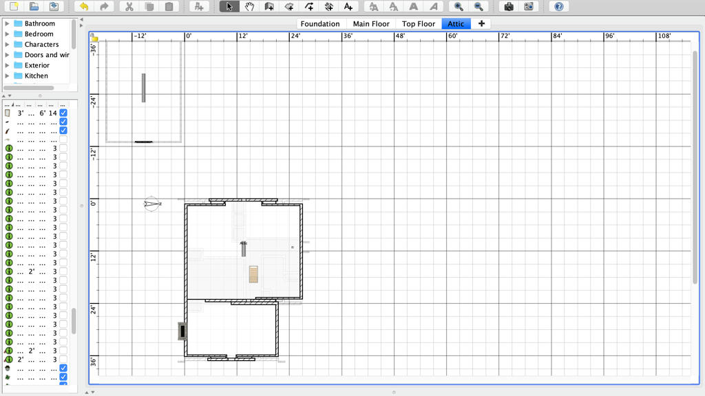
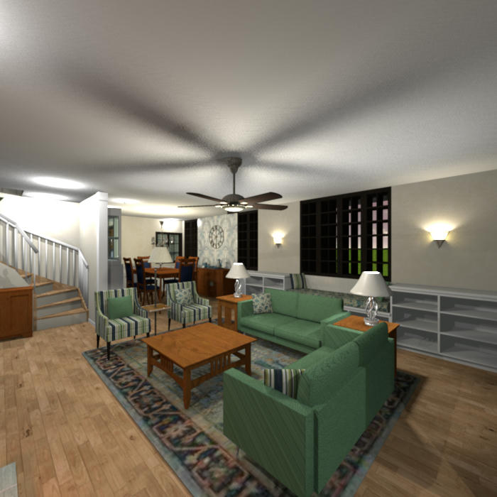
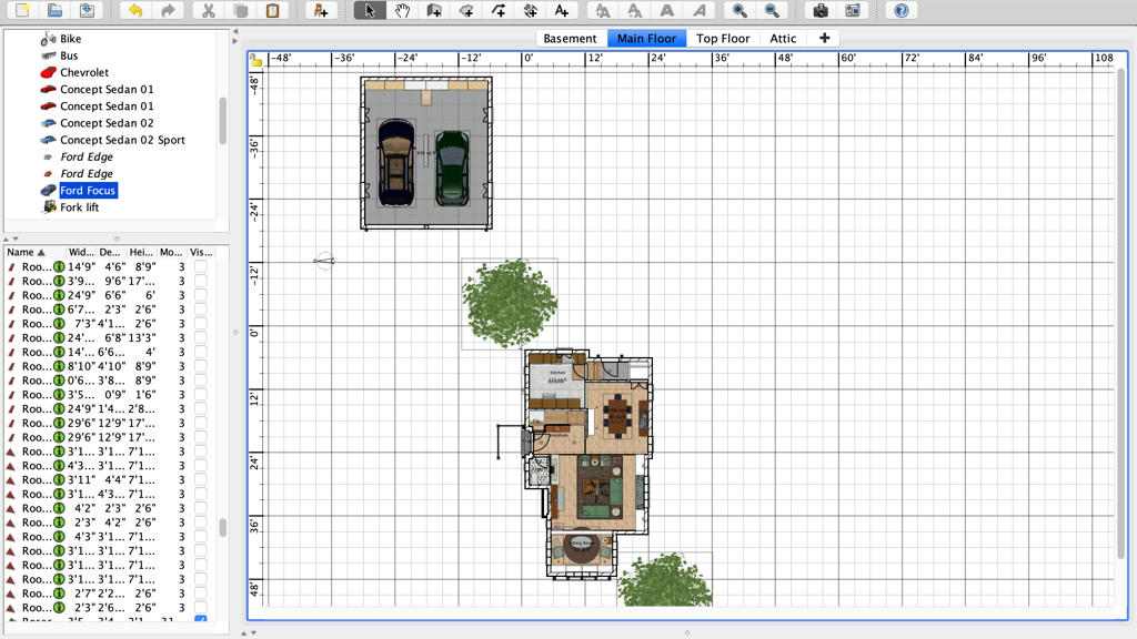
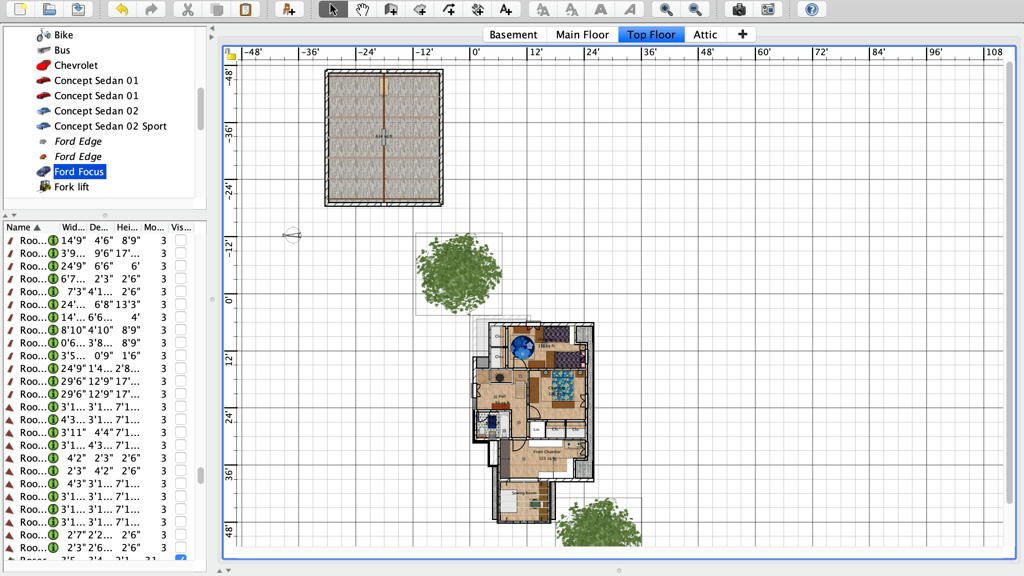
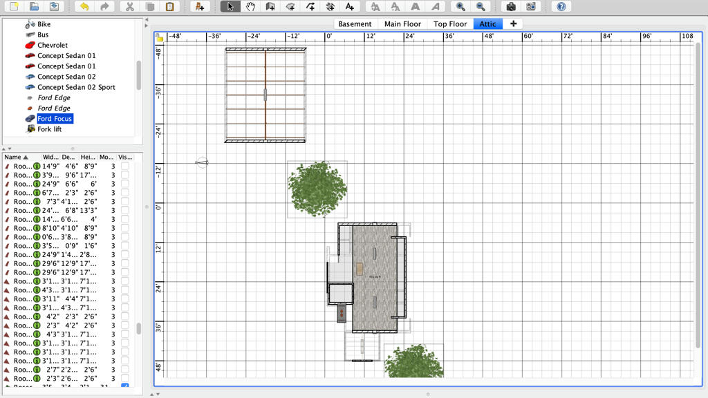
)Screenshots of the different levels (except the attic). ![]() You can see the minor changes I've made from the original. Information on each of these levels: ![]() 
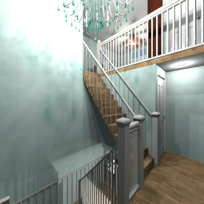
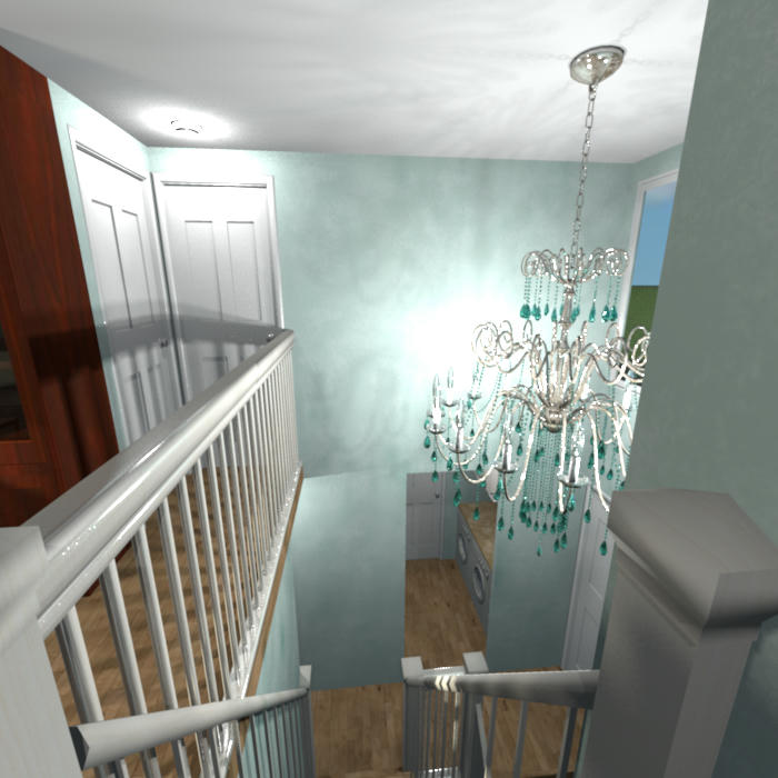
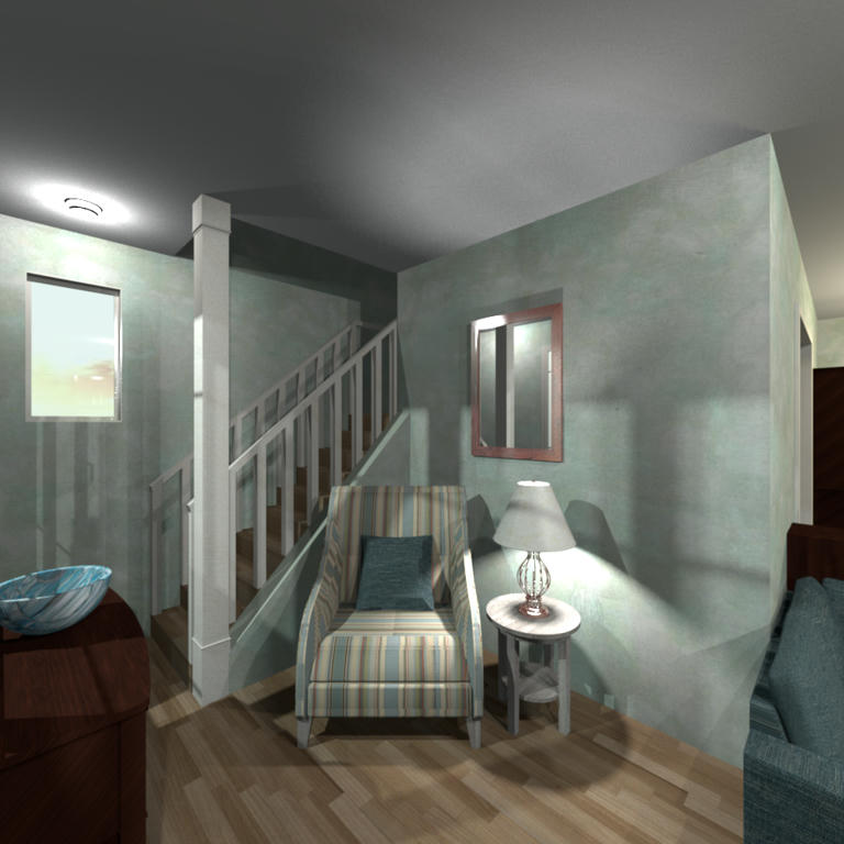
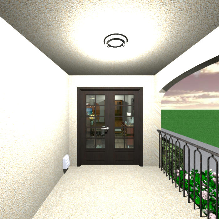
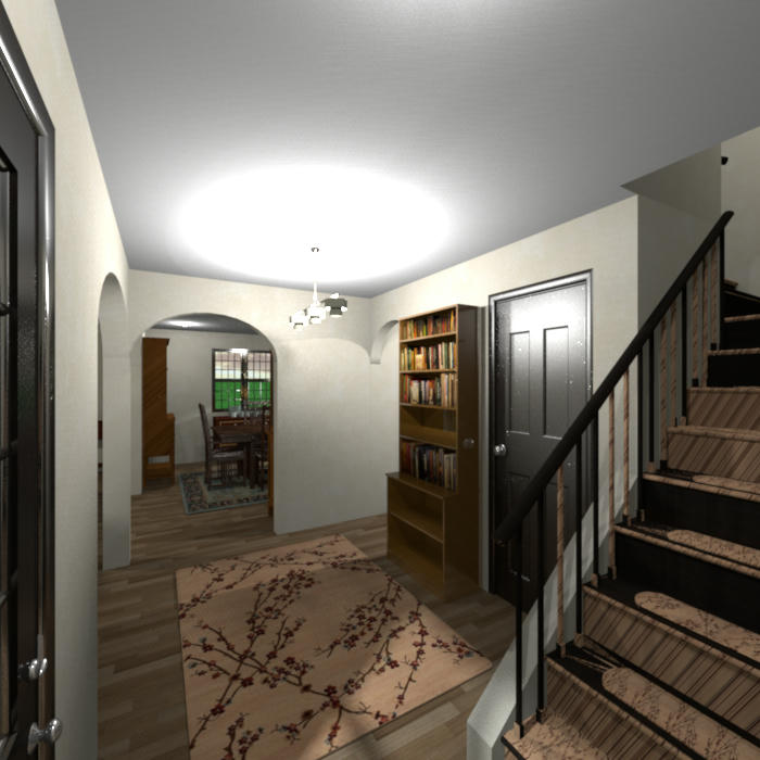
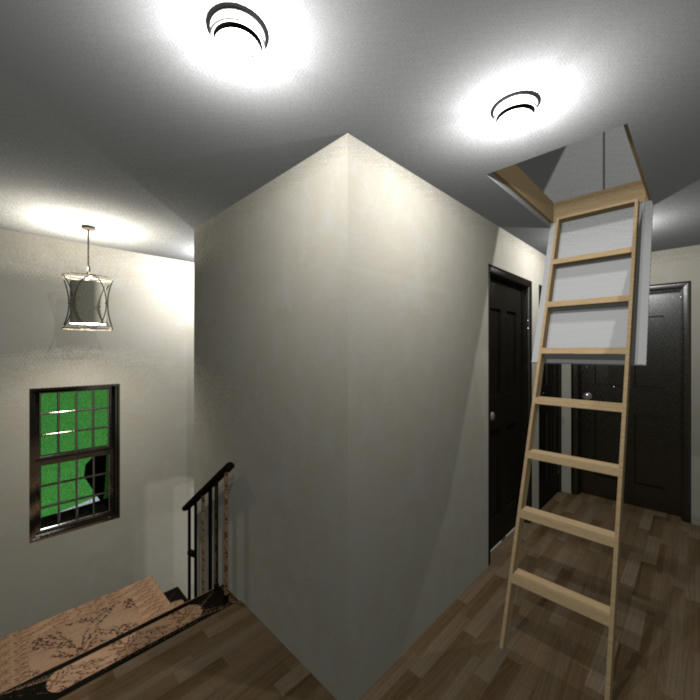
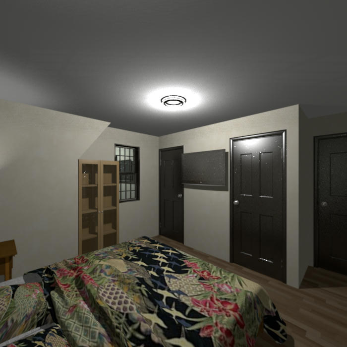
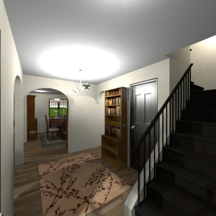
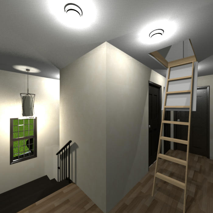
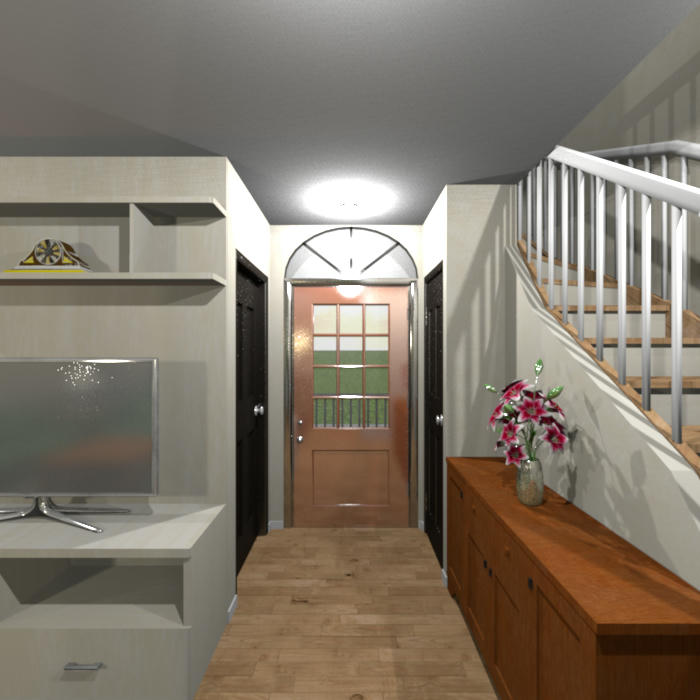
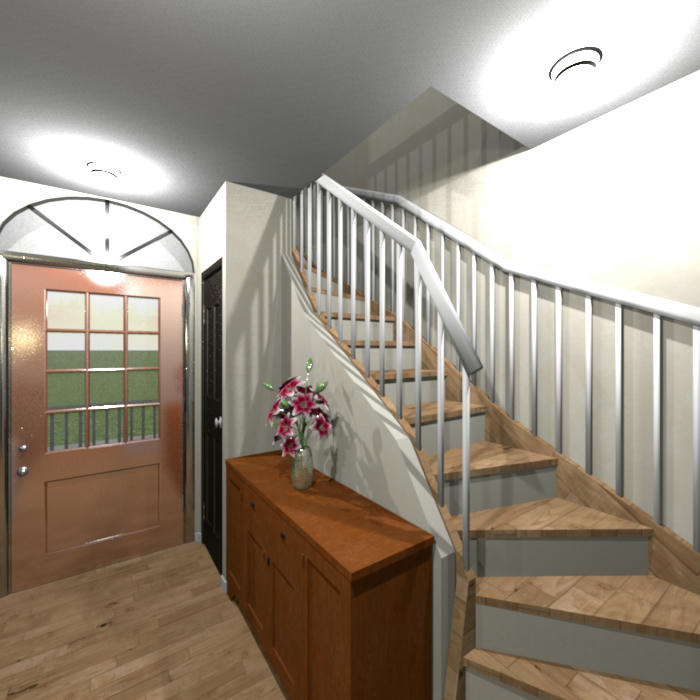
Just inside the front door, looking down the hallway. Starting on the left, going clockwise: entrance to the Dining room, just after the framed pictures is the door to the kitchen, the door to one of the "Chambers", bathroom as visible behind the retractable stairs to the attic, the partially visible door to the linen closet, the door to the central heating and air unit, just after the next set of framed pictures is the front entry closet, and one of the living room doors. (FYI: The "time" in this picture was taken was 4:12 pm, hence the positioning of the shadows.) 
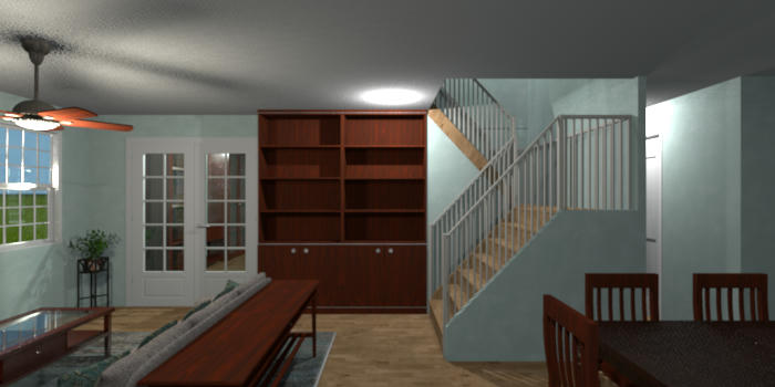
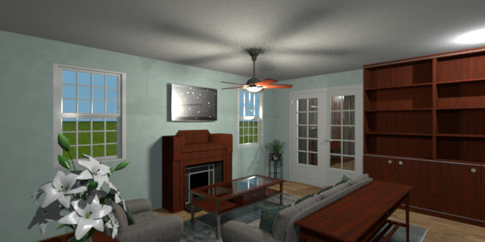
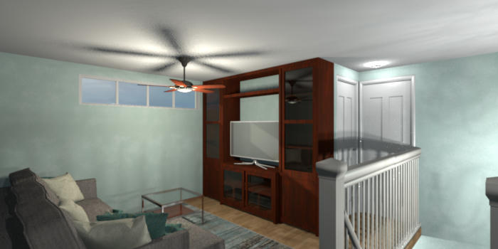
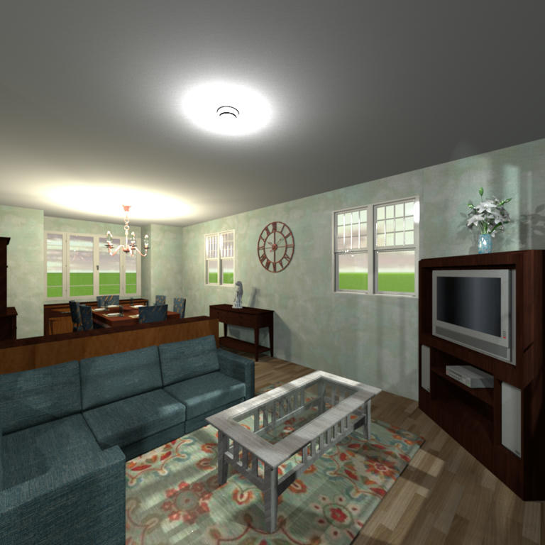
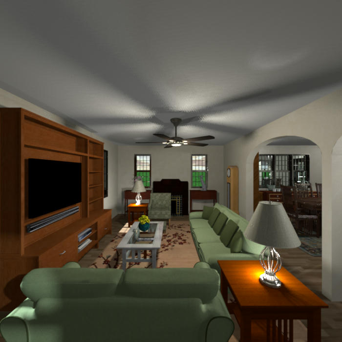
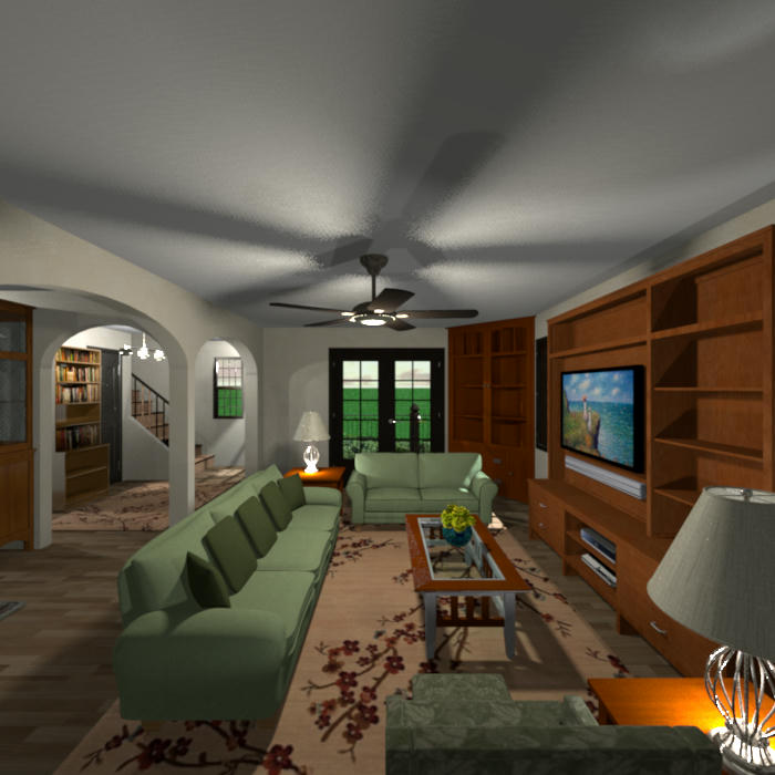
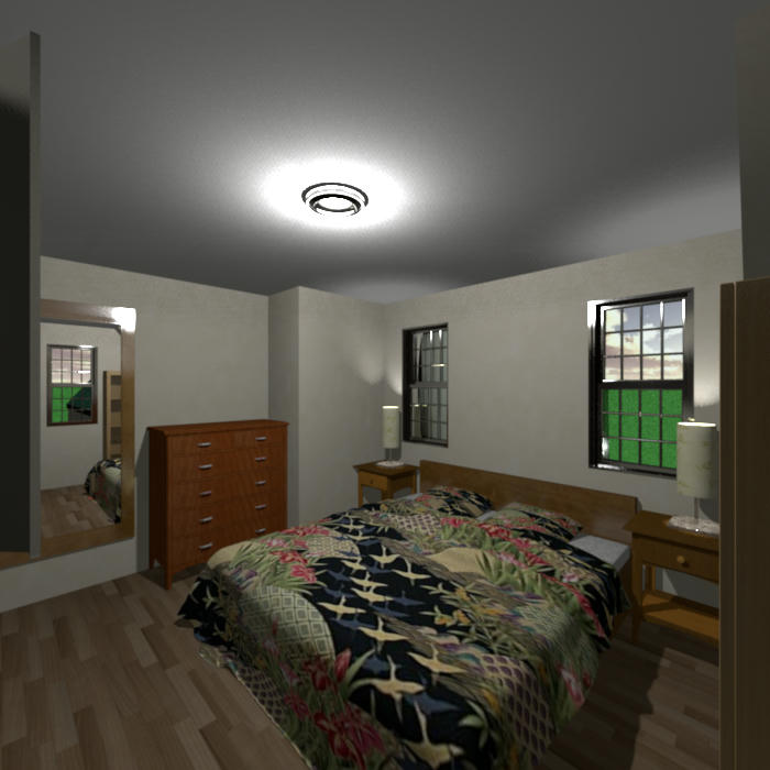
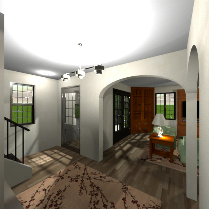
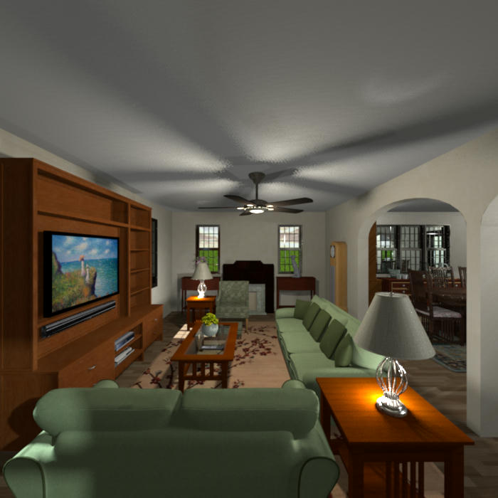
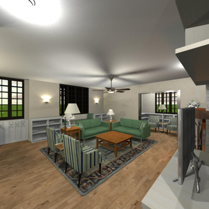
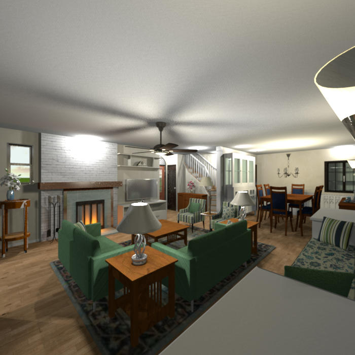
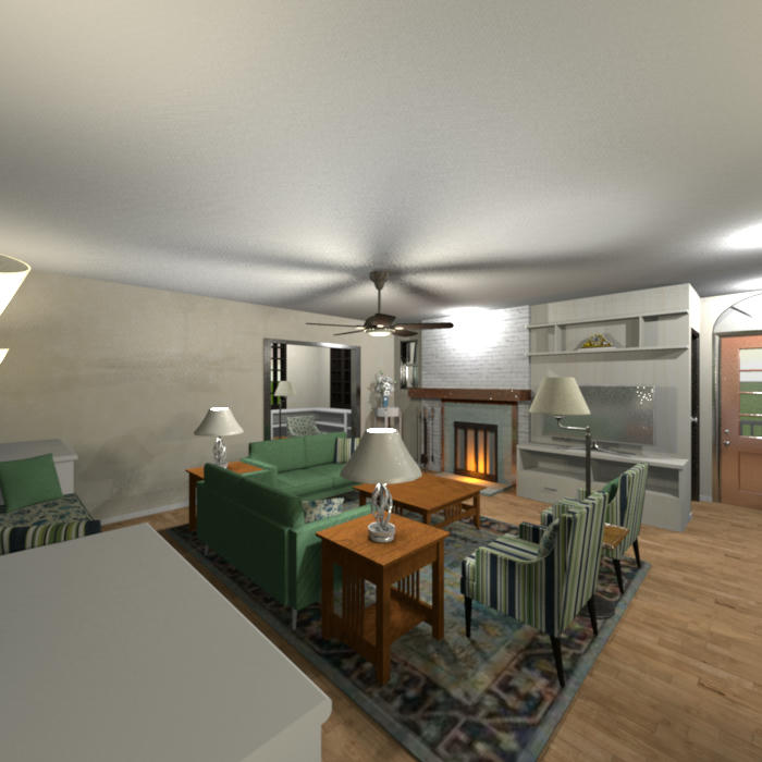
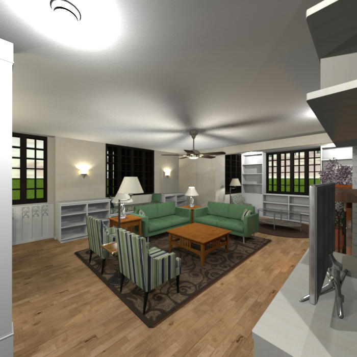
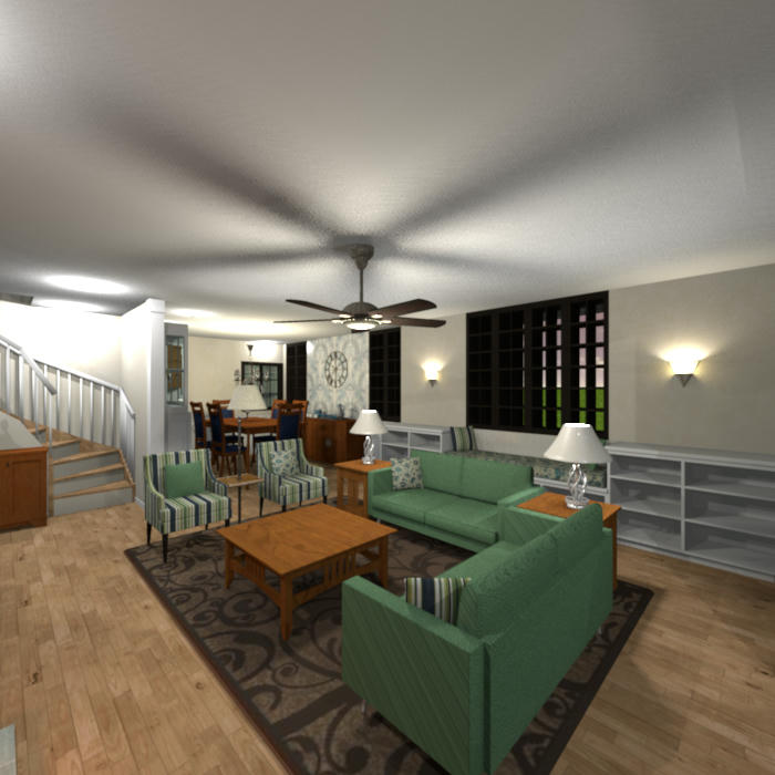
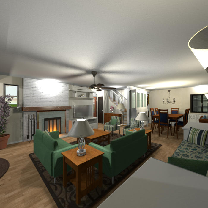
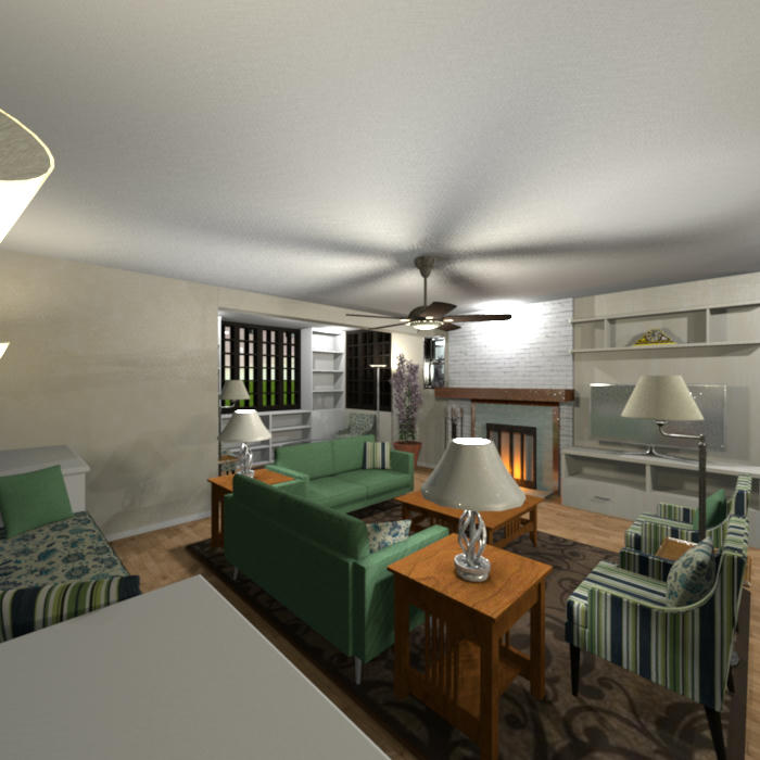
The Living room. What had been a "CLOSET FOR DISAPPEARING BED" is now a built in wardrobe as well as the space for the central heating and air unit (the door to which is visible in the hallway). I've put in a sleeper sofa instead. The other door to the hallway is visible here. Also, the fireplace is now part of an entire wall built in unit; in doing so I took out the windows that had been there. (FYI: The "time" in this picture was taken was 10:09 pm, matching the time on the wall clock, hence the lack of the shadows from the windows behind the virtual visitor, and the fire glow.) 
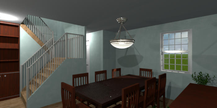
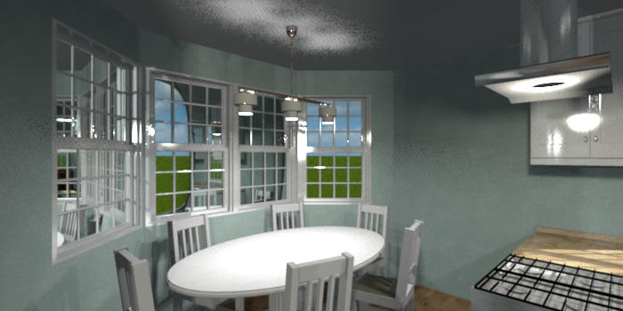
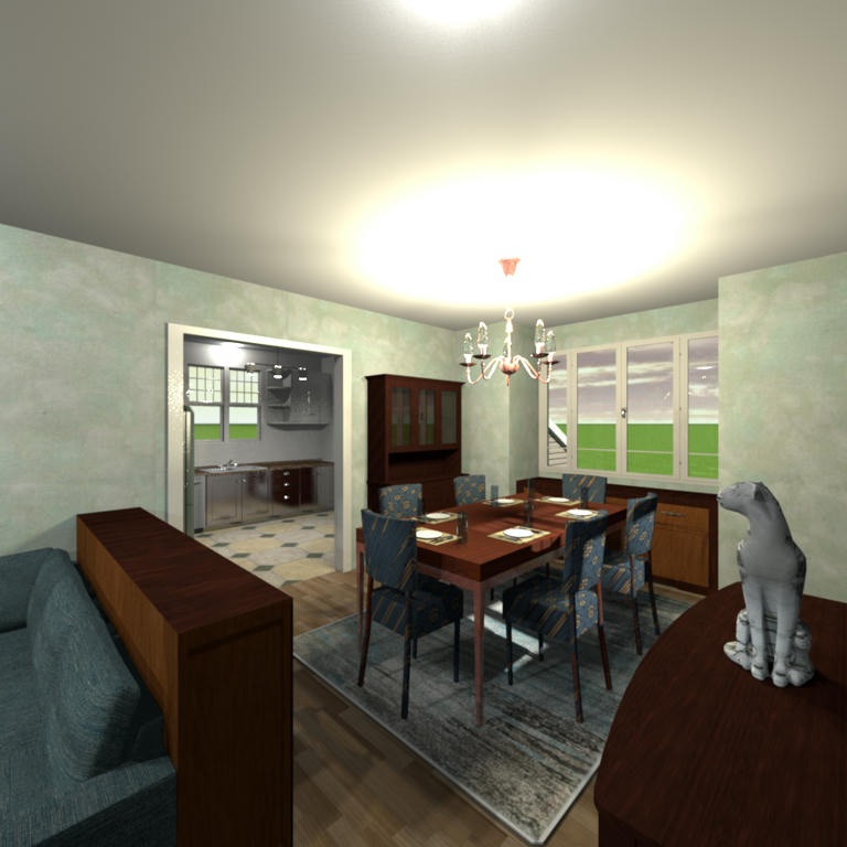
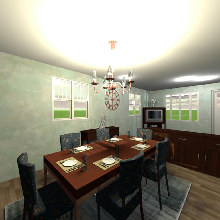
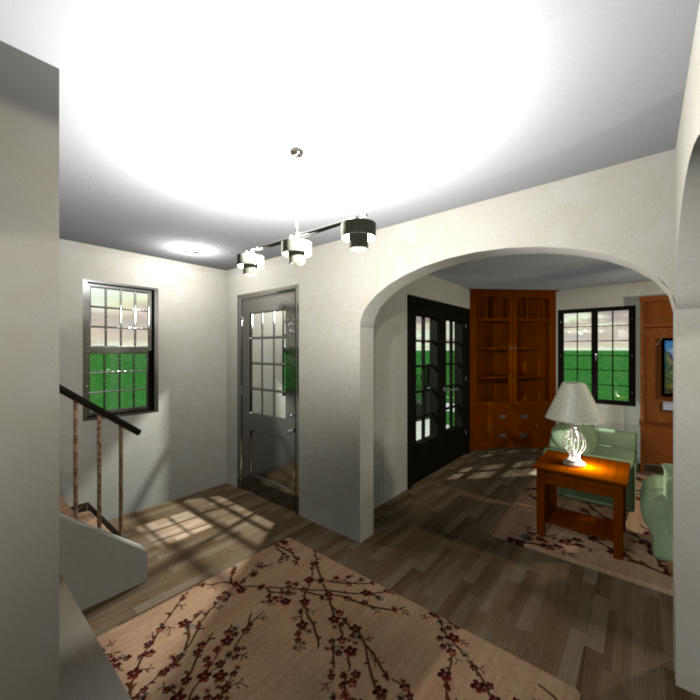
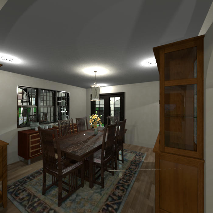
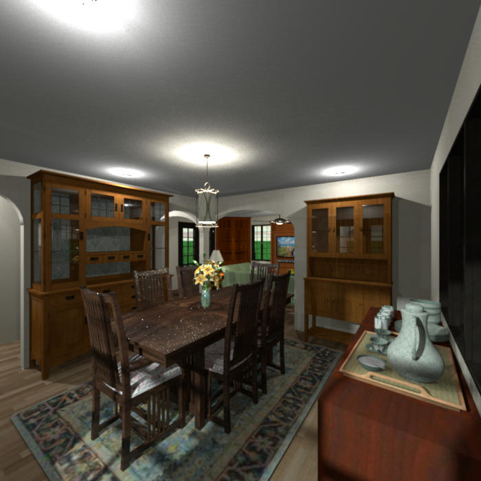
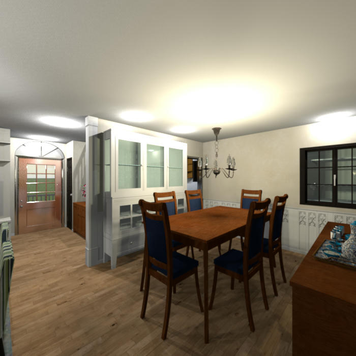
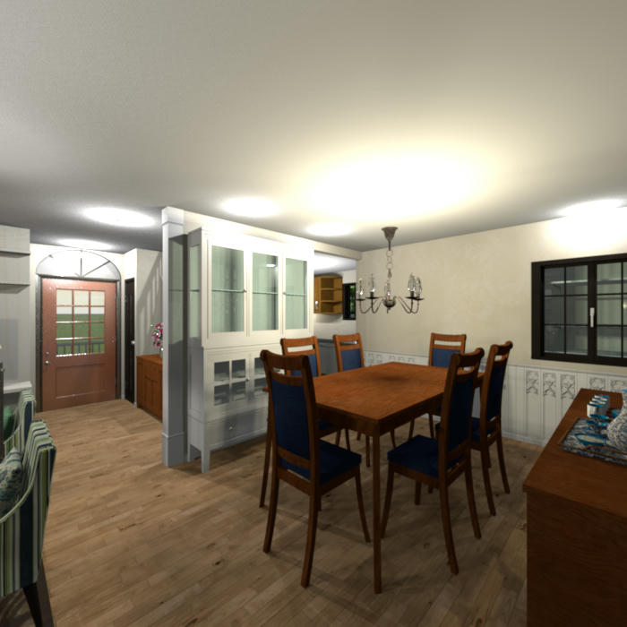
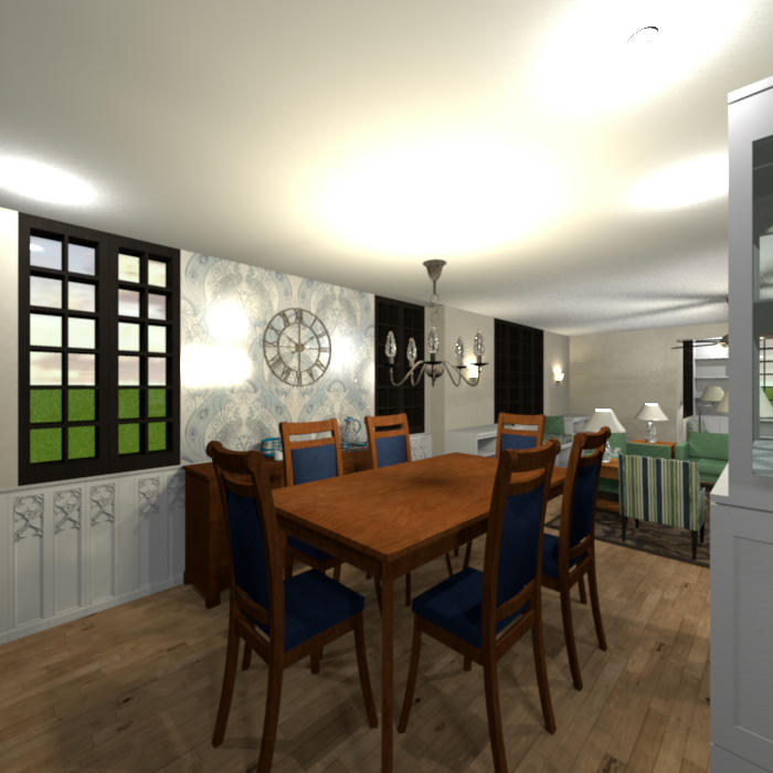
The Dining room, taken from the vestibule. It's kind of difficult to make out what the chandelier looks like unfortunately. Here's a screenshot of it though. ![]() 
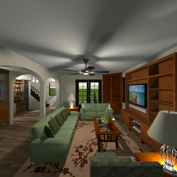
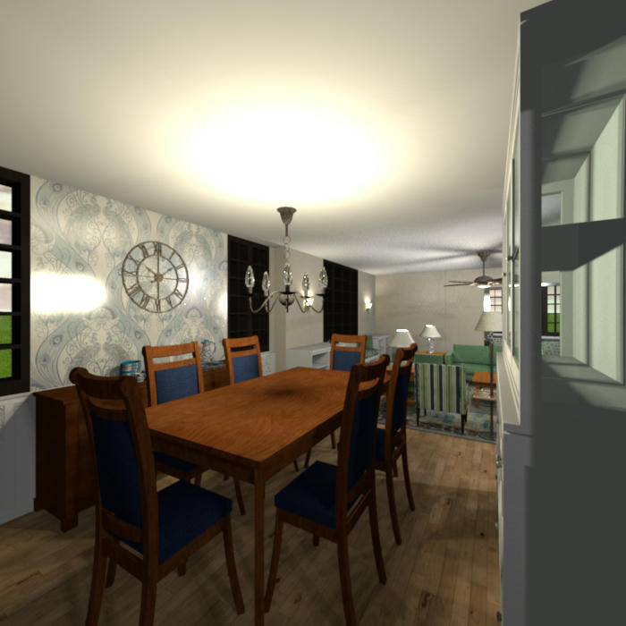
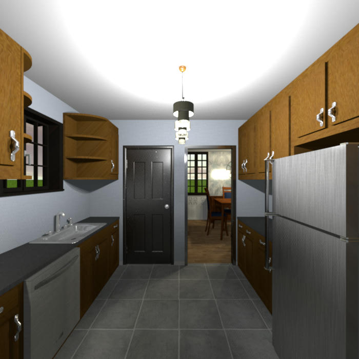
A different angle of the Dining room - taken from one of the windows looking into the kitchen. (FYI: The "time" in both of these rendered pictures is also 10:09 pm.) 
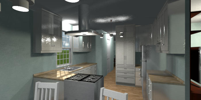
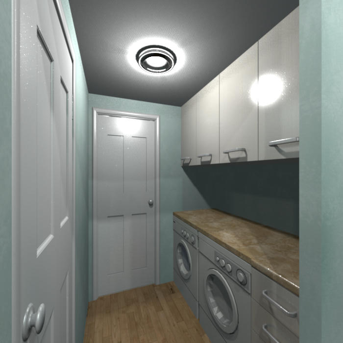
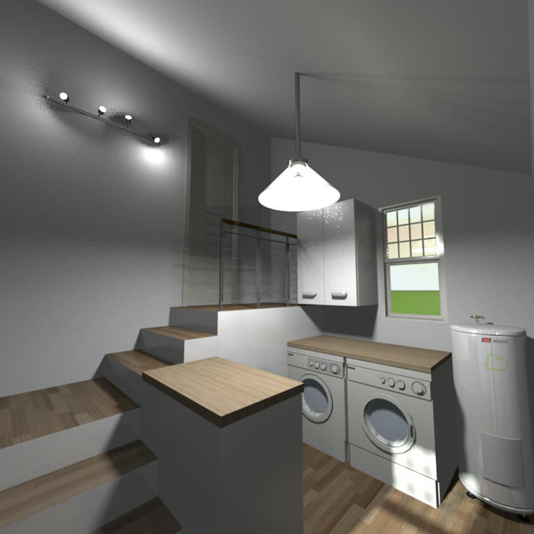
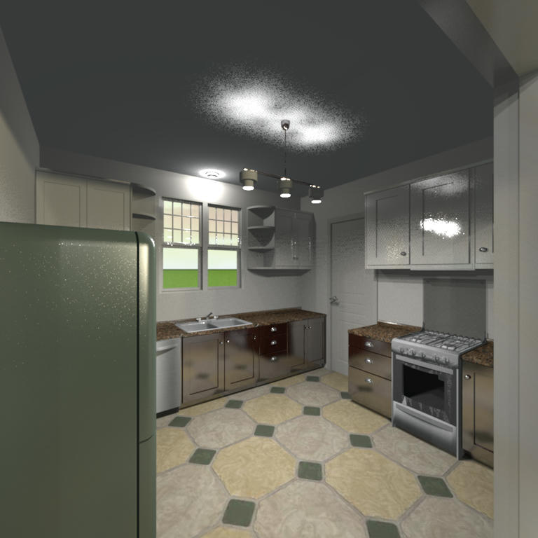
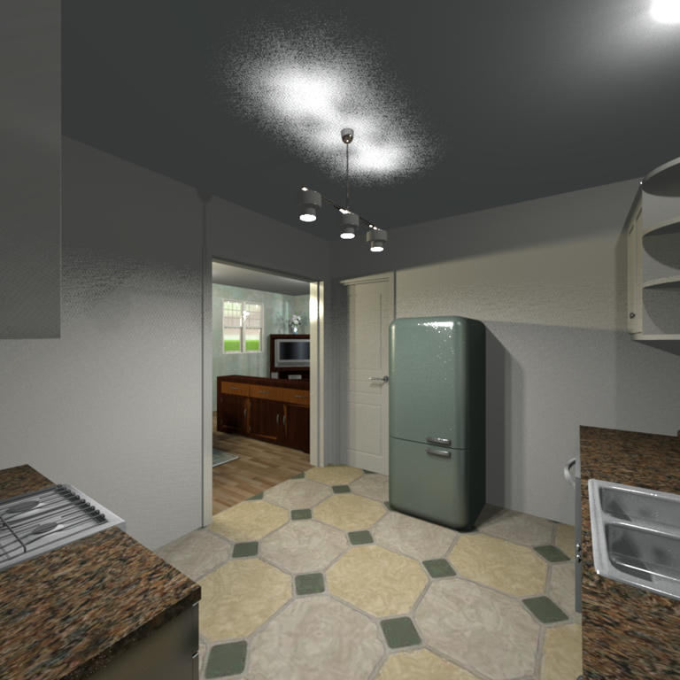
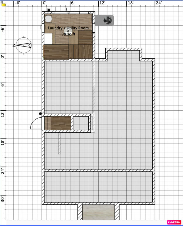
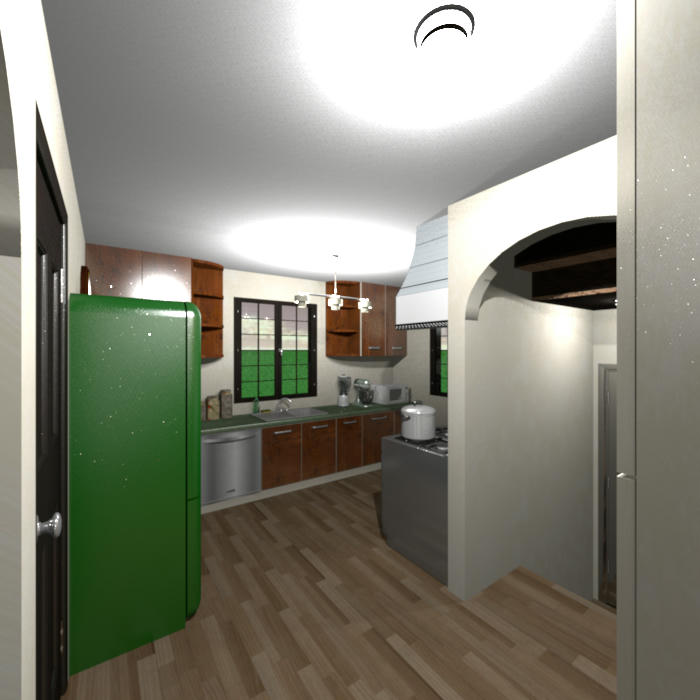
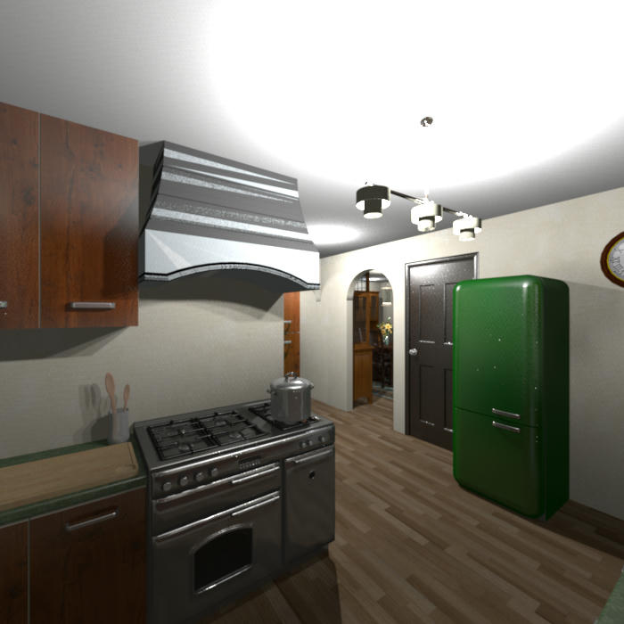
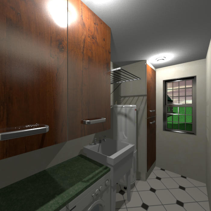
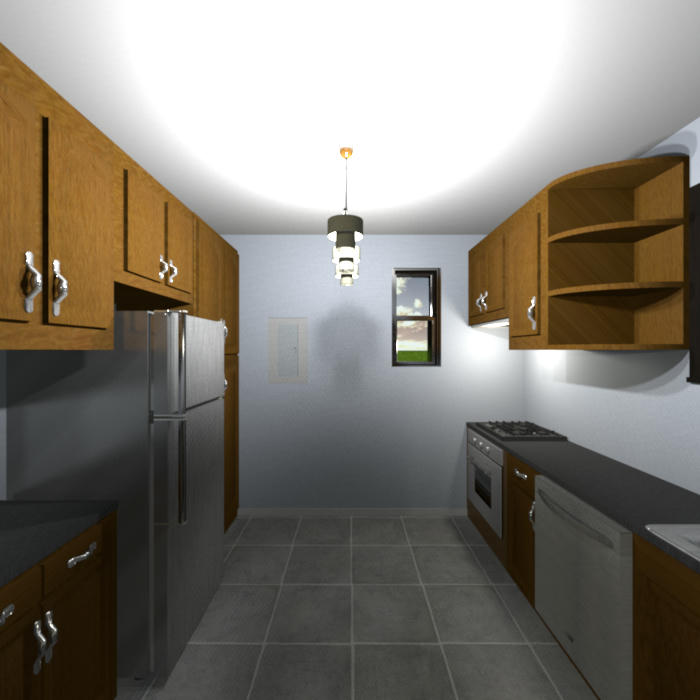
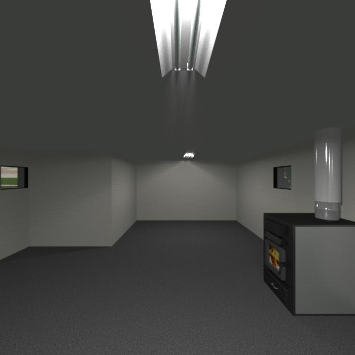
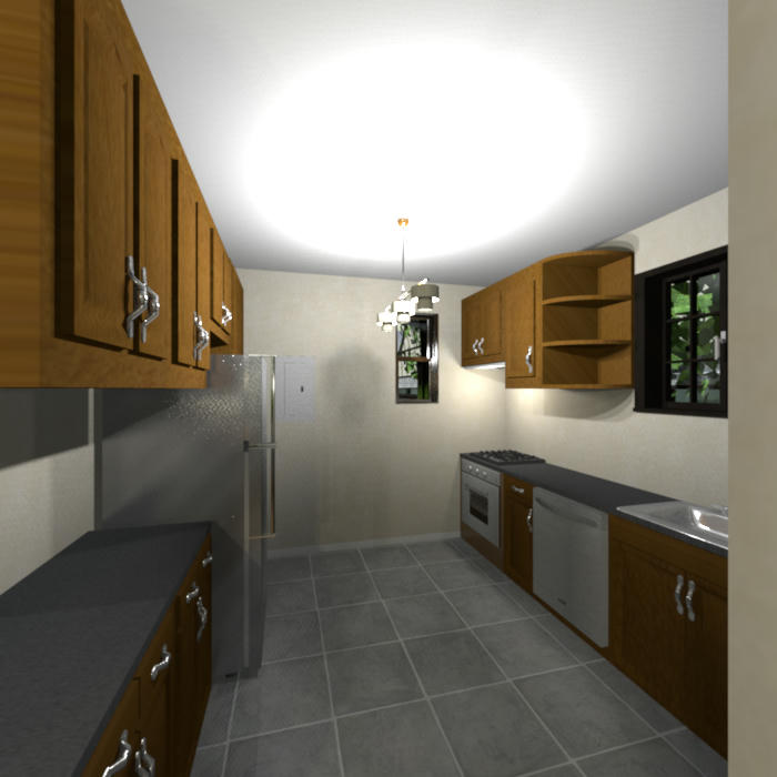
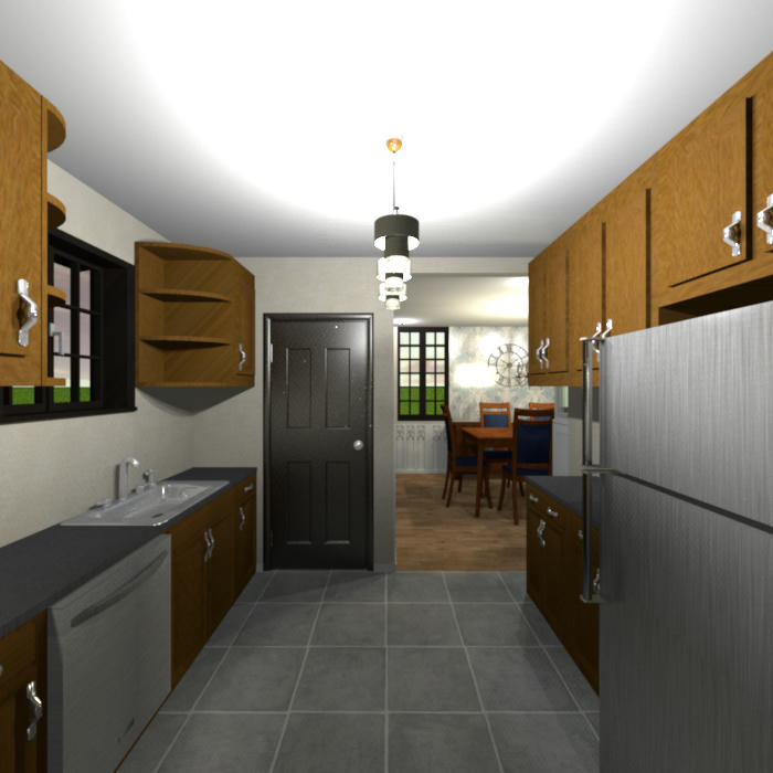
The Laundry room, or "SCREENED PORCH", taken from the back corner looking into the kitchen. Since the original house plan didn't include an electrical box, I had to put it someplace, and in this room seemed the most likely. I had to move the door over to do so. (FYI: The "time" in this picture is 4:12 pm, just as it is on the wall clock visible from inside the kitchen. The remaining pictures are also rendered at 4:12 pm) 
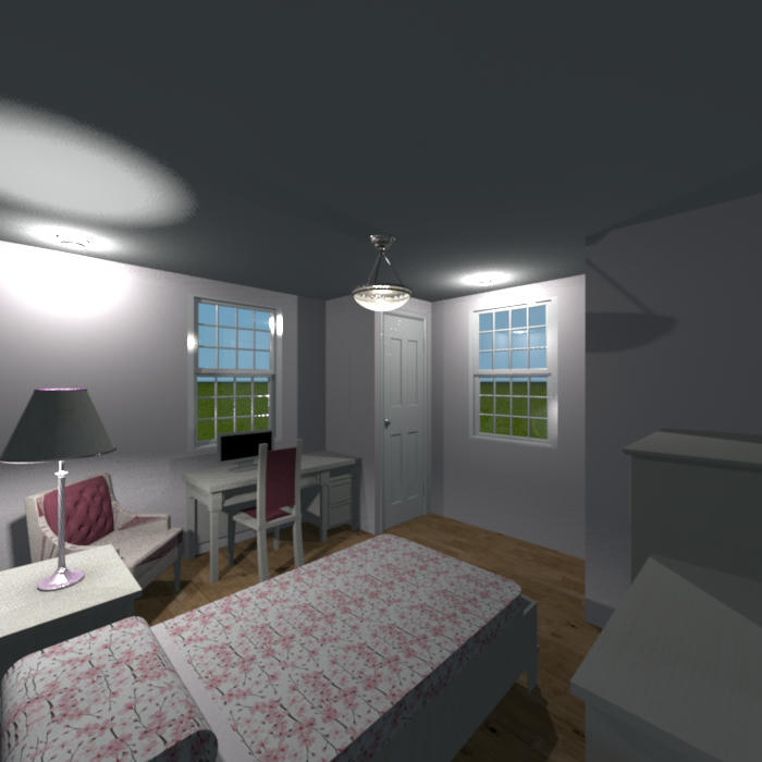
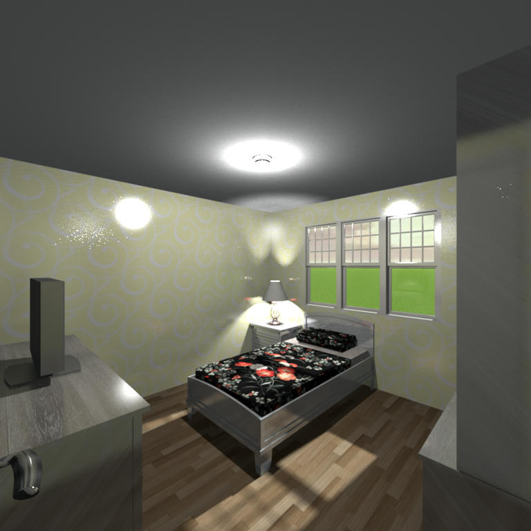
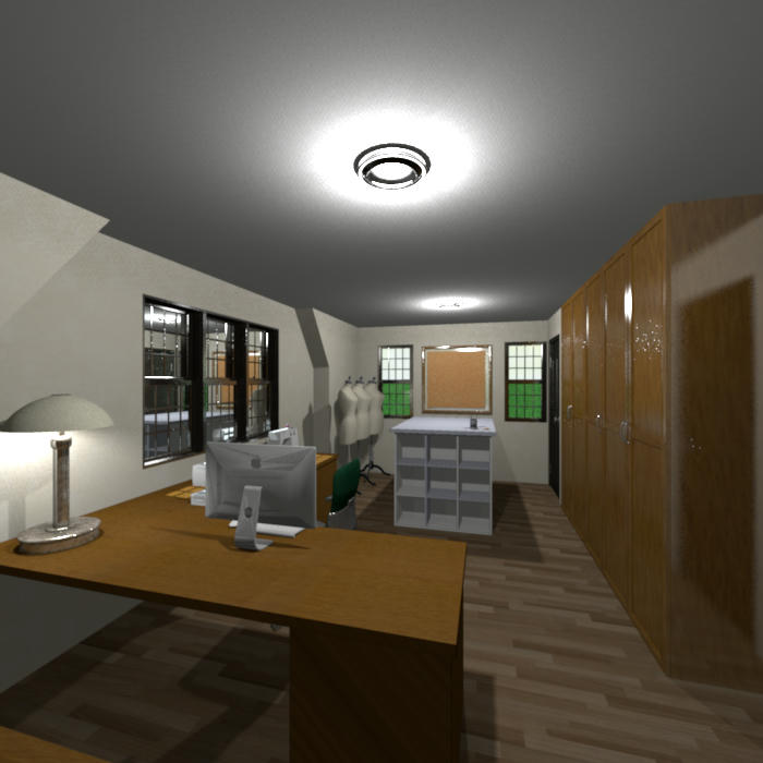
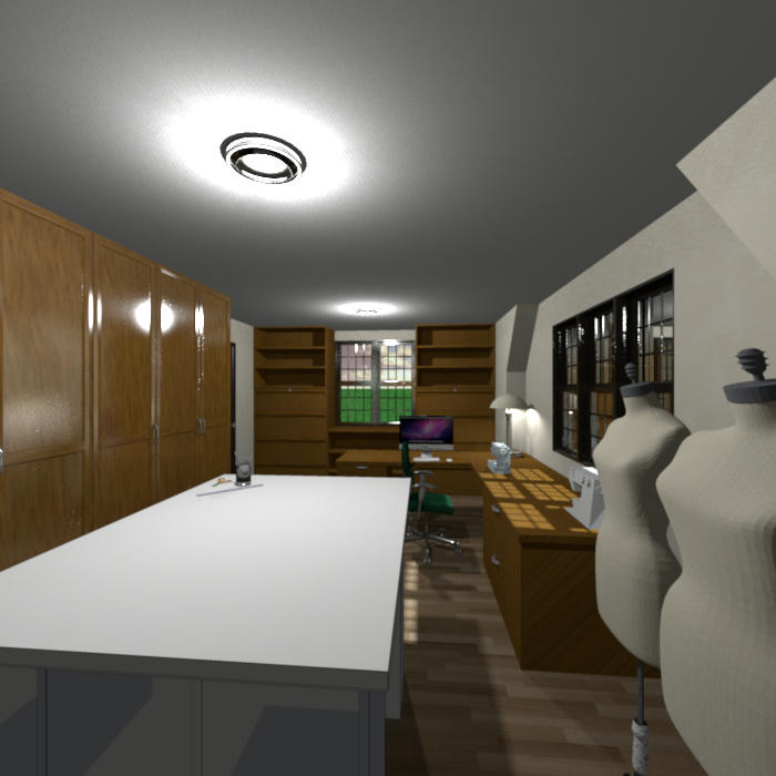
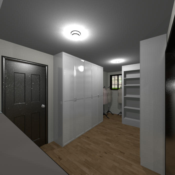
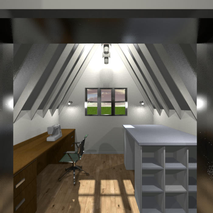
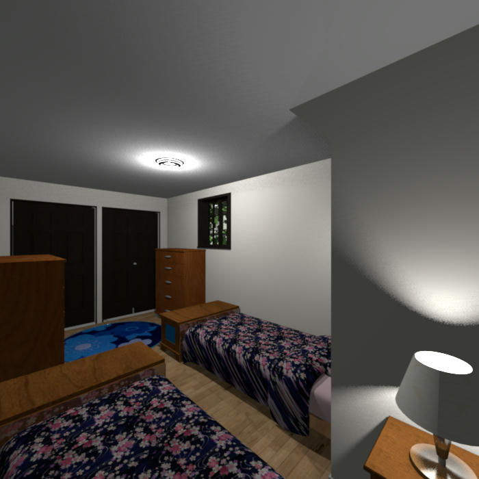
The "Chamber" behind the Kitchen, taken from the back closet looking to the door. I've decided to make this room my Sewing room (big surprise). I've got the hutch above the desk for storage of thread and such, a filing cabinet for all my patterns, some shelving above the filing cabinet for my sewing books, a couple of wardrobes for fabric storage, and the crafting table for cutting out patterns. 
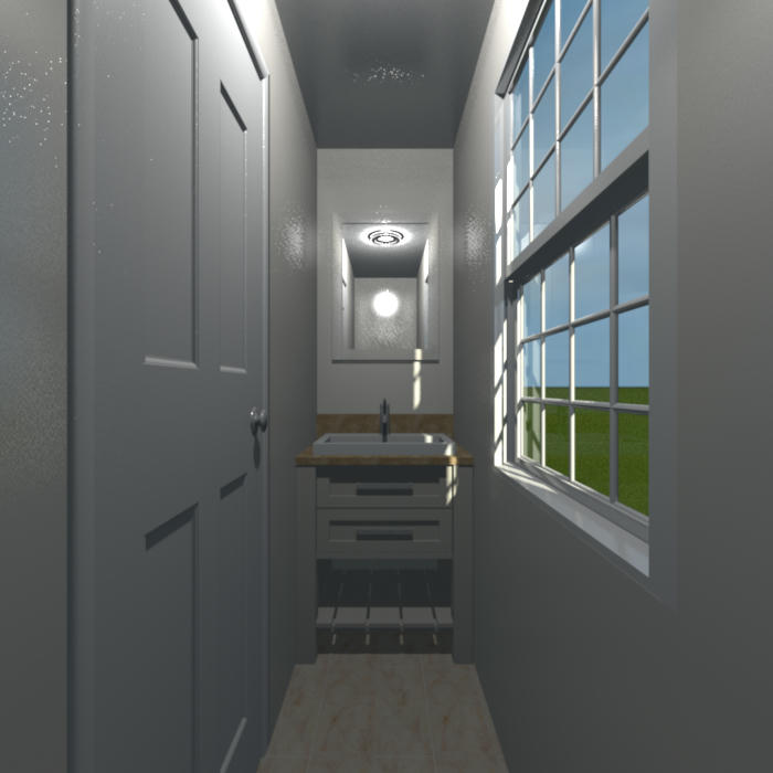
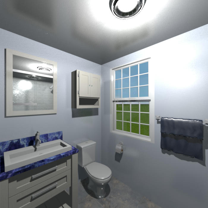
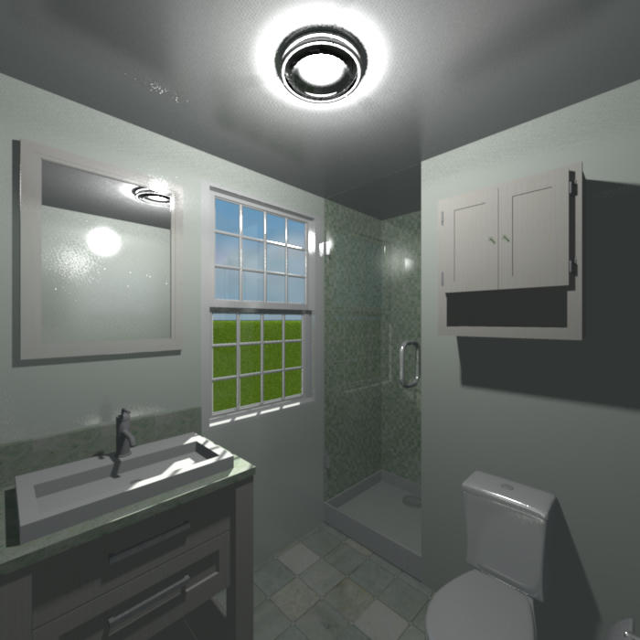
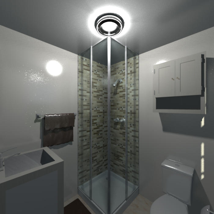
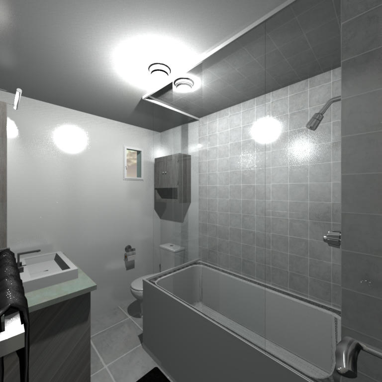
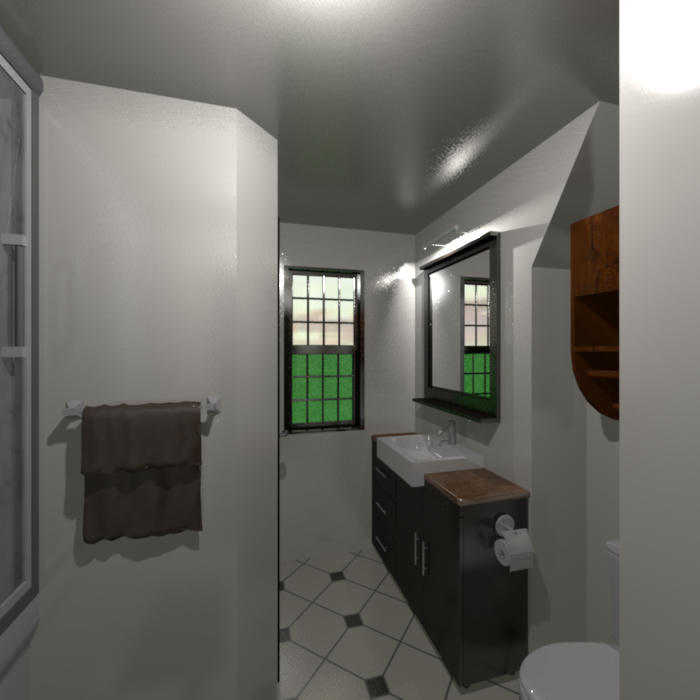
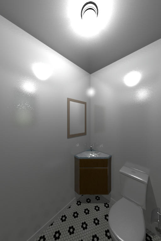
The Bathroom, taken near the door. I've furnished it in roughly the same manner as in the original, although because I made the second chamber (pictured below) equal in size to the first one (pictured above) I've added some extra space in here, enough to include a cabinet next to the bath tub. And upon looking at this, I'm tempted on rearranging things, mainly to get the tub out from under the windows... 
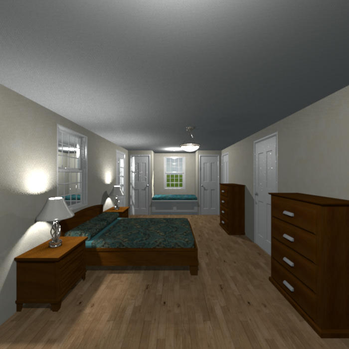
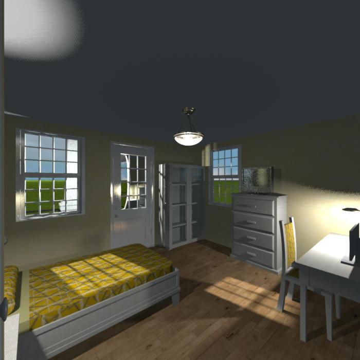
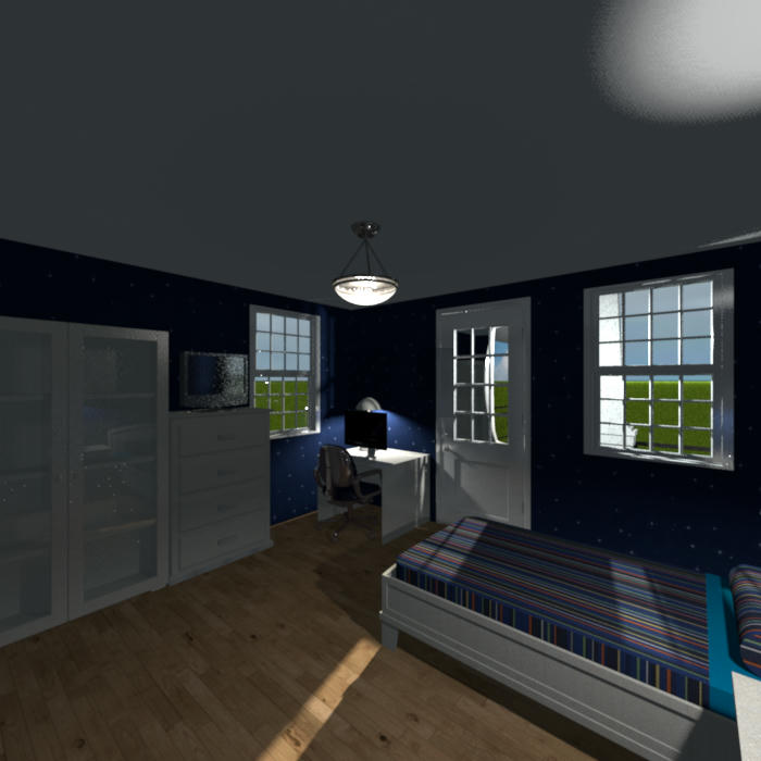
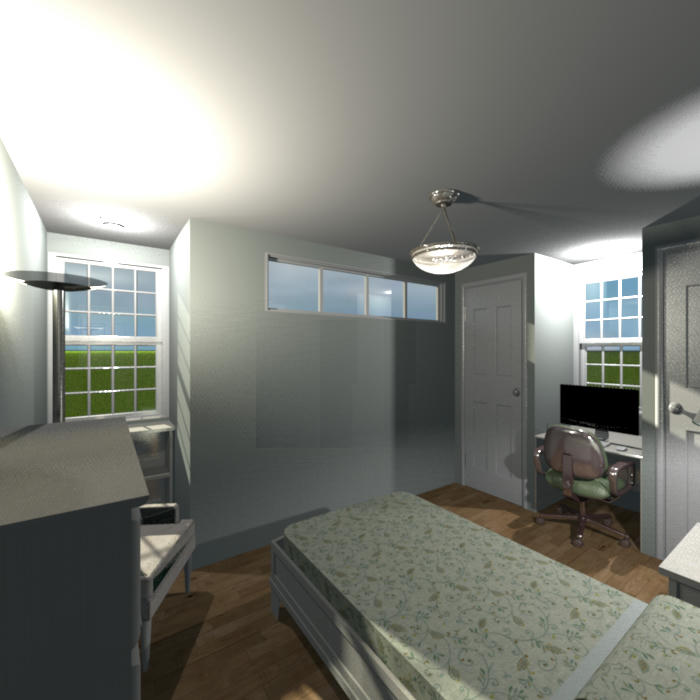
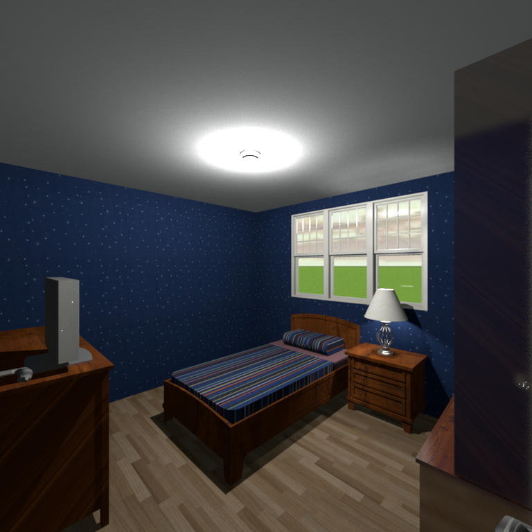
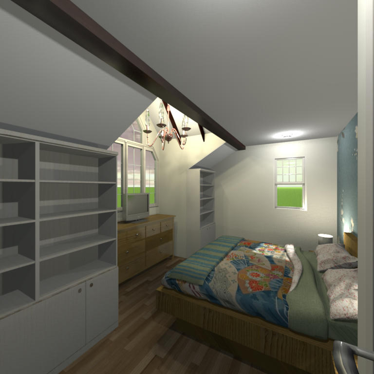
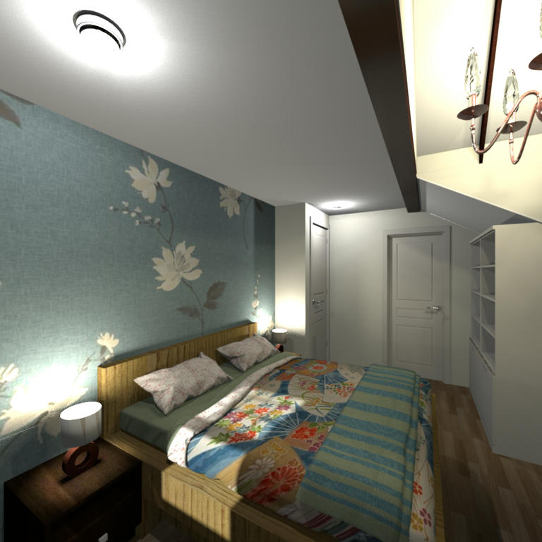
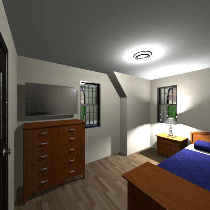
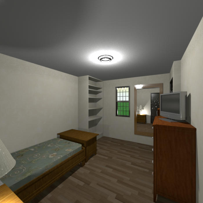
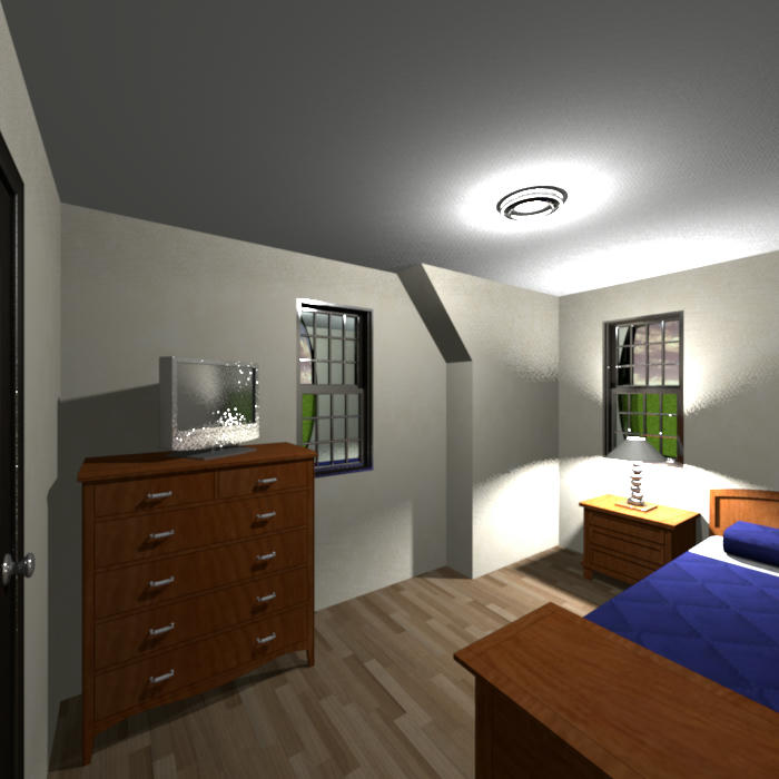
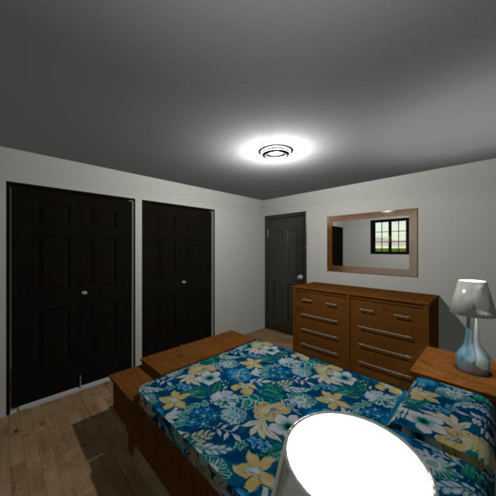
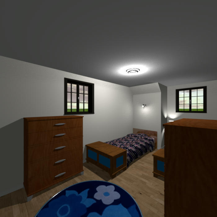
And the final room, the other "Chamber". Just an FYI, when I took the screenshot of the floor plan, I hadn't customized the pieces I'd had in this room, except for the desk and mousepad (actually it's the oriental rug just shrunk down to mousepad size), and I also hadn't added the cedar chest at the foot of the bed. The door to the hallway is just out of shot to the left, and there's a television on top of the dresser on the right. ---------------------------------------- ![]() |
| Posted by AeowynFraser at Jul 18, 2017, 7:16:07 AM |
|
Re: 1928 Home Builders Catalog Co. house plans Here's the next house, "The Chesapeake". This is a much larger house than "The Caruth" so there's going to be a larger number of pictures in this single post. Here's the link to the file I've been working on. ![]() As you can see, it mentions the height of each level (even the basement, which I didn't include but put in a 2-foot foundation instead). Information for each level: As you can see, I did not make the Main level the same ceiling height as it was in the original, but I guess that's alright. Foundation level Main level Top level I didn't include the Attic/Roof spacing as there wasn't really anything there to see. Plus, I hadn't added access to it from the top floor... I've used the "Frosted Glass" texture on all the glass surfaces, so that's why a lot of things that looks like it should be see-through... isn't... Front, aerial view. You can see I did my best to get it to look as close to the original picture as I could. There's a couple of additions to the side that's visible; I've added an enclosed water heater, as well as an electric meter, both near the side door. Back, aerial view, showing the part of the house that wasn't in the original picture. There's a couple of things I've added here; the HVAC on the back wall, and the vent for the dryer coming out in the back porch. Standing at the beginning of the stoop, looking to the front door. After taking all these pictures I realize that I haven't included a mailbox, but I think I'll probably add that later. Side door. The only reason I think it's so dark in the shot is because it's late afternoon and the sun is down past the level of the small wall jutting out near the front door (that's my thought anyway, and I'm sticking to it 
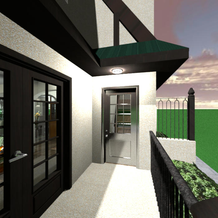
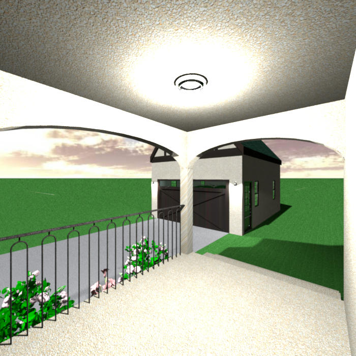
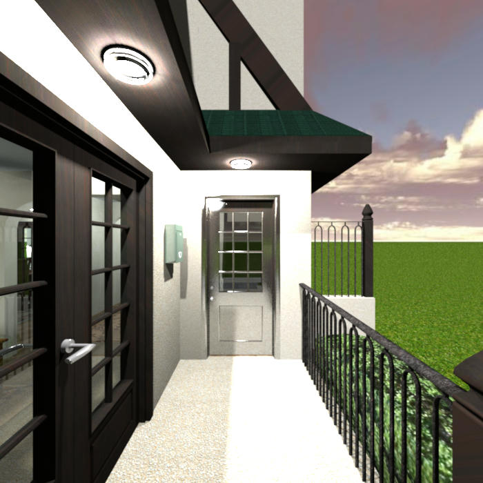
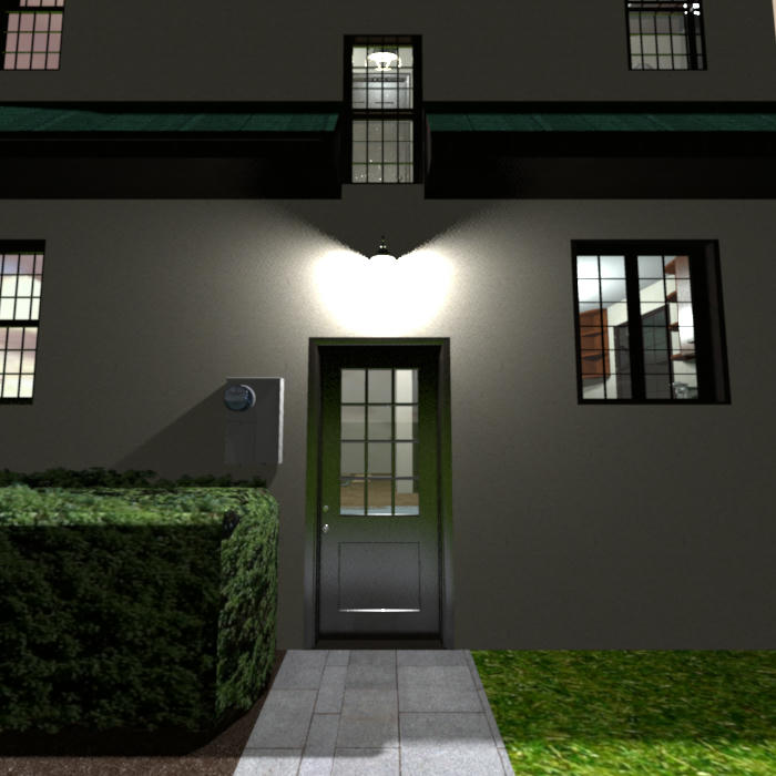
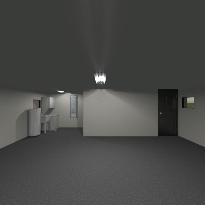
). The enclosure for the water heater and the electric meter are better seen here. Back Porch, taken from the foot of the small stairs. The large strip of paving on the right is the driveway to a detached garage. I know that there needs to be a garage, but it wasn't included (I believe the catalog had many sold separately) so I didn't. I might add one later, or not . I figured that since I'd taken those screenshots previously of the vestibule, living room, dining room, kitchen and laundry nook (as listed here) that the rendered pictures would be of different angles. The vestibule, taken from the front door looking to the kitchen entrance. The door to the right of the bookcase is to a closet. For some reason the staircase rendered so strangely, so here's a screenshot from the same spot to show what I was envisioning of it: ![]() ![]() The Living room, taken from the corner near the vestibule doorway. I think that I probably should have added a fireplace glow to the fireplace... The Dining room, taken from the corner near the doors to the back porch. I don't know why it came out so dark... maybe I need to adjust the luminosity of the hanging lamp... The Laundry Nook, taken near the window. The door to the Dining room is visible. Also, the tall cabinet is for storing cleaning supplies (broom, vacuum, mop, etc.) The kitchen, taken near the door to the Laundry nook. You get a better look (although it didn't render well) at the vintage style cooker, as well as the side wall and the pantry doors between the vestibule doorway and the side door. Also, I've added the electrical panel down near the side door, which isn't visible in this picture. Another view of the kitchen, from the sink looking to the doorway to the vestibule. I am definitely not happy with how the cooker, and the hood, came out. Here's a screenshot of that same rendering, just so that those pieces are better seen: ![]() Now on to the top level. Taken from the hallway, looking down the stairs. Visible on the left is part of the door to one of the "Chambers", and the other two doors (on the right) are to the Bathroom and Linen closet. Once again, the stairs didn't render well, at all. Here's the screenshot: ![]() The bathroom, taken from the window. You can see the shower in the mirror. When I went to take this picture, I realized that I didn't treat the walls and floor very well so I changed them; that's why it looks a little different from the floor plan screenshot of this floor. And upon looking at this picture I'm tempted on changing the floor tile to the vintage style tile treatment I'd used in The Caruth's bathroom (pictured below). The first "Chamber" (the smallest one), taken from the corner near the door to the hallway (which was visible in the hallway picture). I've decorated this room as either a child's room (not a baby or toddler room) or a guest room. Or, if this were my house (as I've designed it), this could be my room and the next room would be the guest room. Lots of possibilities. Disclaimer: Anywhere where there's an odd shaping to the top of walls, as in the previous picture, I don't know how to get do it in the software. The next "Chamber" (the mid-sized one), taken from the corner near the one nightstand (which isn't visible, but the top of the lamp on the nightstand is). Also not visible in this picture is the full-length mirror which is on the wall near between the bumped out wall and the door. As you can see, I've decorated this as the Master bedroom (more specifically, it would be MY bedroom ). The last "Chamber" (the largest one near the front of the house), decorated as my sewing room, taken from two angles. Yes, those are two sewing machines; I couldn't find a specific type of sewing machine on 3D Warehouse and just used a plain sewing machine as a placeholder for it. I've got a cork board where I can pin pictures of my designs, match fabric swatches, etc. I've also got three female dress forms, in three different sizes. I've got filing cabinets for patterns, bookshelves for books and notions (using baskets to store them in - which I didn't add ), and a long wardrobe for storing fabric. (At this point I'm not sure what I'd do with the closet in this room, but probably as additional storage.)---------------------------------------- ![]() |
| Posted by Ceciliabr at Jul 18, 2017, 12:04:42 PM |
|
Re: 1928 Home Builders Catalog Co. house plans I think your constructions are totally impressive! The Dining room, taken from the corner near the doors to the back porch. I don't know why it came out so dark... maybe I need to adjust the luminosity of the hanging lamp... A stronger light source will just create an even more contrasty rendering. To lighten the room, you need to think like a photographer. My advise: As a general rule you should never use the "Add ceiling lights". Instead you should place some light sources around the room, f.i. use five - six incandescent light sources at around 5% strength and increased size, to create focus on the most important details. II have posted a thread about lighting HERE You might find something of interest there. cec |
| Posted by AeowynFraser at Jul 19, 2017, 10:56:34 PM |
|
Re: 1928 Home Builders Catalog Co. house plans Thank you, Ceciliabr. I took your advice and looked at the light source. For one thing, the "time" of the original picture was in the afternoon; I switched it to morning so that the sunlight would be coming better through the dining room windows. I also added a lamp post near those windows. I also added light colored objects to the room to add contrast with all the darker wood, and to help with distinguishing surfaces. ![]() Still not that bright, but better than before. I think I might trying to add some additional light sources within the room later. ---------------------------------------- ![]() |
| Posted by VeroniQ at Jul 20, 2017, 10:47:05 AM |
|
Re: 1928 Home Builders Catalog Co. house plans Aeowyn, there are also some lighting advice in this article of the blog. What you did with this "chesapeake" house is fantastic! |
| Posted by AeowynFraser at Jul 21, 2017, 3:13:14 AM |
|
Re: 1928 Home Builders Catalog Co. house plans Thank you, VeroniQ. I looked at the link, and it gave me insight into what I needed to do. ![]() I added an ENORMOUS halogen light source outside near the back porch, and I also enlarged the halogen light sources I'd used in the hanging lamp (it seems that the lamps on 3D Warehouse don't have their own light source, so I have to add it myself ).---------------------------------------- ![]() |
| Posted by AeowynFraser at Jul 21, 2017, 3:52:45 AM |
|
Re: 1928 Home Builders Catalog Co. house plans Here's the next house, "The Davidston". I started this house after doing some work on "The Commodore", but then I got kind of "burned out" with the whole figuring out the roof for that one. That's why I chose this one instead of "The Commodore" to post now. ![]() This time I chose to include the basement, and I did use the ceiling heights from the original. Information for each level: ![]() I haven't quite completely finished the outside (I haven't gotten it as polished as "The Chesapeake" yet), but I have gotten the basic furniture inside (although I haven't taken many pictures yet either). Screenshot of the Basement; I haven't put much furniture in there (there's only one corner made into the laundry room). Since about half of this level is visible above the ground, I had to come up with some way to show that, so I've used the "Box" with a grass texture on the top. I didn't want to have the back step and the side steps just floating in mid air like I did with the "2-Story Home with Basement Apartment". Screenshot of the Main floor (before adding furniture). The only rooms that I'd worked on furnishing at the time I took this picture were the kitchen and powder room. And some of the roofing is visible over the kitchen. I took out the steps from the Reception hall to the Living room and Dining room, as I didn't feel like trying to figure out how to add an additional level just for something that I felt was more of a tripping hazard. Oh, and I took out the wall mounted telephone in the reception hall. Screenshot of the Top floor (also before adding furniture). The only room that I'd worked on at the time I took this picture was the bathroom. I kept the "Sewing Room" from the original house plan (of course), but it's under the roofing. Also, I did a little change with the closets (even after taking this picture). Aerial front view. It looks like I did a bit of different on some of the roofing on the side visible (over the kitchen) from the original; I couldn't figure out how to get it to work the way they did it back then. ![]() Aerial back view, at least the sides that weren't visible in the original. As I'm looking at these two picture, I see that I probably ought to do some of what I did on "The Chesapeake"; I'll get that later. The Kitchen. I "modernized" it a bit. The original had the wall mounted ironing board, and I included it here, but I'm almost tempted on taking it out... I took out the Dining Set, moved the pantry (looks like it was originally near the door to the Dining room) into that corner, and moved the refrigerator to the left which gave me room for putting in two lower and upper cabinets near the dining room door. I also added a dishwasher, more counter space near the cooker, a smaller cooker, and additional upper cabinetry. After taking those pictures (last night, as I actually worked on this posting then, thought I had posted it and closed the window before clicking "Reply to the post"), I've worked on this house with the furnishing, as well as adding a baseboard. And since furnishing the whole house, it's too large to take pictures so I'm going to have to save each floor as separate files to do so. ---------------------------------------- ![]() |
| Posted by VeroniQ at Jul 21, 2017, 11:14:24 AM |
|
Re: 1928 Home Builders Catalog Co. house plans Whaouh, you did well! About the lighting, I wonder if you still have the ceiling lights (by default) in your photo renderings. It is more easy to remove it to built your own lighting, with different light sources, not too high. This tip is very useful too. This catalog is a wealth of ideas. |
| Posted by AeowynFraser at Jul 24, 2017, 5:33:11 AM |
|
Re: 1928 Home Builders Catalog Co. house plans Thank you, VeroniQ. About the lighting, I try to turn off "Add ceiling lights" whenever I take pictures. ![]() I just took that a couple of minutes ago, although I will say that I did turn down the hanging lights from 25% in the earlier shot to 15%. Larger version. ![]() I had tried posting this picture of the powder room a couple of days ago, but for some reason I kept getting some other picture instead (I think it was a problem of some kind on TinyPic's side). Because of the fireplace's wall (in the living room on the other side) some of the brickwork was showing, so I ended up making the one wall in here as exposed brick (I think I need to make that wall Matte instead of Shiny as it looks kind of strange to me). I have the virtual visitor standing in the one corner (with the bump-out to the left of the virtual visitor and out of sight), looking to the mirror. You can see one side of the window. ---------------------------------------- ![]() |
| Posted by AeowynFraser at Jul 26, 2017, 1:05:42 AM |
|
Re: 1928 Home Builders Catalog Co. house plans Even after making separate files (one for exterior shots, one for each level, and one with everything) I was still having trouble taking rendered pictures. So, here are screenshots of what I have so far. On the file for exterior only pictures, I did some work on the roofing as well as the decoration on the walls. In so doing I realized that the tall windows on the main floor were actually too wide! So I adjusted their width, then realized that they were still missing something... there's a ledge of bricks at the bottom of each window in the original picture! So I added those, to all of the windows in the brick walls (except for the ones in the basement I just realized as I'm typing this). I also realized that there actually is what I believe to be a driveway in the original picture as well as a walkway to the side steps! Added those, even a bit of sidewalk out front. And while I was at it, I figured I might as well add some greenery around the base of the house (a tree wouldn't hurt either). So, once this is all said and done, the file of the unfurnished house is a whopping... 18.2 MG! I figured, "Wow! That's not much at all; I should have no problems getting rendered pictures!" ... I couldn't even get a tiny 300 pixel picture using the next to best quality, and if I have to go below that level than I might as well just take screenshots instead. ![]() Front aerial screenshot. The big front windows are the same height just narrowed. It's hard to see the brickwork under most of the windows though, but it is there. Oh yes, I almost forgot to mention... I realized that the window in the upstairs bathroom was actually too far into the roofing so I ended up making it a bit smaller. Back aerial screenshot. The tall windows in the living room and dining room are actually the same length, although the picture makes them look like they don't; these windows have also been narrowed. The added bit of roofing is visible here, making this part of the house similar to The Chesapeake. I also had to change the size of the top floor windows here because part of them were covered by the new roofing. All the windows in this picture (except for the basement ones) have the brickwork on the bottom, only the top floor ones are visible. ![]() Rendered picture in the basement, looking at the only part that I have work done on. This is the only one I've been able to render so far. The door to the stairs (that lead to the back door and the kitchen) is partially visible on the right. I added a wardrobe for storage, colored just like the walls (mainly to cover up the part of the short stairs that for some reason was visible down here, but also I thought a storage unit here was a pretty good idea ). Then I have a stacked washer/dryer (although it didn't render very well), a laundry sink and the water heater. I think I might add a furnace down here as well, under the placement of the fireplace on the main floor...![]() Vestibule from two different angles; first from the main entrance, second from the corner between the living room and dining room doorways. And as I look at the second picture I realize that I forgot to change the wall paint in the closet (part of that wall is visible near the top of the stairs). In the first picture (from left to right), you have part of the frame to the closet on the left, a partial view up the stairs to the largest "Chamber", a little bit of the banister to the stairs, the doorway to the dining room in the middle, then the doorway to the living room, and then a small portion of the doorframe to the powder room on the right. In the second picture (from left to right), you have the front door with the side steps partially visible through it, the entire closet door, and a better view of the stairs (although if I could've I would've had them closed steps). ![]() Dining room; first from the corner between the living room doorway and the outer wall, second from the corner near the kitchen door. I guess this is self explanatory... Oh, here's the wallpaper I used, in both the dining room and the sitting room: I thought it had an almost Art Deco feel to it. ![]() ![]() Living room; first from the doorway to the vestibule, second from just inside the sitting room (what was marked as "Sun Room" in the original), and third from the corner near the outer wall. I've got against the outer wall some additional sitting space and extra storage shelves. It's hard to tell in these pictures, but I did add a bit of a back rest with the window seats. Sitting room. I've made the "Sun Room" into more of a small library. As I think on it, I could also make this room into something like a breakfast nook maybe... Okay, those are all the pictures I currently have and hopefully should get more done shortly. (Here's hoping the file for the top floor will let me actually render those rooms instead of relying on screenshots for sharing... )---------------------------------------- ![]() |
| Posted by AeowynFraser at Jul 27, 2017, 2:30:21 AM |
|
Re: 1928 Home Builders Catalog Co. house plans Top floor pictures, rendered. ![]() The hallway from the top of the stairs. The stairs are on the left and the door to the bathroom is on the right. Visible are the doors to Chamber 1, Chamber 2 and the retractable stairs to the attic space. Unfortunately the curio cabinet didn't render well. Chamber 1, the longest one and furthest from the Sewing Room, I've set up as a little girl's room, complete with pink walls, flowery bedsheets, toy chest and dollhouse. What had been a long single closet I have broken into two equally sized closets, both of which are behind the virtual visitor. Chamber 2, decorated as the master bedroom. I turned the closet that would have been for Chamber 3 so that this room has two separate closets. Chamber 3, decorated as the part of the sewing room; I'm using it as storage for the patterns, fabric and etcetera for sewing. The Sewing Room. I've added a built in desk on the one side and have the crafting table on the other. I've also got the walls covered in the same wallpaper as below in the dining and sitting rooms. The Bathroom. Not much to describe here. Not visible is the bathmat on the floor which matches the towel hanging on the rack. The shower curtain I used a glass tile texture: ![]() And I believe that's all for this house. ---------------------------------------- ![]() |
| Posted by bdfd at Jul 27, 2017, 6:37:59 AM |
|
Re: 1928 Home Builders Catalog Co. house plans Nice pictures ! But I saw that on the first the light is too low, isn't it ? ![]() ---------------------------------------- Evil progresses when good people do nothing! --- SH3D 7.1 and nothing else - W11 64b in 4K |
| Posted by AeowynFraser at Jul 28, 2017, 8:37:27 PM |
|
Re: 1928 Home Builders Catalog Co. house plans Thank you, bdfd. Yeah, yeah; it's not lit up as bright as the sun but I guess it'll have to do. ![]() And I realize that I didn't share the file to this house. Now I have; the whole thing at about 74-78 MB compressed. ![]() ---------------------------------------- ![]() |
| Posted by AeowynFraser at Aug 3, 2017, 4:59:01 AM |
|
Re: 1928 Home Builders Catalog Co. house plans I've been working on another house from this catalog, "The Channing". Unfortunately, the site I've been recently using seems to be having issues with uploading and sharing the pictures, so I can't at the moment share the pictures. And I've had trouble with getting pictures I've uploaded to MediaFire to show here, so I can't effectively do it either way. Here's the file to this house; you can download it to walk through if you wish. Also, I've split the original file into three separate additional files (an "unfurnished" home for exterior pictures, the Main floor, and the Top floor) in order to try and get rendered pictures. Unfortunately, so far I've only been able to do so with the exterior shots (I do confess that I haven't had a chance to see if the Top floor is "renderable")... Let's see if I can get the pictures to show from MediaFire (if you see the pictures, that's great, but they're not visible to me)... Aerial Front Aerial Back ![]() Virtual visitor looking to the Front door. ![]() Virtual visitor looking to the side door. ---------------------------------------- ![]() |
| Posted by AeowynFraser at Aug 3, 2017, 10:30:13 PM |
|
Re: 1928 Home Builders Catalog Co. house plans So, I'm going to post these while the TinyPic is working... Original image from the catalog. Aerial Front. I just noticed that I hadn't placed a couple of the faux beams on the front section, and I know that I didn't include the rain gutters as are visible on the original. Aerial Back I'm in the process of recreating the virtual visitor views as the ones I'd posted before were actually quite dark. I'll post those as soon as TinyPic lets me upload them...---------------------------------------- ![]() |
| Posted by AeowynFraser at Aug 8, 2017, 7:50:12 PM |
|
Re: 1928 Home Builders Catalog Co. house plans I'm going to share these pictures, whether or not they actually show here. The Channing - virtual visitor - Front Door The Channing - virtual visitor - Side Door Level 0 - 2' Foundation Level 1 - 8'6" Main Floor Level 2 - 8' Top Floor If none of the images are visible, I've included the link to each. Also, you'll see that I've made a few changes to the placement of some of the furniture, changed texture choices on others, and added a few pieces. Here's the link to the updated version. ---------------------------------------- ![]() |
| Posted by kjb at Sep 29, 2017, 12:56:50 AM |
|
Re: 1928 Home Builders Catalog Co. house plans like what you are doing there is a large number of collections avaiable if you search the internet archive.org website |
| Posted by AeowynFraser at Oct 2, 2017, 9:39:34 AM |
|
Re: 1928 Home Builders Catalog Co. house plans Thank you, kjb. After starting these houses, I did find other collections on archive.org (through Pinterest, which is how I found the Home Builders Catalog in the first place), and have even worked on a house from one of them. ![]() From the "Book of Homes * L. C. Andrew", copyright 1929. Design 691-B. I'm still working on the interior (furnishings on the top floor, some lighting, that sort of thing). Awesome! The picture sharing page I'm using is actually working! ![]() Okay, I actually have a few homes from that collection that I'm interested in possibly recreating as well. Possibly I'll work on those and hopefully start a whole thread on them as well? Who knows.---------------------------------------- ![]() |
| Posted by VeroniQ at Oct 3, 2017, 1:27:47 PM |
|
Re: 1928 Home Builders Catalog Co. house plans These typical american houses are so sweet! Congratulations, Aeowyn, you rebuild them very well. |
| Posted by bdfd at Oct 3, 2017, 2:01:24 PM |
|
Re: 1928 Home Builders Catalog Co. house plans Bravo aeowyn ! The typical form and the green roofs are like in the story of Hansel and Gretel... ![]() ---------------------------------------- Evil progresses when good people do nothing! --- SH3D 7.1 and nothing else - W11 64b in 4K |
| Posted by AeowynFraser at Jun 30, 2018, 1:20:26 AM |
|
Re: 1928 Home Builders Catalog Co. house plans I am so devastated at the moment; my computer crashed on me yesterday without warning, and I lost a good number of the house designs I've been working on (not to mention other things I'd saved on it). The ones that I didn't lose were ones that I downloaded to MediaFire, but some of those aren't quite updated (I posted those there then made modifications, but didn't save the modifications). ![]() So, it looks like some of them I'm going to have to start from scratch, and some I'll have to update, hopefully with the help of the pictures I've posted here and on Facebook as references. That'll take some time though. ---------------------------------------- ![]() |
| Posted by AeowynFraser at Jan 5, 2019, 5:19:54 AM |
|
Re: 1928 Home Builders Catalog Co. house plans It's been a while since the last time I commented on this post. So far, I haven't recreated or downloaded any of these houses, and I probably ought to at some point. The reason why I'm commenting on this post after so long is because I worked on reworking another vintage house plan. DISCLAIMER: There are a large number of pictures in this post. The original picture. http://www.mediafire.com/file/t0cq3d8ap29mra1/New_Orleans_88.sh3d/file Now, I'm not sure exactly how old this is, and I don't remember the source (other than that I found it on Pinterest), but I believe that it's either a couple decades older than my previous reworks, possibly from around 1900/1910 or so, or a more recent design with vintage style. As I tried making it close to the original, I found it really quite closed in with way too many walls, and then the roofline I felt cut into rooms. Below are renderings of what I came up with. ![]() ![]() The original plan could either be a 2-story 3-bedroom 2 1/2-bathroom home, or a 3-story 5-bedroom 2 1/2-bathroom home. I kept it as a 3-story home, but I converted the storage room on the top floor into a third bathroom. I tried to keep the windows the same, even keeping the ones in the bathrooms as large as the rest of the house, but I was able to add a few additional ones in the top floor bathroom, the front of the house as well as near the top of the stairwell on the top floor, although I'm not sure what the windows look like for the basement so I just added what I thought would work. I also made a small change with the closets in both Bedroom 2 and Bedroom 3. The wood siding is supposed to be white, but for some reason it kept rendering as pink. The bottom half of the house is covered in stucco. The Virtual Visitor just standing inside the front door. In the original layout what would have been visible would have been a long hallway with a few doors visible, and that's it. That would boring. I also opened up the stairwell and the passageway. While still at the front door, the Virtual Visitor is now looking into the dining area. The passageway between the Dining area and the Kitchen is visible; I opened this up as well. Still at the front door but looking into the living room area. I realize the original design actually was open between the "Parlor" and the back room (which was marked as either Dining Room or Library), and that I closed it off. I made that back room into a Family room instead and felt that would be better closed off. I might change my mind later and open it up again, I might not. ![]() ![]() The Family Room with the first picture taken from the corner near the Living Room double doors and the second taken from the opposite corner near the Breakfast room. I kept one of the closets and the door down to the basement from this room, but I did move the TV wall so that there is a bit more room in the Kitchen. The Breakfast Room. I wanted to have a bench that followed the curve of the window but I couldn't find one, and went with the chairs instead. ![]() The Kitchen. I extended the peninsula into the Breakfast Room for more counter and cabinet space. And the passageway that was visible from the Dining area is visible from here. The Powder Room. No changes from the original. The Stairwell. I really worked hard on this, mainly because I had at first made changes to the one closet that's still included in the Family Room (I'd turned it toward the stairwell) as well as the stairs from the basement (I'd had it coming out into the Kitchen) - nightmare. When I put those two things back the way it was in the original design, this staircase worked. Now onto the First Floor: The view of the stairwell from just in front of the Master Bedroom. The stairs up to the Second floor, part of the Sitting room and the door to Bedroom 4 on the Second floor, as well as the door to Bedroom 5 on this floor are visible. The Master Bedroom. I didn't make any changes to this room, and the more I look at it I'm not sure that that was a good plan... not bad, but just something about it might need a change or two... The Master Bathroom. Sure, it's tiny, but it's the space I had... I switched the shower space with the closet space for Bedroom 3. The Laundry Room. I did remove the door/door frame as well as half of the wall, mainly so that the door to the linen closet inside this area didn't interfere with it. Before, that wouldn't have been a problem in this space, but it would have been in Bedroom 4, and taking out the door to the bedroom wasn't an option; this was. Also, it seems that there was room for the drawers cabinet. Bathroom 2. Basic layout is the same. Bedroom 2. I didn't like how the original had access to the balcony, in either this bedroom or Bedroom 3, so I changed that in both rooms. That, and the closet placement in both bedrooms, are the only changes. Bedroom 3. The only reason I believe this room is so dark is because of the wallpaper that I used. ![]() On to the Second Floor: The top of the stairs looking down to the First floor. This would have been closed off, as well as having a wall instead of the banister in the Sitting room. Too closed off for my taste. Bathroom 3. This had originally been a storage space with the back wall cut into to accommodate the sloping roof, but with the changes I made outside this room was possible. I kind of felt that it was inconvenient for those in the Second Floor bedrooms to run down the stairs when they have to go or from a shower... I couldn't fit the same vanity sink that I'd had in the other bathrooms, so I found a small one that could. The Sitting Room. I'm not sure what the original designer had in mind with the way the roofing cut into this room, and expecting someone to actually use it... With my change to the roofing, I was able to not only not have the room cut into but add the long window. I realize it seems to be in a weird placement, but that was because of where I was able to place a matching window in Bedroom 4. Bedroom 4. Bedroom 5. ---------------------------------------- ![]() |
| Posted by AeowynFraser at Oct 11, 2019, 3:29:32 AM |
|
Re: 1928 Home Builders Catalog Co. house plans Here's another one where the site I had the pictures stored is no longer available, and I'm re-posting them from MediaFire. http://www.mediafire.com/file/8ket6rfjbvt2yxq/New_Orleans_88.sh3d/file ![]() ![]() ![]() ![]() ![]() ![]() ![]() ![]() ---------------------------------------- ![]() |
| Posted by AeowynFraser at Oct 11, 2019, 4:47:06 AM |
|
Re: 1928 Home Builders Catalog Co. house plans Also, I'd like to share another vintage house design that I had worked on, also not from the book but still about as old. 1920 Bennett Home - Bison Original ad Aerial Front Aerial Back. Here you can see that I added an additional room to the back of the house, as well as removed the chimney from the kitchen. The addition; a Laundry Room, and I have the water heater in here. The door visible at the top of the stairs is into the Kitchen. Now on to the Main Floor. Disclaimer: I did keep the ceiling height of this level at 9 feet. ![]() Living Room and Dining Room. I took down the wall between the two, making it into a Great Room. I wasn't sure what to do with that small area near the stairs in the first picture so I used it as a place to add another sitting area. You can also see that I took out the door to the Kitchen and enlarged the door frame. Kitchen, first from near the doorway to the Dining Room, and second from the door to the Laundry Room. I kept the layout pretty basic, almost sparse; I might change that in the future. Now on to the First Floor. Disclaimer: I did not take any pictures of the Walk-In Closets. Bedroom 1 Bedroom 2 The roofing in the original was cutting into the Walk-In Closets to these two bedrooms, I didn't like that, so I shortened them. Bathroom. I didn't like the layout in the original, so I switched things around. Master Bedroom, two different angles. This room, along with the Walk-In Closet, had been marked as storage in the original, which I felt was a bit of a waste of space, so I bumped out the wall so that it matched with the Dining Room below and created the little nook with the vaulted ceiling. And, as I look at the layout of this room, another way to decorate it might be to have the bed in the nook under the window, but I don't know where the nightstands would go... maybe not... (I know that the beam on the ceiling looks a bit out of place, but it's there to cover the mess where all those walls and roof pieces join.) I'm not sure what I'd call this level... anyway, this is the floor plan screenshot of the level of the front stairs and the Laundry Room in back. Screenshot of the Main Floor floor plan. Screenshot of the Top Floor floor plan. Screenshot of the Attic level floor plan. ---------------------------------------- ![]() |
| Posted by AeowynFraser at Jul 21, 2020, 9:09:26 AM |
|
Re: 1928 Home Builders Catalog Co. house plans Once again, I'm revisiting an older work. I found that I had 'The Chesapeake' saved onto this computer, and saw that the pictures that I'd previously posted on it were no longer available because of that one website. So, I went to take new pictures of it, but I decided to make a few changes to it; I couldn't help myself. I started updating this just after posting about that 'new' house that I'd found that I'd created 10 months ago ; I've been working on these changes and picture renderings on and off for the past 2 weeks so some of the changes I don't remember clearly, as I will mention below. Here's the updated file. The Chesapeake And here's a reminder of the original advertisement from inside the Catalog. ![]() And here are the updated pictures. Front aerial. As you can see I've added some railing near the front porch, as well as a detached garage (it looks like in the original advertisement that there was a driveway to one, but of course that would've been something sold separately). I've taken out that front window near the peak of the roof, mainly because I didn't include access to that small space and figured that it looked odd there, and replaced it with a gable vent. I did however put the window to the next front peak because I was able to put an attic space there with access from the top floor hallway. I'm sure that there should be a border wall and a decorated backyard space, but I didn't do either of those... yet anyway... ![]() Front, Virtual Visitor view, taken from the sidewalk looking toward the front entrance. Now that I look at this picture, it looks like I have some odd issues with those front steps... maybe I'll get to those later too... Front Entrance, taken from on the front porch. You can see that I modified that little privacy wall on the side there; shortened it and added some of that railing... and maybe I should add one of those lights over the French doors into the Living Room... and I think that I'd forgotten to add a mailbox as well... Back Aerial. Here's a bit of a closer view of the detached garage. Also I'd added some more of that railing here on the back porch; if I'd been able to find a similar railing to put on the steps I would have I think... and I see that I have a bit of an issue with the alignment on the Attic wall... yikes! I'm finding quite a few issues... ![]() Back, Virtual Visitor view, taken from in front of the garage. Back Entrance, taken from on the back porch. A pretty good view of the railing. Side Aerial. More of the detached garage is visible... and it looks like I have a bit of an issue with the little roof over the water heater... and I just realized that I'd forgotten the water heater was there and put one in the laundry room... oh, good grief!... I guess that's another thing to fix... Side Entrance. Yeah, my adding that little bump-out here was silly in the first place; it's going the first chance I get... Reception hall, taken from the front door. As usual the staircase didn't render properly; it's supposed to be dark wood with those rounded sections of rug... maybe I'll just switch out that for the dark wood... boring but then I probably wouldn't have that rendering problem. I think that I'd made the light a bit brighter. ![]() Reception hall, taken from the doorway to the kitchen. Living Room, two different angles. I'd changed out the 2-seat sofa for a smaller byte-sized one (I think that I did that for the 3-seat sofa as well but I don't remember), and the fireplace for an Art Deco style one. Oh, and I decorated those two matching tables surrounding the fireplace with the White Lilies and a cat figurine... and I'm not happy with the way the coffee table rendered either... Dining Room, two different angles. If I remember correctly there'd been a door to the kitchen. I changed that so that there was an arched doorway instead, hopefully to bring in more light. I'd also added more lighting, changed the sideboard, and added the tea set. Oh, and I changed the pattern on the rug, as well as the back of the big china cabinet. Kitchen, two different angles. I regretfully took out the antique style stove/oven for a more modern but not tiny one, mainly so that I'd have some more storage space next to it as well as a prep counter. I also moved some of the accessories around on the counters... I don't remember what other changes that I did here... Laundry/Utility Room. As you can see I took out that outside door that had let out onto the back porch, just so that I'd have some more room. I rearranged what I had in there, added the laundry sink, a drying rack above said laundry sink, and the aforementioned second water heater... and moved the window. Back Porch, taken from the back door, looking toward the new garage. It's a 1-car garage... Top floor Hallway. Once again the stairway rendered badly... and I think that I might lengthen that hanging lamp in there... You can see the Attic stairs (they're retractable of course). Bedroom 1, taken from the door. This is the smaller of the back bedrooms. I'd found a triangle that I could use to cover that one corner where the roof pitch is visible. I don't think that I made any other changes here... Bedroom 2, two different angles. This is the larger of the back bedrooms. It's still decorated as the Master Bedroom. I've added that triangle to that weird roof angle area here too. I also took out the wardrobe and put in a second matching closet, and added that closed bookcase. Oh, and I changed out the nightstands... I think those are all the changes I made here... Bedroom 3, taken from near the door. I added the bookcase to that one bumped out wall, and I think that I changed the TV... and I think that's all that I did in this room... The front 'chamber' that I have decorated as my Sewing Room but could be the Master Bedroom or a Family Room in the house for those who don't sew, taken from two different angles. I've added the computer and changed the sizes of the two sewing machines, oh and that triangle to those two weird roof angle areas too... I think that's all that I changed here... The one and only Bathroom, taken from near the door. I changed out the bath for a glass enclosed one, added the towel rack, a bathmat, the light above the vanity, and the triangle wall piece to cover the roof angle... I think that's all the changes that I made here... Attic space. I realize that the space looks a little strange; that's because of my placement of the roofing originally. ![]() The detached 1-Car Garage, two different angles. I'm not sure I have enough lighting in here... but then again it's a garage, it doesn't really need much lighting... And I believe that's it for this house, for now anyway. Maybe in another year or so I'll revisit it again... ![]() ---------------------------------------- ![]() |
| Posted by bdfd at Jul 21, 2020, 10:40:59 AM |
|
Re: 1928 Home Builders Catalog Co. house plans Great work Aeowyn ! . ---------------------------------------- Evil progresses when good people do nothing! --- SH3D 7.1 and nothing else - W11 64b in 4K |
| Posted by AeowynFraser at Jul 22, 2020, 10:29:54 PM |
|
Re: 1928 Home Builders Catalog Co. house plans So, I've made the adjustments (and a few additional yet minor changes). ![]() I've added the trees to the front yard, raised the Attic windows about a foot, fixed the front steps, changed the wall texture from the White Roughcast with Stones to a similar colored stucco (except for the front and back steps and porches), shortened one of the front bushes so that I could add some of the lilies at the front corner, added the additional light and mailbox to the front porch, fixed the back wall, removed the little 'bump out' for the now unnecessary water heater, and made the side door not so shiny so that it no longer reflects the grass and background as much anymore. ![]() I switched the rug texture to the dark wood texture on the stairs, and adjusted the size of the hanging lamp. I changed some of the textures on the fireplace, fixed the textures on the coffee table so that it rendered better, and changed the texture on the round bowl holding the roses on the And finally, I changed out the wall-mounted TV in the smaller back bedroom with a smaller one on top of the dresser. I also realized that I'd forgotten to include the screenshots of each floor's floor plan, so here they are. I figured that since I originally did the roofing strangely (no, I haven't fixed that) that there when I looked at it again that there would be (if I did adjust the roofing) a small crawlway between the large open area (that has the foldaway stairs) and the smaller area over the front 'chamber' so now that part is accessible... sort of I guess... ---------------------------------------- ![]() |
| Posted by ninja592 at Sep 12, 2020, 12:35:59 PM |
|
Re: 1928 Home Builders Catalog Co. house plans Thank you for sharing your work AeowynFraser, I absolutely love your 1928 Home Builders Catalog Co. houses and the Chesapeake is my favourite! |
| Posted by AeowynFraser at Sep 17, 2020, 3:55:28 AM |
|
Re: 1928 Home Builders Catalog Co. house plans Thank you, ninja592. It's also one of my favorites. ---------------------------------------- ![]() |
| Posted by AeowynFraser at Sep 24, 2020, 10:57:37 AM |
|
Re: 1928 Home Builders Catalog Co. house plans I almost forgot to mention, but I’ve been updating and plan on rendering new pictures of “The Daviston†(previously misspelled as “The Davidstonâ€, or something like that). Hopefully I can have them done in a few days. The updates are mostly changing out furnishings that were large bit sized for smaller bit sized, but I also replaced the stairs for a set that I think work better (which meant a little rearranging of the walls around it), opened up the entryway/living room/dining room spaces, and added a garage. I believe that there one or two other changes not mentioned, but I think that I’ll leave it/them as a surprise (to you and me, since I’m writing this on my phone). ---------------------------------------- ![]() |
| Posted by AeowynFraser at Sep 27, 2020, 11:26:22 AM |
|
Re: 1928 Home Builders Catalog Co. house plans I'm still in the process of rendering new pictures of "The Daviston", but here's a sneak peak of them. ![]() Front Aerial View. ---------------------------------------- ![]() |
| Posted by VeroniQ at Sep 27, 2020, 11:43:58 AM |
|
Re: 1928 Home Builders Catalog Co. house plans Really lovely and well done! |
| Posted by AeowynFraser at Sep 29, 2020, 11:02:09 AM |
|
Re: 1928 Home Builders Catalog Co. house plans So I've finally got all of the pictures rendered. Here's the current file for the house. And here's a quick reminder of what the house plan originally looked. And here are all of the pictures (I'm even including the one I shared as a 'preview'). Front Aerial Front Virtual Visitor (although, with the way that I'd originally created this house, the Virtual Visitor is standing about three-and-a-half to four feet above the ground...) I've made some changes to the chimney, making it out of a different brick as well as adding the chimney top. Back Aerial Back Virtual Visitor I have not made any changes to the roofing, so there is still a bit of it on the back that I don't like -- the spot where the roofing 'splits' on the Top Floor. I don't see anytime in the future where I would try and figure out how to 'fix' that spot... Front Entrance, standing on the top step landing. ![]() Inside the front entrance area, from the base of the stairs. I'm not sure if there is enough head room at that first bend of the stairs, but I had to add a 'box' to continue the upstairs hallway, otherwise there wouldn't be any way to access the front bedroom (the one with the sewing room attached, that I have decorated as storage for said sewing room). I think that I might have the front door a bit too shiny though... Powder Room. I think that I have the walls shiny enough that the reflections of the door and the window can be distinguished. ![]() Living Room (four angles), and the Sitting Room. I believe that I had opened up the entrance area, Living Room and Dining Room; I felt that the walls made each room smaller... and now that I think about it maybe I should have done the same thing with the Sitting Room... and possibly the Sewing Room upstairs... Dining Room, two angles. I added a built-in, recessed cabinet. A bit of a convoluted story, but when I went to take the picture of the back entrance stairwell to the basement, I thought that the space back there was wasted. As I'm looking at it, I'm thinking that since I have that I don't know if I need the China cabinet anymore... Kitchen, two angles. Not much changed here; mostly I just changed the textures, but I did change out the cooker for what's there now. Back Entrance stairwell to Basement. The built-in, recessed cabinet addition is somewhat visible here, with the bit of wall and such above the basement door. Basement, two angles. I think that I might have all the stuff down there a bit crowded... Now onto the Top Floor. Main Bathroom. I changed out the bathtub that had previously been in here, added the light over the sink and mirrored cabinet (which I also made more recessed into the wall), and changed the wall color. Front Chamber/Bedroom and Sewing Room. The only change that I remember making here is the roof beams in the Sewing Room. Middle Chamber, decorated as the Master Bedroom. I changed out dresser, mirror and lamps for smaller bit-sized ones. I think that those are the only changes. Back Chamber, two views. I changed the footlockers and the lamp for smaller bit-sized ones. I think that those are the only changes. Attic, two angles. My poor roofing placement is very evident here, as the area should be (I believe) a rectangle, and the fold-away stairs from the Top Floor is between those roof parts. And I just realized that I haven't rendered pictures of the Garage, or the Storage space above it, not to mention the screen shots of each level, and I need to get to bed. I'll try to include them in the next few days. ---------------------------------------- ![]() |
| Posted by AeowynFraser at Sep 30, 2020, 7:50:05 AM |
|
Re: 1928 Home Builders Catalog Co. house plans As I'm rendering the pictures for the garage and its storage, I've decided to make a few of the changes I'd mentioned above, mainly opening up the sitting room. I'm at the point where I'm looking at the setup, and I don't the dark wood on the long windows... windows that cannot be a different color on the inside than on the outside... which would mean that if I change their color I'll have to change the color on all of the other windows (I think), and take new pictures of the outside. Yikes, no. So I'll leave the window frames dark wood... and I'll get some new pictures of the living room, sitting room, dining room, and kitchen. Anyway, here are the pictures of the Garage and the Storage area above it. The storage area is really quite large; I don't know if I can but it looks to me like there might be space maybe for an extra living area? Or not... and I just realized that the floor is very shiny (why I didn't catch that earlier I haven't a clue)... leaving that... for now... I might make more changes to the garage later, as it looks maybe like there could be room for another car? As for the screen shots of each level, I'll get those done (as well as sharing the updated file) after I've finished retaking the pictures previously mentioned... ---------------------------------------- ![]() |
| Posted by AeowynFraser at Sep 30, 2020, 11:11:58 PM |
|
Re: 1928 Home Builders Catalog Co. house plans Okay, here's the changes. Living Room/Sitting Room/Dining Room/Kitchen ![]() As you can see, I opened up the Sitting Room area by taking out the door frame and wall, and in so doing completely changed around the furniture in there. No longer are there the corner bookcases as before that wrapped around that room, but now has the tall built in bookcases surrounding the short ones and the window. I was able to spread the chairs out in there, add a round rug, oval coffee table, standing lamp, and even a potted plant/tree. Now that space seems so huge! Also, I didn't like how plain the ceiling looked afterward, that the space seemed to no longer be defined as a separate area (I know, that was part of why I was opening it up in the first place), and just to make it visibly a bit separated I added a 'box' to create a blended beam so to speak. I'm not sure how to word that as I don't have technical training in architecture. I did that same thing between the Dining Room and the Kitchen. I took out the door frame and the wall between the two rooms, added a blended beam for a visual distinction between the two rooms, and narrowed the China cabinet to fit better against that wall (also took off the wainscoting on that little strip of wall). Because of opening up the space, I ended up doing two small changes to the Kitchen. 1. I changed the wall color because now that part of one of its walls is now basically included in the Dining Room I couldn't just leave them blue. 2. I shortened the cabinets on the refrigerator wall so that walking into the Kitchen didn't feel so 'claustrophobic'. I did keep the wainscoting on 2 of the Dining Room walls, basically as a 'nod' to the historic/retro roots of the original design. I'm not sure I like how 'tall' the table set looks in the Dining Room, but that's such a small detail I don't really feel like it's worth fixing that. Now, on to the Garage. Different angles, plus an updated Front Aerial view, but the changes are more apparent I feel. I found that there was enough room in the Garage for 2 cars, although getting out of both at the same time probably would be a terrible idea. Anyway, in adding the second car I figured it would be better to have 2 garage doors instead of just 1, so I shortened the one I already had in place then copied/pasted a second one next to it. I also took the shine out of the floor. Lastly, I figured that converting the Storage area above to Garage into an apartment of some sort would be way too much work, mainly because of how low the two sides get, that I just left it as is. And finally, the screen shots for each level. ![]() ---------------------------------------- ![]() |
| Posted by AeowynFraser at Aug 10, 2021, 3:28:00 AM |
|
Re: 1928 Home Builders Catalog Co. house plans I figured I'd add another house that I found on Pinterest here, since it's another vintage catalog house although I don't know who created/sold it. It's part of this blog post. http://upcycledugly.com/history-design/ I've been recently watching a US TV show called "Good Bones" and how they have been renovating vintage homes in their local neighborhoods inspired me to work on this one. Just a quick disclaimer though; I've only started working on these so I don't have anything except walls, floors (and labeled them), doors and windows added, and only the main floor. Um... I'm having a bit of trouble actually sharing the pictures from MediaFire... I guess I'll just add the links to them? https://www.mediafire.com/view/g1a6v1shh28b238/PinterestFloorPlan.jpg/file The original image from Pinterest. https://www.mediafire.com/view/h0f63otyqu8p648/PinterestFloorPlanSH3D.png/file My rendition of the original floor plan. https://www.mediafire.com/view/gd5tujoj1ajycy...oorPlan-Modified.png/file My modification of the original floor plan. The Great Room includes a large Living area, Dining area (basically where it was in the original) and the Kitchen (now where one of the bedrooms had been). I've made the Pantry area into the main bathroom, the original kitchen is now the smaller of the two bedrooms, the original bathroom is now a laundry room (I also moved the back door to this room), moved the wall between the two original bedrooms so that I can add in a Master bathroom to the larger of the two bedrooms. I hope that isn't confusing... ---------------------------------------- ![]() |
| Posted by VeroniQ at Aug 10, 2021, 11:56:34 AM |
|
Re: 1928 Home Builders Catalog Co. house plans Good choices, but the bedroom won't be too small? |
| Posted by AeowynFraser at Aug 12, 2021, 9:47:20 AM |
|
Re: 1928 Home Builders Catalog Co. house plans Personally, I don’t think so, but once I start furnishing the rooms I think then that I will have a better idea if I have to add more space. I haven’t been on the program today, so I’ll try and check tomorrow. ---------------------------------------- ![]() |
| Posted by AeowynFraser at Aug 13, 2021, 7:42:32 AM |
|
Re: 1928 Home Builders Catalog Co. house plans I've been able to do a quick furnishing of my modification of the Pinterest house, with very little texture change. https://www.mediafire.com/view/3o90rpc54s7c9a...2_at_10.43.14_PM.png/file The only change with the walls that I made was with the Master Bedroom closets, making them 2'6" in depth instead of 2'9" or so. I don't know if that change makes much difference, as I think that there was enough room for the queen bed. It seems to me that I was able to fit the basic furnishings into the rooms. And I just realized that I had not added the links to the files in my previous comments. Pinterest Floor Plan - Original Pinterest Floor Plan - Modified ---------------------------------------- ![]() |
| Posted by AeowynFraser at Aug 18, 2021, 11:01:42 PM |
|
Re: 1928 Home Builders Catalog Co. house plans So I've taken photos of the rooms in the Pinterest house, after changing textures, adding lighting, and making other moderate modifications. https://www.mediafire.com/folder/mgvgt9z4785oy/08-18-2021 ---------------------------------------- ![]() |
| Posted by AeowynFraser at Aug 21, 2021, 10:26:57 AM |
|
Re: 1928 Home Builders Catalog Co. house plans There’s one thing I think that I might change with the Pinterest house; the bedroom closets. I’m thinking that I might cut the one closest to the hall in half, adding one part to the other closet and making the rest into a linen closet, the door being in the hall. Since it’s 2:25 a.m. here now, and long since I probably should have been asleep, I think that I might make the change tomorrow. ---------------------------------------- ![]() |
| Posted by AeowynFraser at Aug 22, 2021, 2:24:09 AM |
|
Re: 1928 Home Builders Catalog Co. house plans I've made the changes mentioned above, plus a couple of other changes. And here's the MediaFire file folder with the pictures of the changes. https://www.mediafire.com/folder/lwxlooczsrhip/Pinterest_Floor_Plan_08-21-2021 I was wondering... it looks like MediaFire changed some of its options... so, how do you actually post pictures from there, to here, now? ---------------------------------------- ![]() |
| Posted by AeowynFraser at Jan 3, 2025, 2:19:06 AM |
|
Re: 1928 Home Builders Catalog Co. house plans Hi, all. It's been a while since I last posted, especially in this thread, but I recently revisited one of the houses specifically in this thread and made a few changes. The Chesapeake. I actually had to start from scratch but it is the same basic design. Here's the new file, and here's the folder with all the pictures of it. Unfortunately, I still haven't figured out how to display pictures from MediaFire in a post, so this is just going to be a short but sweet reply. ---------------------------------------- ![]() |
| Posted by AeowynFraser at Jan 19, 2025, 11:14:49 AM |
|
Re: 1928 Home Builders Catalog Co. house plans Okay, I'm going to try something different with adding pictures to my posts, something I should have done previously... I read the post regarding doing a web search for "free image hosting sites" and actually followed the recommendation... ![]() Hooray! It worked! (Of course it worked, it was a helpful hint from someone who knows better than me, and I should have followed it in the first place. )Okay, so this image is an aerial view of the front of the house. As you can see, I did not add in the walkways, driveway or border walls, and I changed the color of most of the stucco. So far, it looks pretty much the same design to what it had been before, but with a hint of some changes to the back. ![]() The front but from a visitor's perspective, looking up. ![]() Here the visitor is standing on the front porch looking at the front door. As you can see, the front door has changed, and instead of a set of double doors leading into the front room there is now a set of three windows. ![]() Here's where the major changes on the main floor have occurred. This is the view from the front door. I've taken out just about every wall and reconfigured the space, and what had previously been a back porch/patio is now enclosed and is used as the laundry room behind the door visible on the left side (there's a separate picture of that). ![]() Looking back at the front door. Even though I've taken out the wall that separated the front room from the rest of the floor, I've added a colonnade with a small amount of storage. ![]() Now, turning ever so slightly, is the view of the front room. You can see the matching colonnades, and that I've taken out the fireplace with the chimney. I've replaced them with an electric fireplace, and moved them to the front wall. The mantle has a live edge on it. ![]() The front room from a different angle, looking back towards the stairway. Here's a better view of how the spaces all work together, as well as a better view of the live edge on the mantle. The dining room, with the stairway behind the viewer. Turning your view to the right is the kitchen. A different view of the kitchen. Another view of the kitchen. As you can see, there's a new back door, but I kept the side door under the stairway. I also kept the small closet but moved its location slightly. A closer look at the side door. You can see that I still have the electrical panel placed here, but there seems to be another doorway down there... it's something that I added to the design. It's a powder room, with some extra storage! There really is a sink in there; it's just hidden in this view behind the wall. Here's the picture of the laundry room as previously mentioned. I've got the water heater in there too. And the final picture I'm going to include in this post (although there are more; I'm just sleepy since it's been a long day for me, and this posting seems to be taking a really long time to create): ![]() I've added an enclosed back porch/patio, or as I've heard it sometimes called (mostly in Florida) a Florida room . I didn't furnish this room, as I wasn't sure what would be appropriate. With adding this room, I was also able to add to the top floor. I'll leave posting pictures of the top floor for my next reply here.---------------------------------------- ![]() |
| Posted by AeowynFraser at Jan 19, 2025, 11:05:50 PM |
|
Re: 1928 Home Builders Catalog Co. house plans I've had a good long sleep, so here goes with posting the rest of the pictures. The stairwell and upstairs hallway haven't changed all that much, except that I added some to part of the hallway from the stairwell in order to have enough room for the two bathrooms; the floor plan picture below show's it better than I could describe it. I put in a small, lighted ceiling fan in the stairwell instead of a large hanging light. Here's a new room which I've added above the enclosed patio/Florida room. It's a secondary en-suite bedroom; the door to the attached bathroom is visible in the second picture, next to the closets. The doorway into this bedroom I created like this to cover up the uneven ceiling of the roofline. The attached bathroom. This is basically where the smallest bedroom had been in the original plan. This is the only full bathroom with a window. ![]() The two small bedrooms, right next to each other. They're roughly about the same size. Not much to say here. ![]() The primary (or master) en-suite bedroom. It's roughly the same size as the secondary; the only difference being the little archway and tiny built-in cabinet in the secondary. The primary attached bathroom. It's just a little bigger than the secondary and configured a little differently, but basically the same. I just realized that I'd previously forgot to take a picture of the main bathroom; as I was getting the links ready for this post I saw that there wasn't a picture for it in the folder I'd previously shared. I've now added it, and copied the link so that I can share it here. It's much smaller than the ones attached to either the primary or secondary en-suite bedrooms, and for some reason the bathtub/shower door rendered strangely. I didn't take a picture of the attic space. ![]() Aerial view of the back of the house, along with the roof of the detached garage. I didn't make any changes to the garage, other than the stucco color (as you can see), so I didn't take any pictures of it. Back area from a visitor's perspective. I didn't add a paved patio area but there really should be one. And finally, the floor plan pictures. ![]() ![]() I did not take a picture of the attic floor plan either. ---------------------------------------- ![]() |
| Posted by AeowynFraser at Feb 24, 2025, 10:24:47 PM |
|
Re: 1928 Home Builders Catalog Co. house plans I was just looking at my previous postings, out of curiosity, and I just noticed that I did not include a dishwasher in the most recent version of The Chesapeake. Oops. I might need to figure out how I could add one. ---------------------------------------- ![]() |
| Posted by AeowynFraser at Feb 25, 2025, 3:00:06 AM |
|
Re: 1928 Home Builders Catalog Co. house plans I was able to make some quick changes in order to fit a dishwasher into the kitchen. Here's the link to the changed file. Here are the pictures of the updated kitchen. And, finally, a screenshot of the kitchen portion of the floor plan. I took out the double sink and replaced it with a single sink. In doing so I was able to add in the dishwasher. Because of that, and moving the door into the enclosed patio over a little, I was also able to keep the lower cabinet at the end, and it almost lines up with the end of the peninsula. Also, I was able to not only add in more upper cabinets, but I was also able to widen them. I adjusted the size of both the window looking into the enclosed patio, and the dish drying rack over the sink to better fit the new space. Then I looked at where I'd placed that window looking into the enclosed patio, and I realized that I might have it a little too low. The space above the window also looked weird without having the backsplash tile continuing up, so I included it there as well. And finally, I realized that the lighting needed to be moved, as well as there needed to be a light over the sink. See? Just a few small, quick changes. I think it looks pretty good, but maybe I could have just kept the double sink, and gotten rid of the lower cabinet at the end. Also, does it look like I might have the lighting just a little too bright?---------------------------------------- ![]() |
| Posted by AeowynFraser at Feb 25, 2025, 4:38:15 AM |
|
Re: 1928 Home Builders Catalog Co. house plans I don't know why the screenshot didn't load, so I'm posting it again. ![]() ---------------------------------------- ![]() |
| Posted by AeowynFraser at Feb 27, 2025, 10:16:46 PM |
|
Re: 1928 Home Builders Catalog Co. house plans I just made a little update to the powder room now too. I thought it looked a little... plain, so I added a framed picture and tiled about a third of the walls. Also, I changed the size of the built-in cabinet; first I reduced each half by 3 inches then added a third piece. I also found a contoured rug on 3D Warehouse to put in front of the toilet. Part of the sink is visible in the first picture. ![]() ![]() ---------------------------------------- ![]() |
|
|
Current timezone is GMT Dec 16, 2025, 9:30:32 AM |