Recently, I've been trying to make sweethome3d.com web more responsive, and today, I'm happy to publish an update of the web site.
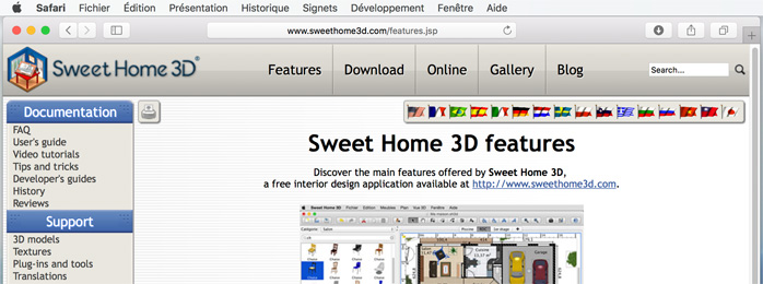
On large screens, nothing changed with the same menu at the top and at the left:
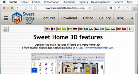
On medium-size screens, the search text field was removed at the top, and a "sandwich" menu icon was added at top left to display the menu that now overlaps the main screen which occupies more space.

On small screens, a less large version of "Sweet Home 3D" logo is displayed:
On smartphone screens, it behaves like on small screen but fonts should be larger:
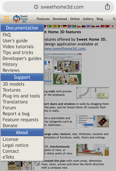
As you can see, no miracle, just moving a few things according to screen size.
Hope you'll like it!