I am so devastated at the moment; my computer crashed on me yesterday without warning, and I lost a good number of the house designs I've been working on (not to mention other things I'd saved on it). The ones that I didn't lose were ones that I downloaded to MediaFire, but some of those aren't quite updated (I posted those there then made modifications, but didn't save the modifications). [:((]
So, it looks like some of them I'm going to have to start from scratch, and some I'll have to update, hopefully with the help of the pictures I've posted here and on Facebook as references. That'll take some time though.
1928 Home Builders Catalog Co. house plans
This topic has been viewed 142354 times and has 49 replies
-
AeowynFraser
- Posts: 557
- Joined: Wed Oct 08, 2014 1:02 am
- Country: Lancaster, CA, USA
-
AeowynFraser
- Posts: 557
- Joined: Wed Oct 08, 2014 1:02 am
- Country: Lancaster, CA, USA
Re: 1928 Home Builders Catalog Co. house plans
It's been a while since the last time I commented on this post. So far, I haven't recreated or downloaded any of these houses, and I probably ought to at some point. The reason why I'm commenting on this post after so long is because I worked on reworking another vintage house plan.
DISCLAIMER: There are a large number of pictures in this post.

The original picture.
http://www.mediafire.com/file/t0cq3d8ap ... .sh3d/file
Now, I'm not sure exactly how old this is, and I don't remember the source (other than that I found it on Pinterest), but I believe that it's either a couple decades older than my previous reworks, possibly from around 1900/1910 or so, or a more recent design with vintage style. As I tried making it close to the original, I found it really quite closed in with way too many walls, and then the roofline I felt cut into rooms. Below are renderings of what I came up with.


The original plan could either be a 2-story 3-bedroom 2 1/2-bathroom home, or a 3-story 5-bedroom 2 1/2-bathroom home. I kept it as a 3-story home, but I converted the storage room on the top floor into a third bathroom. I tried to keep the windows the same, even keeping the ones in the bathrooms as large as the rest of the house, but I was able to add a few additional ones in the top floor bathroom, the front of the house as well as near the top of the stairwell on the top floor, although I'm not sure what the windows look like for the basement so I just added what I thought would work. I also made a small change with the closets in both Bedroom 2 and Bedroom 3.
The wood siding is supposed to be white, but for some reason it kept rendering as pink. The bottom half of the house is covered in stucco.

The Virtual Visitor just standing inside the front door. In the original layout what would have been visible would have been a long hallway with a few doors visible, and that's it. That would boring. I also opened up the stairwell and the passageway.

While still at the front door, the Virtual Visitor is now looking into the dining area. The passageway between the Dining area and the Kitchen is visible; I opened this up as well.

Still at the front door but looking into the living room area. I realize the original design actually was open between the "Parlor" and the back room (which was marked as either Dining Room or Library), and that I closed it off. I made that back room into a Family room instead and felt that would be better closed off. I might change my mind later and open it up again, I might not.


The Family Room with the first picture taken from the corner near the Living Room double doors and the second taken from the opposite corner near the Breakfast room. I kept one of the closets and the door down to the basement from this room, but I did move the TV wall so that there is a bit more room in the Kitchen.

The Breakfast Room. I wanted to have a bench that followed the curve of the window but I couldn't find one, and went with the chairs instead.

The Kitchen. I extended the peninsula into the Breakfast Room for more counter and cabinet space. And the passageway that was visible from the Dining area is visible from here.

The Powder Room. No changes from the original.

The Stairwell. I really worked hard on this, mainly because I had at first made changes to the one closet that's still included in the Family Room (I'd turned it toward the stairwell) as well as the stairs from the basement (I'd had it coming out into the Kitchen) - nightmare. When I put those two things back the way it was in the original design, this staircase worked.
Now onto the First Floor:

The view of the stairwell from just in front of the Master Bedroom. The stairs up to the Second floor, part of the Sitting room and the door to Bedroom 4 on the Second floor, as well as the door to Bedroom 5 on this floor are visible.

The Master Bedroom. I didn't make any changes to this room, and the more I look at it I'm not sure that that was a good plan... not bad, but just something about it might need a change or two...

The Master Bathroom. Sure, it's tiny, but it's the space I had... I switched the shower space with the closet space for Bedroom 3.

The Laundry Room. I did remove the door/door frame as well as half of the wall, mainly so that the door to the linen closet inside this area didn't interfere with it. Before, that wouldn't have been a problem in this space, but it would have been in Bedroom 4, and taking out the door to the bedroom wasn't an option; this was. Also, it seems that there was room for the drawers cabinet.

Bathroom 2. Basic layout is the same.

Bedroom 2. I didn't like how the original had access to the balcony, in either this bedroom or Bedroom 3, so I changed that in both rooms. That, and the closet placement in both bedrooms, are the only changes.

Bedroom 3. The only reason I believe this room is so dark is because of the wallpaper that I used.

On to the Second Floor:

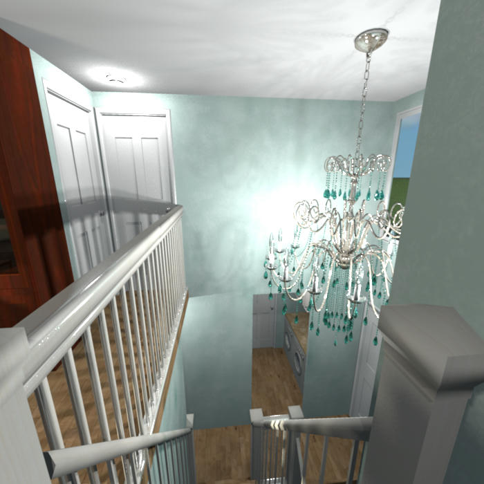
The top of the stairs looking down to the First floor. This would have been closed off, as well as having a wall instead of the banister in the Sitting room. Too closed off for my taste.

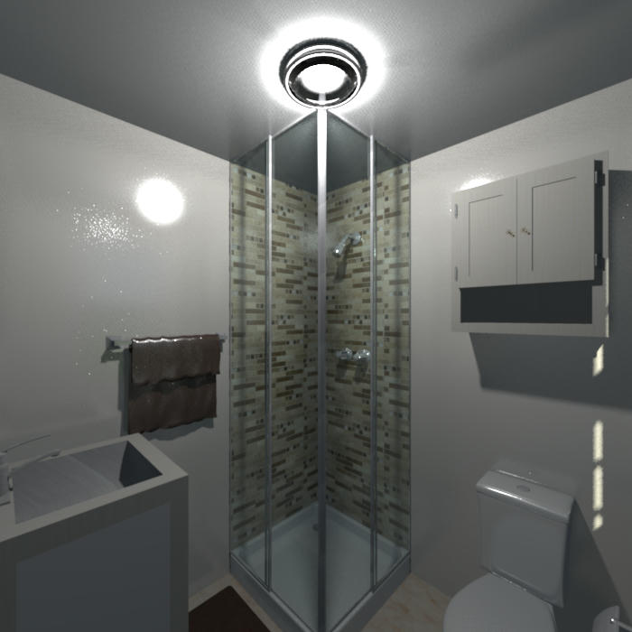
Bathroom 3. This had originally been a storage space with the back wall cut into to accommodate the sloping roof, but with the changes I made outside this room was possible. I kind of felt that it was inconvenient for those in the Second Floor bedrooms to run down the stairs when they have to go or from a shower... I couldn't fit the same vanity sink that I'd had in the other bathrooms, so I found a small one that could.

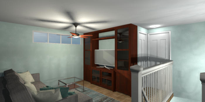
The Sitting Room. I'm not sure what the original designer had in mind with the way the roofing cut into this room, and expecting someone to actually use it... With my change to the roofing, I was able to not only not have the room cut into but add the long window. I realize it seems to be in a weird placement, but that was because of where I was able to place a matching window in Bedroom 4.

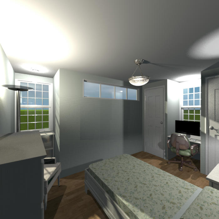
Bedroom 4.

Bedroom 5.
DISCLAIMER: There are a large number of pictures in this post.
The original picture.
http://www.mediafire.com/file/t0cq3d8ap ... .sh3d/file
Now, I'm not sure exactly how old this is, and I don't remember the source (other than that I found it on Pinterest), but I believe that it's either a couple decades older than my previous reworks, possibly from around 1900/1910 or so, or a more recent design with vintage style. As I tried making it close to the original, I found it really quite closed in with way too many walls, and then the roofline I felt cut into rooms. Below are renderings of what I came up with.
The original plan could either be a 2-story 3-bedroom 2 1/2-bathroom home, or a 3-story 5-bedroom 2 1/2-bathroom home. I kept it as a 3-story home, but I converted the storage room on the top floor into a third bathroom. I tried to keep the windows the same, even keeping the ones in the bathrooms as large as the rest of the house, but I was able to add a few additional ones in the top floor bathroom, the front of the house as well as near the top of the stairwell on the top floor, although I'm not sure what the windows look like for the basement so I just added what I thought would work. I also made a small change with the closets in both Bedroom 2 and Bedroom 3.
The wood siding is supposed to be white, but for some reason it kept rendering as pink. The bottom half of the house is covered in stucco.
The Virtual Visitor just standing inside the front door. In the original layout what would have been visible would have been a long hallway with a few doors visible, and that's it. That would boring. I also opened up the stairwell and the passageway.
While still at the front door, the Virtual Visitor is now looking into the dining area. The passageway between the Dining area and the Kitchen is visible; I opened this up as well.
Still at the front door but looking into the living room area. I realize the original design actually was open between the "Parlor" and the back room (which was marked as either Dining Room or Library), and that I closed it off. I made that back room into a Family room instead and felt that would be better closed off. I might change my mind later and open it up again, I might not.
The Family Room with the first picture taken from the corner near the Living Room double doors and the second taken from the opposite corner near the Breakfast room. I kept one of the closets and the door down to the basement from this room, but I did move the TV wall so that there is a bit more room in the Kitchen.
The Breakfast Room. I wanted to have a bench that followed the curve of the window but I couldn't find one, and went with the chairs instead.
The Kitchen. I extended the peninsula into the Breakfast Room for more counter and cabinet space. And the passageway that was visible from the Dining area is visible from here.
The Powder Room. No changes from the original.
The Stairwell. I really worked hard on this, mainly because I had at first made changes to the one closet that's still included in the Family Room (I'd turned it toward the stairwell) as well as the stairs from the basement (I'd had it coming out into the Kitchen) - nightmare. When I put those two things back the way it was in the original design, this staircase worked.
Now onto the First Floor:
The view of the stairwell from just in front of the Master Bedroom. The stairs up to the Second floor, part of the Sitting room and the door to Bedroom 4 on the Second floor, as well as the door to Bedroom 5 on this floor are visible.
The Master Bedroom. I didn't make any changes to this room, and the more I look at it I'm not sure that that was a good plan... not bad, but just something about it might need a change or two...
The Master Bathroom. Sure, it's tiny, but it's the space I had... I switched the shower space with the closet space for Bedroom 3.
The Laundry Room. I did remove the door/door frame as well as half of the wall, mainly so that the door to the linen closet inside this area didn't interfere with it. Before, that wouldn't have been a problem in this space, but it would have been in Bedroom 4, and taking out the door to the bedroom wasn't an option; this was. Also, it seems that there was room for the drawers cabinet.
Bathroom 2. Basic layout is the same.
Bedroom 2. I didn't like how the original had access to the balcony, in either this bedroom or Bedroom 3, so I changed that in both rooms. That, and the closet placement in both bedrooms, are the only changes.
Bedroom 3. The only reason I believe this room is so dark is because of the wallpaper that I used.
On to the Second Floor:
The top of the stairs looking down to the First floor. This would have been closed off, as well as having a wall instead of the banister in the Sitting room. Too closed off for my taste.
Bathroom 3. This had originally been a storage space with the back wall cut into to accommodate the sloping roof, but with the changes I made outside this room was possible. I kind of felt that it was inconvenient for those in the Second Floor bedrooms to run down the stairs when they have to go or from a shower... I couldn't fit the same vanity sink that I'd had in the other bathrooms, so I found a small one that could.
The Sitting Room. I'm not sure what the original designer had in mind with the way the roofing cut into this room, and expecting someone to actually use it... With my change to the roofing, I was able to not only not have the room cut into but add the long window. I realize it seems to be in a weird placement, but that was because of where I was able to place a matching window in Bedroom 4.
Bedroom 4.
Bedroom 5.

-
AeowynFraser
- Posts: 557
- Joined: Wed Oct 08, 2014 1:02 am
- Country: Lancaster, CA, USA
Re: 1928 Home Builders Catalog Co. house plans
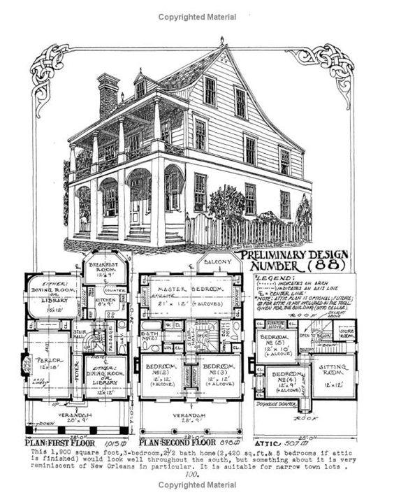
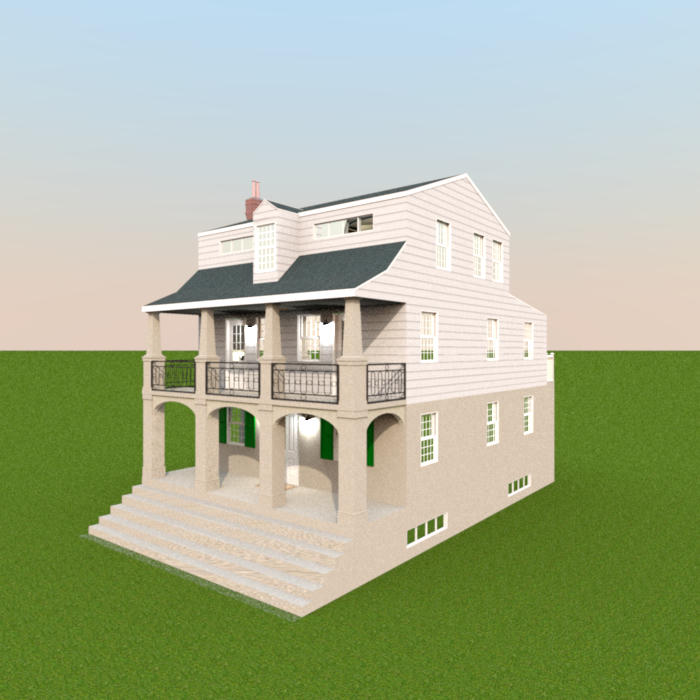
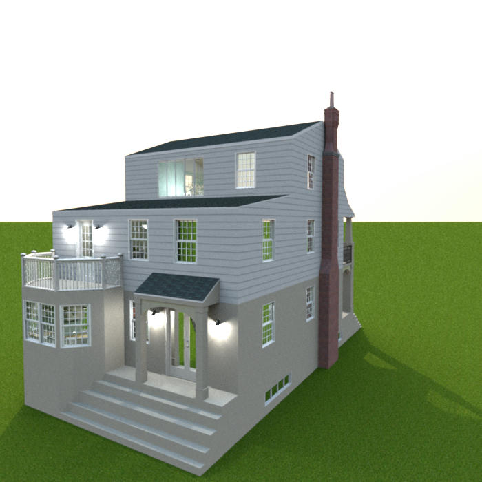
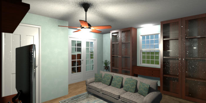
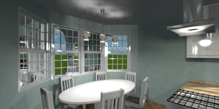
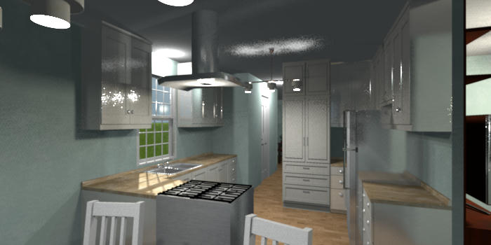
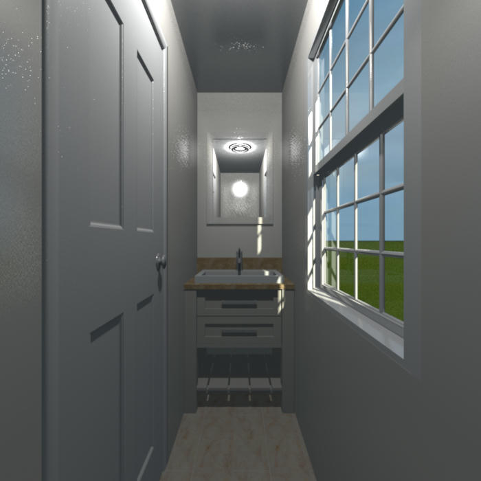
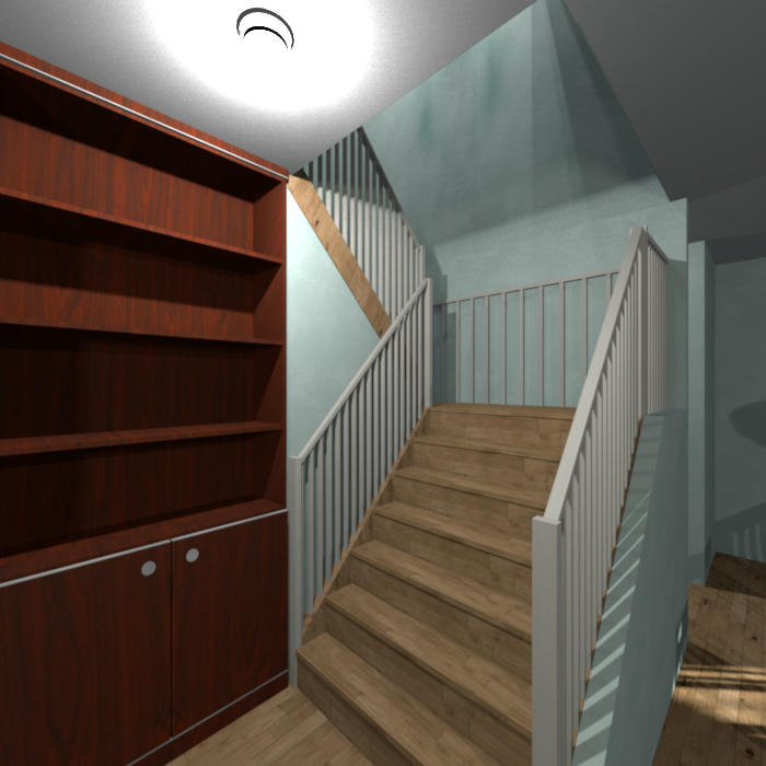
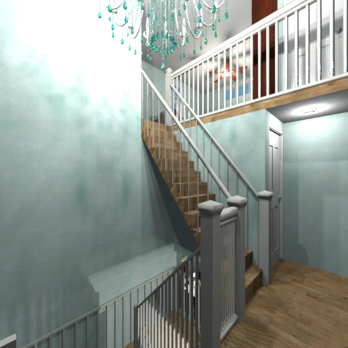
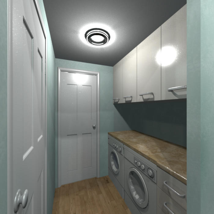
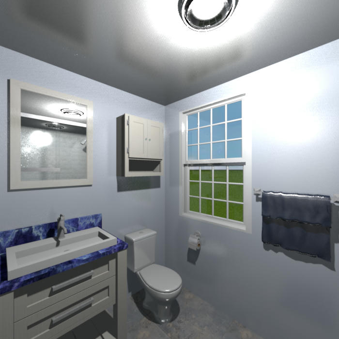
Here's another one where the site I had the pictures stored is no longer available, and I'm re-posting them from MediaFire.
http://www.mediafire.com/file/8ket6rfjb ... .sh3d/file
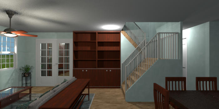
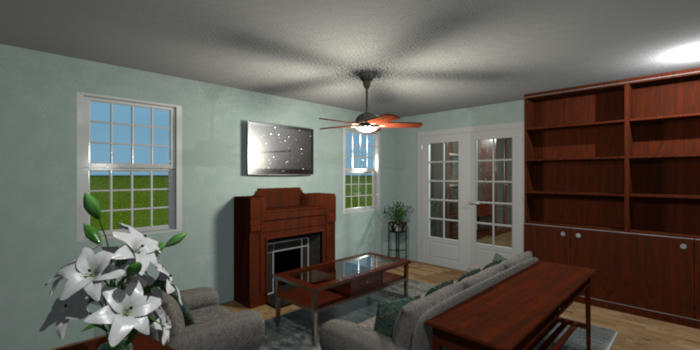
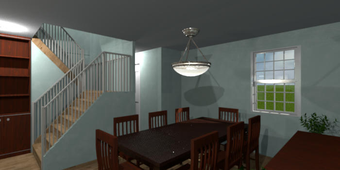
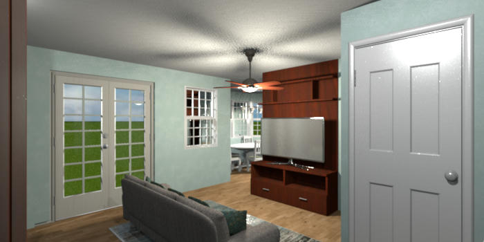
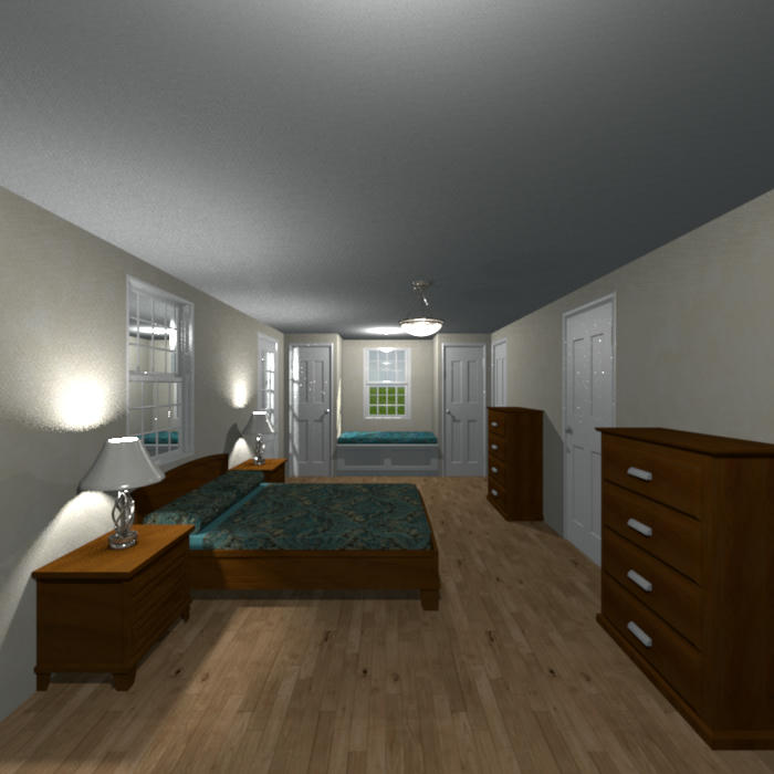
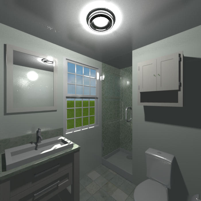
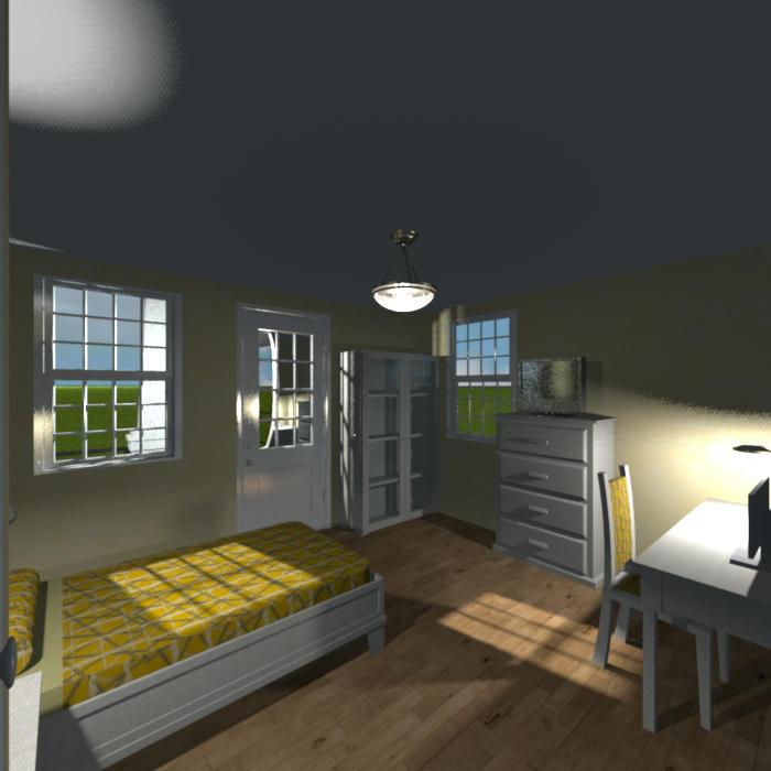
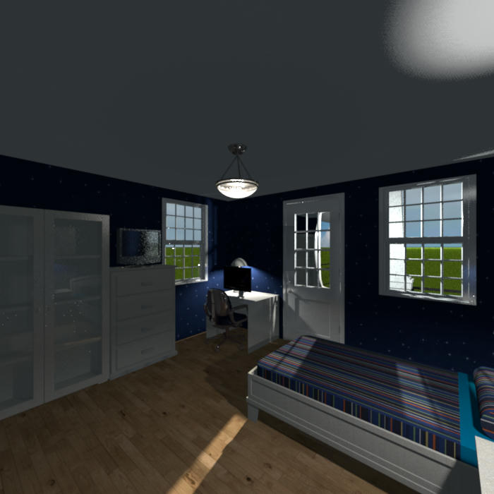
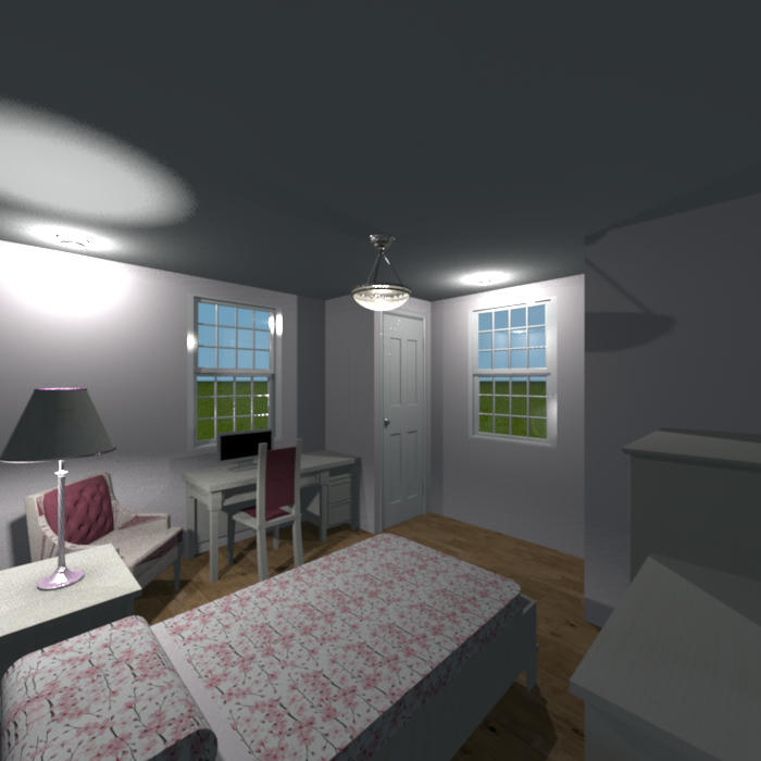
http://www.mediafire.com/file/8ket6rfjb ... .sh3d/file
-
AeowynFraser
- Posts: 557
- Joined: Wed Oct 08, 2014 1:02 am
- Country: Lancaster, CA, USA
Re: 1928 Home Builders Catalog Co. house plans
Also, I'd like to share another vintage house design that I had worked on, also not from the book but still about as old.
1920 Bennett Home - Bison
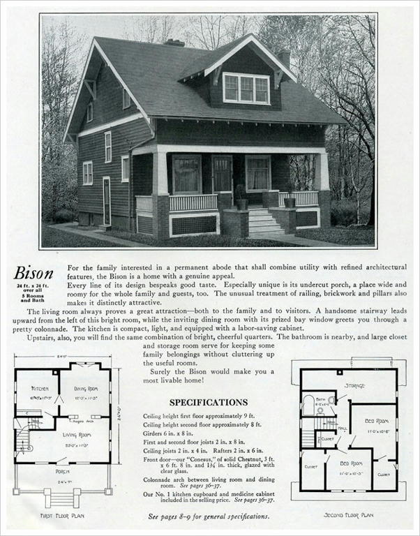
Original ad
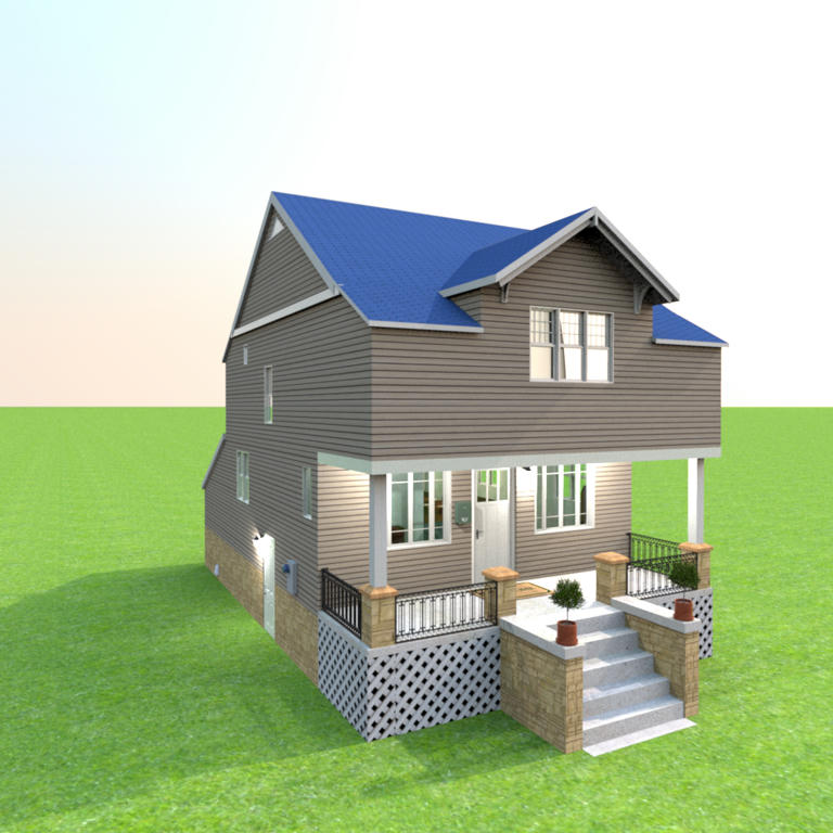
Aerial Front
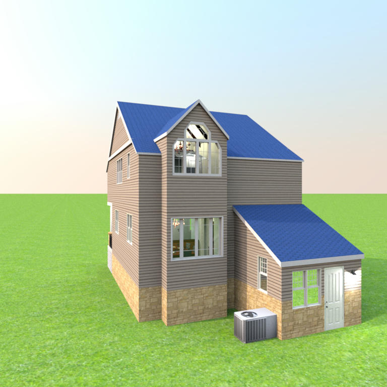
Aerial Back. Here you can see that I added an additional room to the back of the house, as well as removed the chimney from the kitchen.
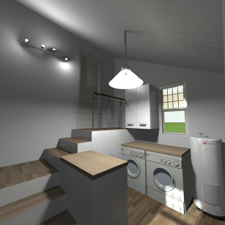
The addition; a Laundry Room, and I have the water heater in here. The door visible at the top of the stairs is into the Kitchen.
Now on to the Main Floor. Disclaimer: I did keep the ceiling height of this level at 9 feet.
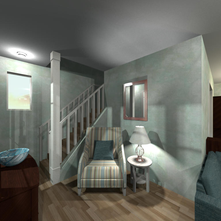
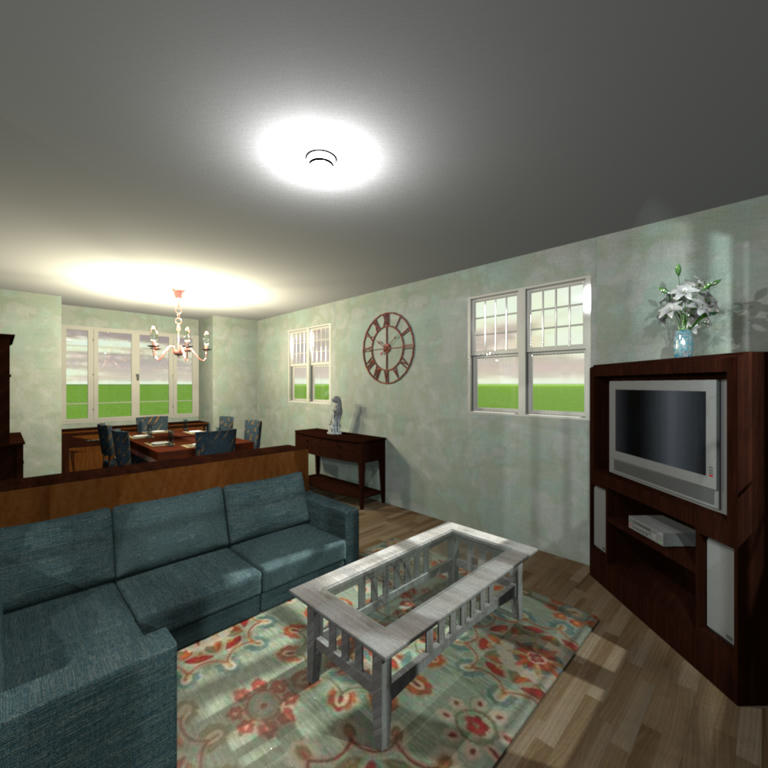
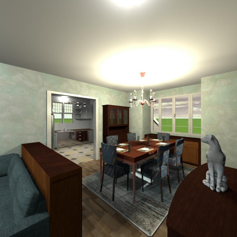
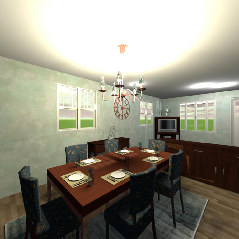
Living Room and Dining Room. I took down the wall between the two, making it into a Great Room. I wasn't sure what to do with that small area near the stairs in the first picture so I used it as a place to add another sitting area. You can also see that I took out the door to the Kitchen and enlarged the door frame.
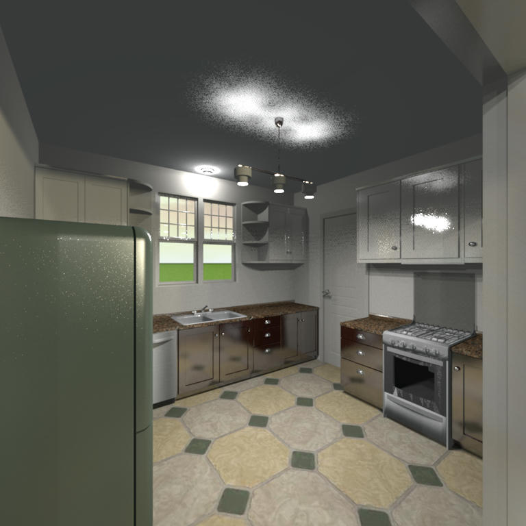
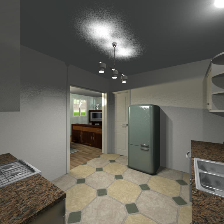
Kitchen, first from near the doorway to the Dining Room, and second from the door to the Laundry Room. I kept the layout pretty basic, almost sparse; I might change that in the future.
Now on to the First Floor. Disclaimer: I did not take any pictures of the Walk-In Closets.
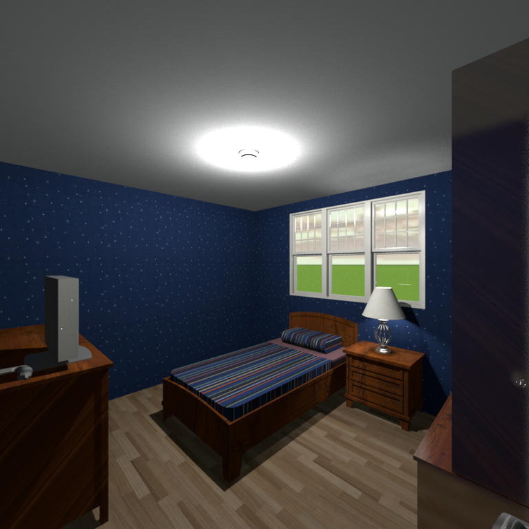
Bedroom 1
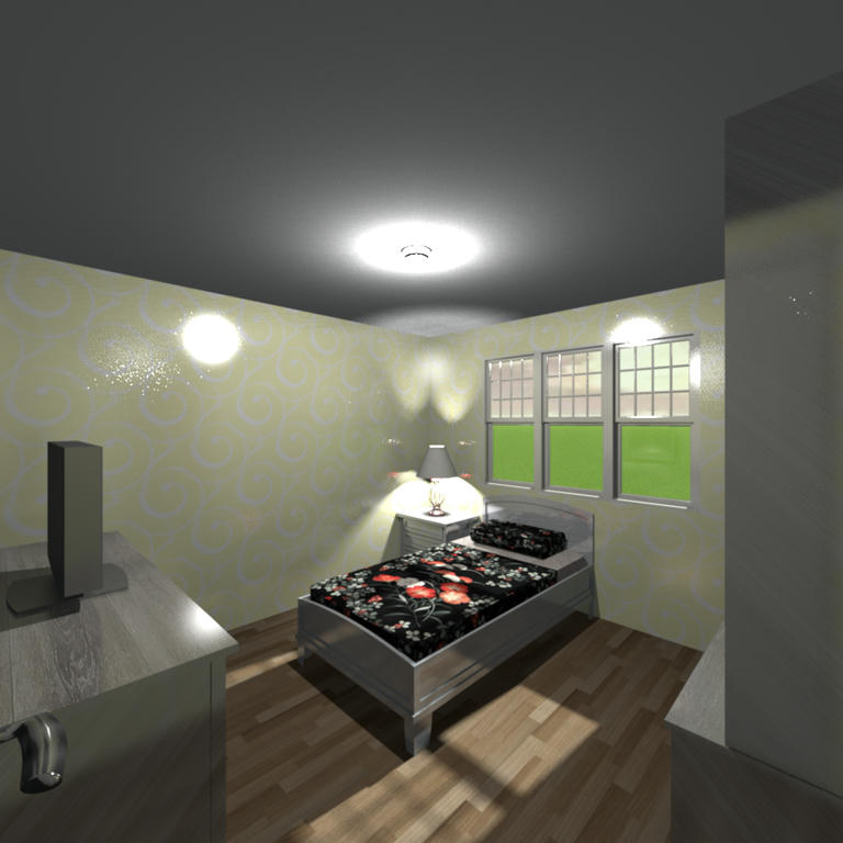
Bedroom 2
The roofing in the original was cutting into the Walk-In Closets to these two bedrooms, I didn't like that, so I shortened them.
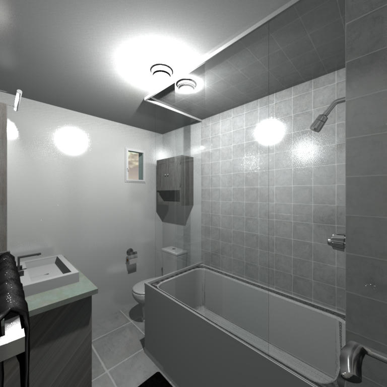
Bathroom. I didn't like the layout in the original, so I switched things around.
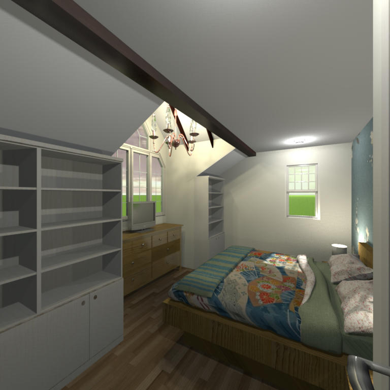
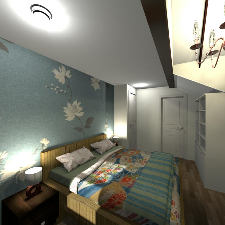
Master Bedroom, two different angles. This room, along with the Walk-In Closet, had been marked as storage in the original, which I felt was a bit of a waste of space, so I bumped out the wall so that it matched with the Dining Room below and created the little nook with the vaulted ceiling. And, as I look at the layout of this room, another way to decorate it might be to have the bed in the nook under the window, but I don't know where the nightstands would go... maybe not... (I know that the beam on the ceiling looks a bit out of place, but it's there to cover the mess where all those walls and roof pieces join.)
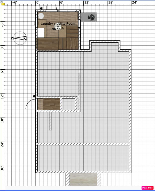
I'm not sure what I'd call this level... anyway, this is the floor plan screenshot of the level of the front stairs and the Laundry Room in back.
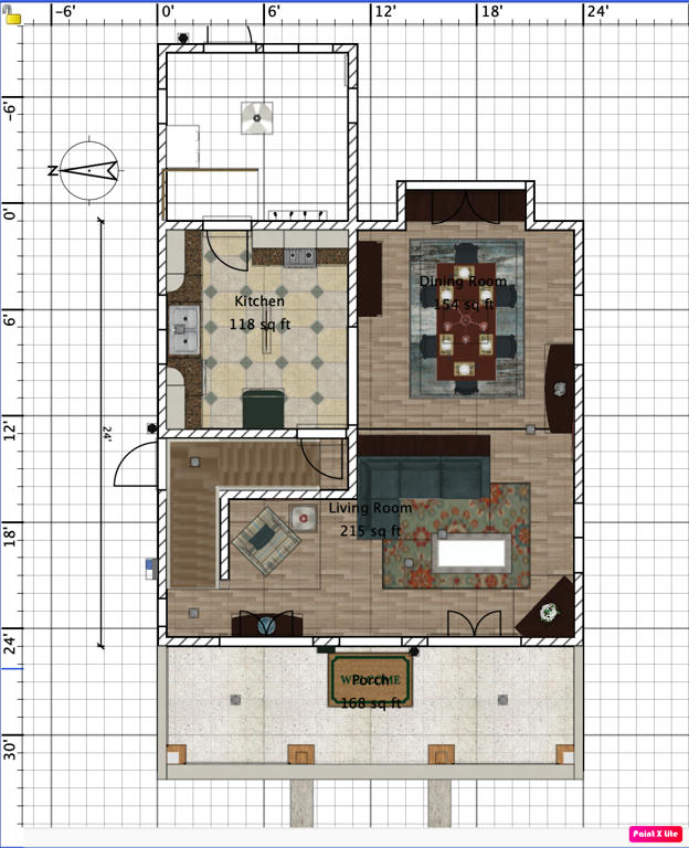
Screenshot of the Main Floor floor plan.
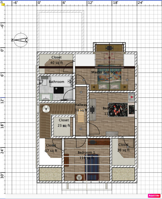
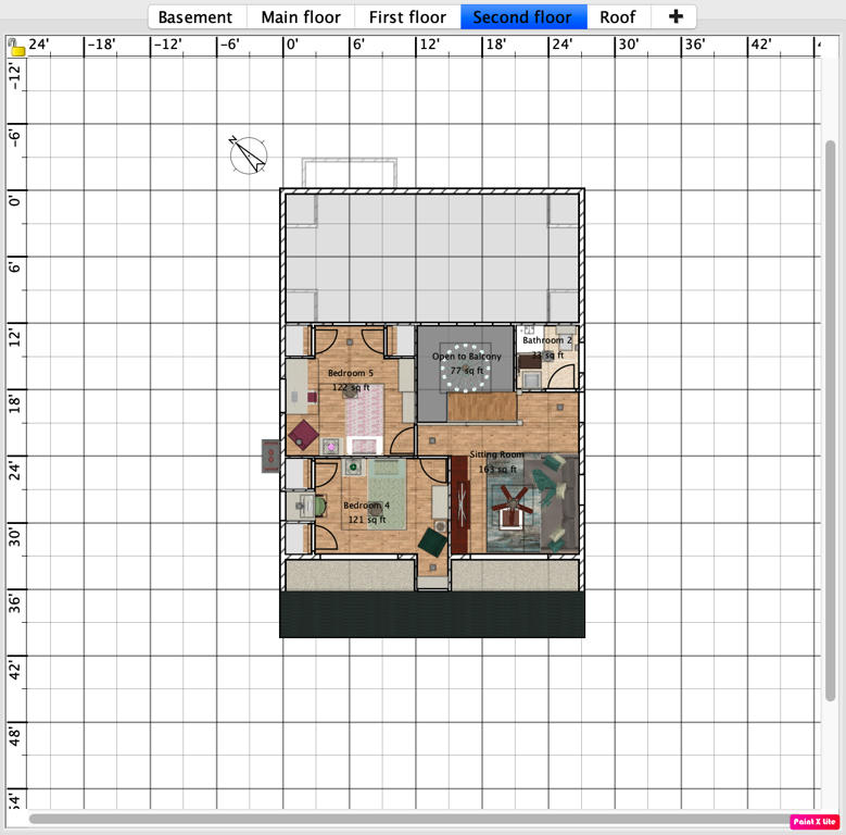
Screenshot of the Top Floor floor plan.
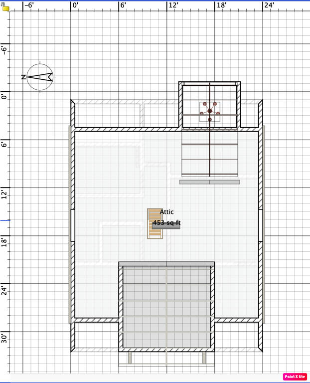
Screenshot of the Attic level floor plan.
1920 Bennett Home - Bison
Original ad
Aerial Front
Aerial Back. Here you can see that I added an additional room to the back of the house, as well as removed the chimney from the kitchen.
The addition; a Laundry Room, and I have the water heater in here. The door visible at the top of the stairs is into the Kitchen.
Now on to the Main Floor. Disclaimer: I did keep the ceiling height of this level at 9 feet.
Living Room and Dining Room. I took down the wall between the two, making it into a Great Room. I wasn't sure what to do with that small area near the stairs in the first picture so I used it as a place to add another sitting area. You can also see that I took out the door to the Kitchen and enlarged the door frame.
Kitchen, first from near the doorway to the Dining Room, and second from the door to the Laundry Room. I kept the layout pretty basic, almost sparse; I might change that in the future.
Now on to the First Floor. Disclaimer: I did not take any pictures of the Walk-In Closets.
Bedroom 1
Bedroom 2
The roofing in the original was cutting into the Walk-In Closets to these two bedrooms, I didn't like that, so I shortened them.
Bathroom. I didn't like the layout in the original, so I switched things around.
Master Bedroom, two different angles. This room, along with the Walk-In Closet, had been marked as storage in the original, which I felt was a bit of a waste of space, so I bumped out the wall so that it matched with the Dining Room below and created the little nook with the vaulted ceiling. And, as I look at the layout of this room, another way to decorate it might be to have the bed in the nook under the window, but I don't know where the nightstands would go... maybe not... (I know that the beam on the ceiling looks a bit out of place, but it's there to cover the mess where all those walls and roof pieces join.)
I'm not sure what I'd call this level... anyway, this is the floor plan screenshot of the level of the front stairs and the Laundry Room in back.
Screenshot of the Main Floor floor plan.
Screenshot of the Top Floor floor plan.
Screenshot of the Attic level floor plan.
-
AeowynFraser
- Posts: 557
- Joined: Wed Oct 08, 2014 1:02 am
- Country: Lancaster, CA, USA
Re: 1928 Home Builders Catalog Co. house plans
Once again, I'm revisiting an older work.
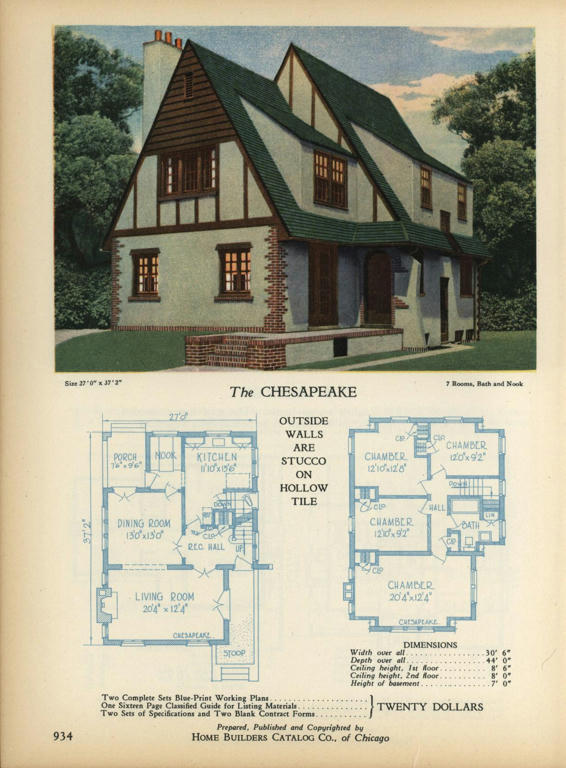
I found that I had 'The Chesapeake' saved onto this computer, and saw that the pictures that I'd previously posted on it were no longer available because of that one website. So, I went to take new pictures of it, but I decided to make a few changes to it; I couldn't help myself. I started updating this just after posting about that 'new' house that I'd found that I'd created 10 months ago ; I've been working on these changes and picture renderings on and off for the past 2 weeks so some of the changes I don't remember clearly, as I will mention below.
Here's the updated file.
The Chesapeake
And here's a reminder of the original advertisement from inside the Catalog.
And here are the updated pictures.
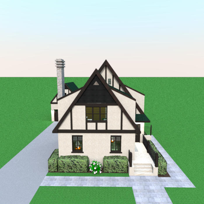
Front aerial. As you can see I've added some railing near the front porch, as well as a detached garage (it looks like in the original advertisement that there was a driveway to one, but of course that would've been something sold separately). I've taken out that front window near the peak of the roof, mainly because I didn't include access to that small space and figured that it looked odd there, and replaced it with a gable vent. I did however put the window to the next front peak because I was able to put an attic space there with access from the top floor hallway. I'm sure that there should be a border wall and a decorated backyard space, but I didn't do either of those... yet anyway... [;)]
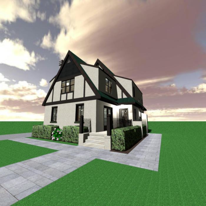
Front, Virtual Visitor view, taken from the sidewalk looking toward the front entrance. Now that I look at this picture, it looks like I have some odd issues with those front steps... maybe I'll get to those later too...
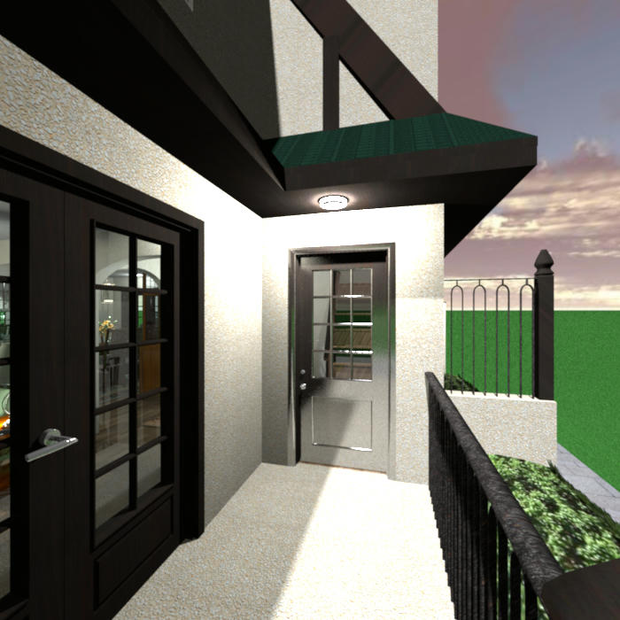
Front Entrance, taken from on the front porch. You can see that I modified that little privacy wall on the side there; shortened it and added some of that railing... and maybe I should add one of those lights over the French doors into the Living Room... and I think that I'd forgotten to add a mailbox as well...
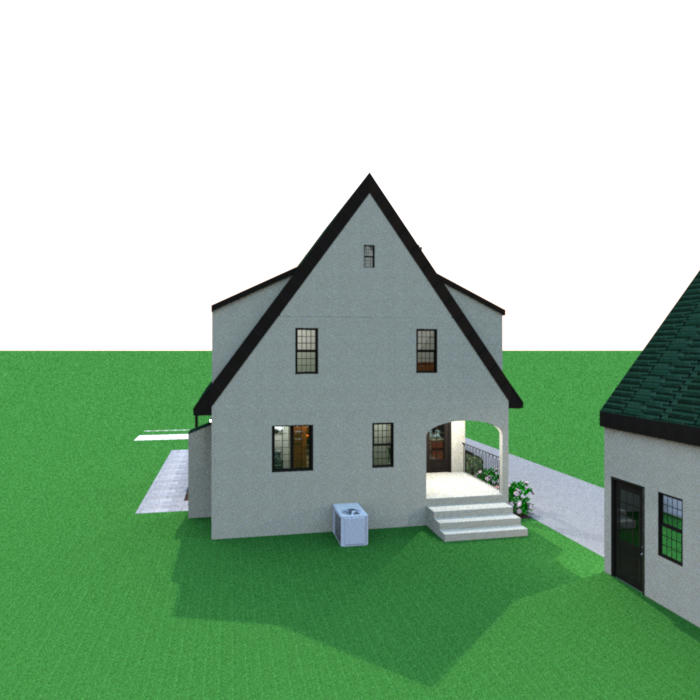
Back Aerial. Here's a bit of a closer view of the detached garage. Also I'd added some more of that railing here on the back porch; if I'd been able to find a similar railing to put on the steps I would have I think... and I see that I have a bit of an issue with the alignment on the Attic wall... yikes! I'm finding quite a few issues...
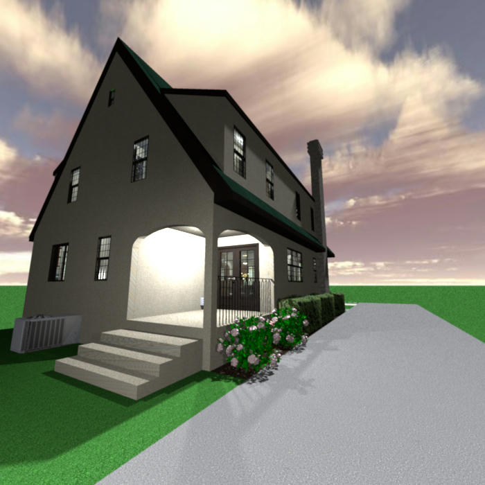
Back, Virtual Visitor view, taken from in front of the garage.
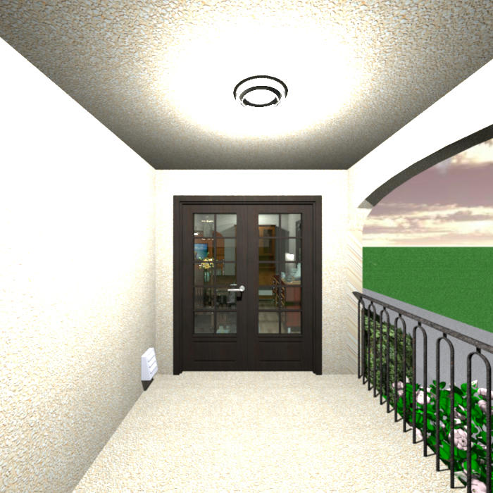
Back Entrance, taken from on the back porch. A pretty good view of the railing.
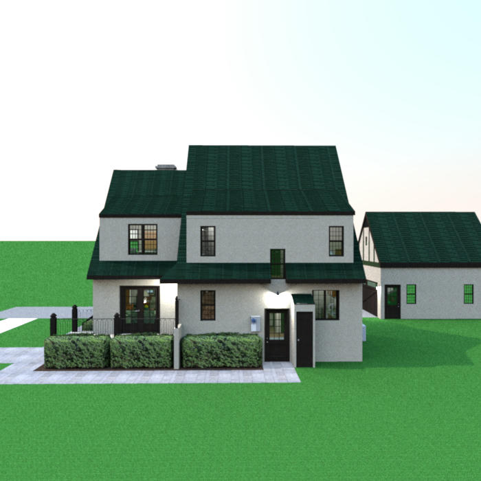
Side Aerial. More of the detached garage is visible... and it looks like I have a bit of an issue with the little roof over the water heater... and I just realized that I'd forgotten the water heater was there and put one in the laundry room... oh, good grief!... I guess that's another thing to fix...
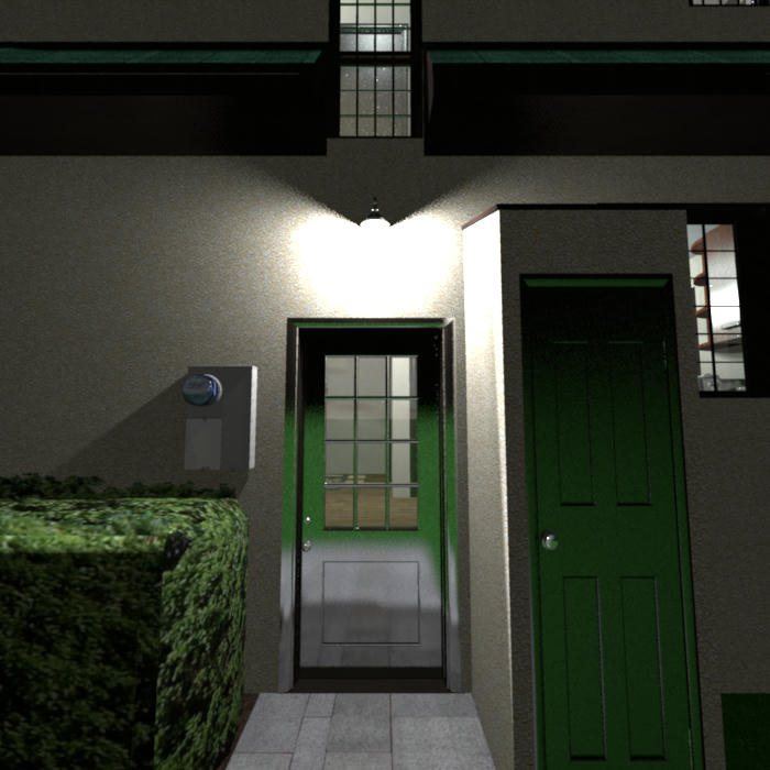
Side Entrance. Yeah, my adding that little bump-out here was silly in the first place; it's going the first chance I get...
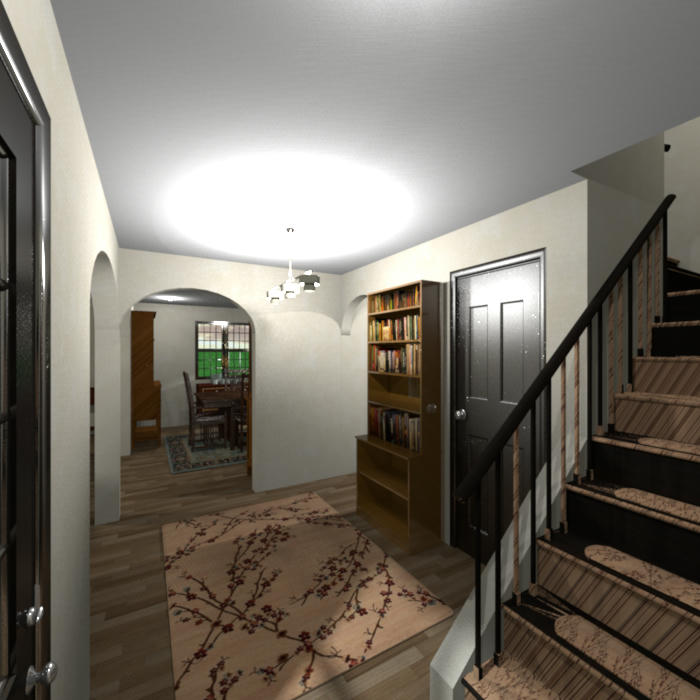
Reception hall, taken from the front door. As usual the staircase didn't render properly; it's supposed to be dark wood with those rounded sections of rug... maybe I'll just switch out that for the dark wood... boring but then I probably wouldn't have that rendering problem. I think that I'd made the light a bit brighter.
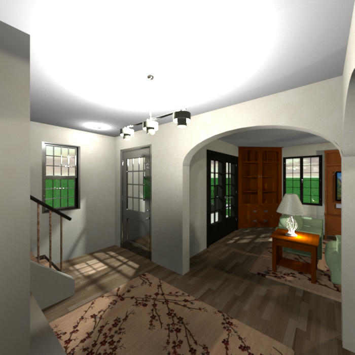
Reception hall, taken from the doorway to the kitchen.
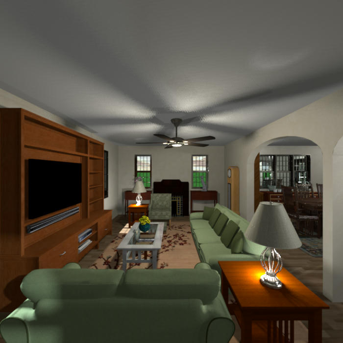
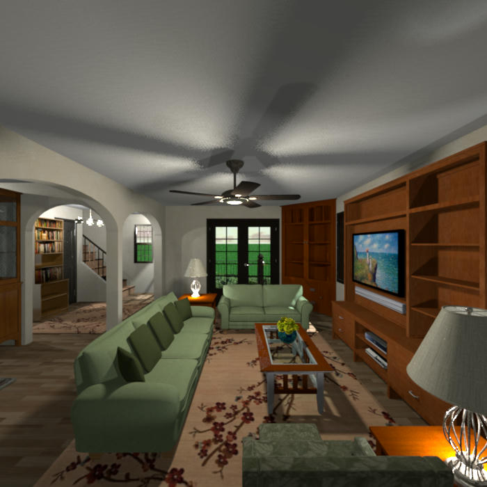
Living Room, two different angles. I'd changed out the 2-seat sofa for a smaller byte-sized one (I think that I did that for the 3-seat sofa as well but I don't remember), and the fireplace for an Art Deco style one. Oh, and I decorated those two matching tables surrounding the fireplace with the White Lilies and a cat figurine... and I'm not happy with the way the coffee table rendered either...
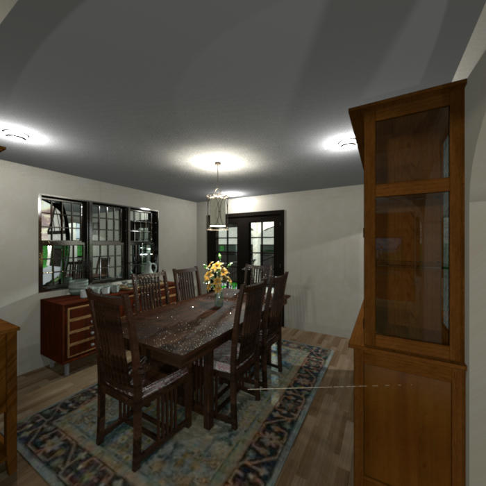
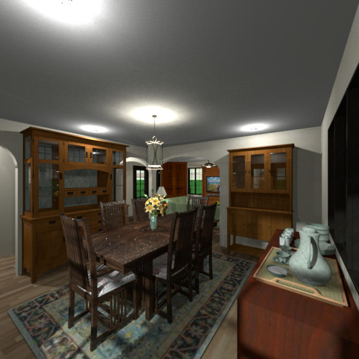
Dining Room, two different angles. If I remember correctly there'd been a door to the kitchen. I changed that so that there was an arched doorway instead, hopefully to bring in more light. I'd also added more lighting, changed the sideboard, and added the tea set. Oh, and I changed the pattern on the rug, as well as the back of the big china cabinet.
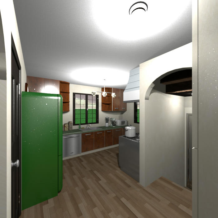
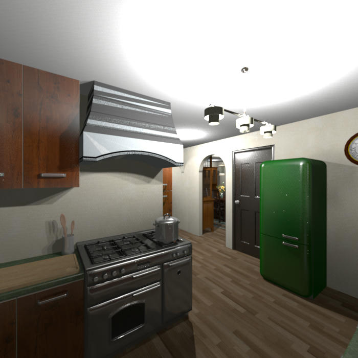
Kitchen, two different angles. I regretfully took out the antique style stove/oven for a more modern but not tiny one, mainly so that I'd have some more storage space next to it as well as a prep counter. I also moved some of the accessories around on the counters... I don't remember what other changes that I did here...
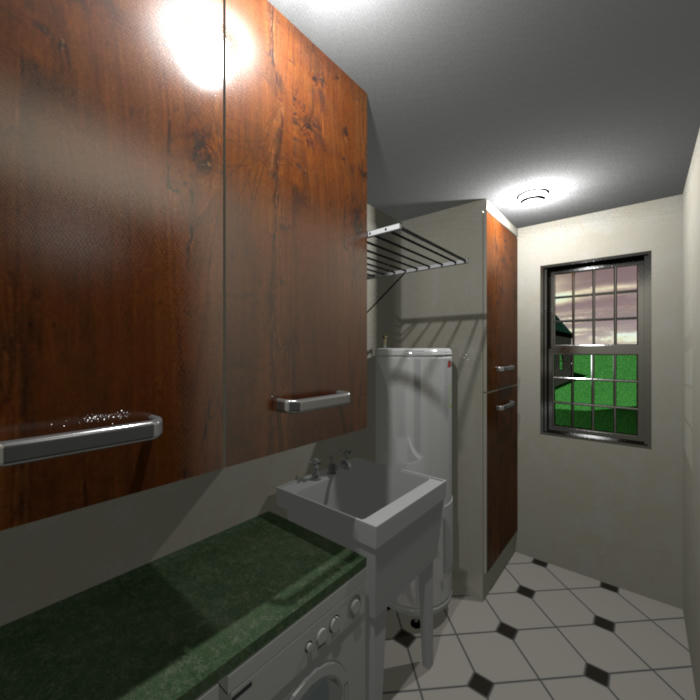
Laundry/Utility Room. As you can see I took out that outside door that had let out onto the back porch, just so that I'd have some more room. I rearranged what I had in there, added the laundry sink, a drying rack above said laundry sink, and the aforementioned second water heater... and moved the window.
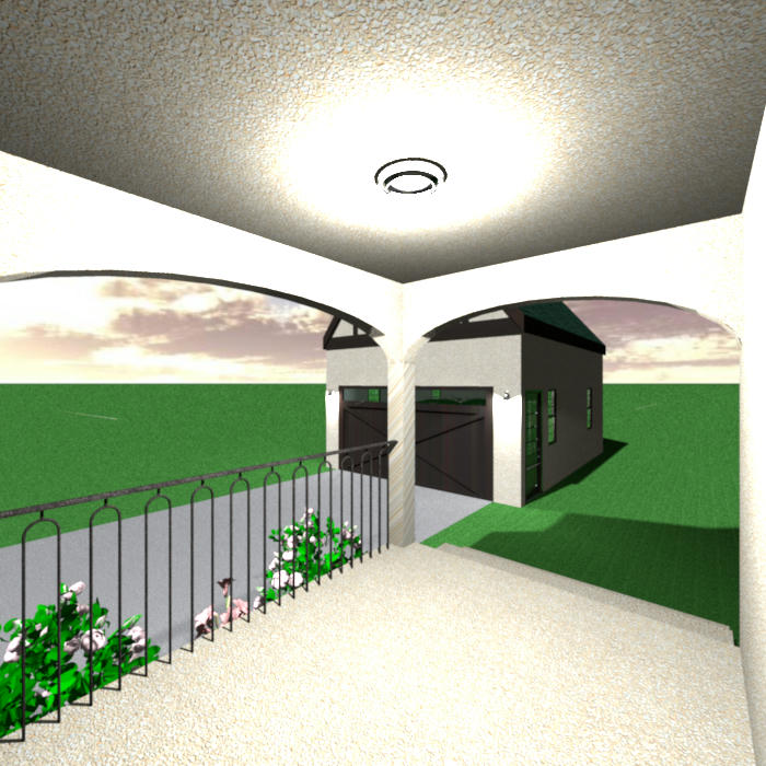
Back Porch, taken from the back door, looking toward the new garage. It's a 1-car garage...
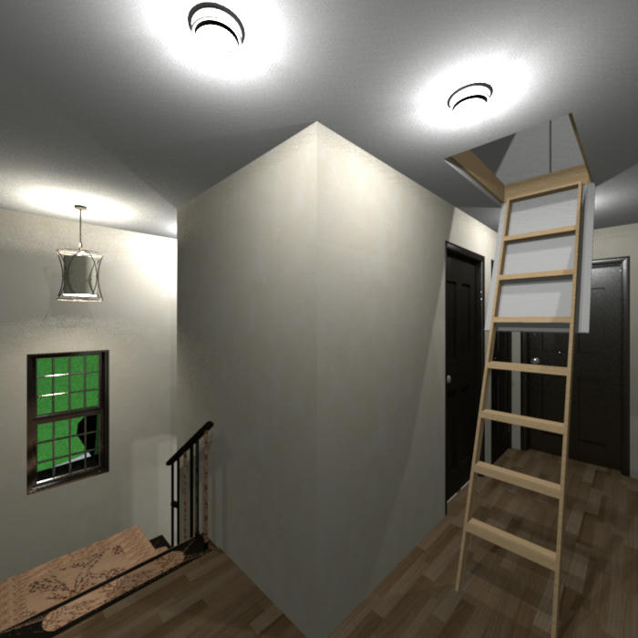
Top floor Hallway. Once again the stairway rendered badly... and I think that I might lengthen that hanging lamp in there... You can see the Attic stairs (they're retractable of course).
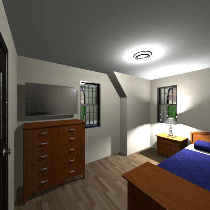
Bedroom 1, taken from the door. This is the smaller of the back bedrooms. I'd found a triangle that I could use to cover that one corner where the roof pitch is visible. I don't think that I made any other changes here...
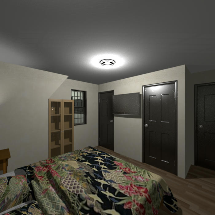
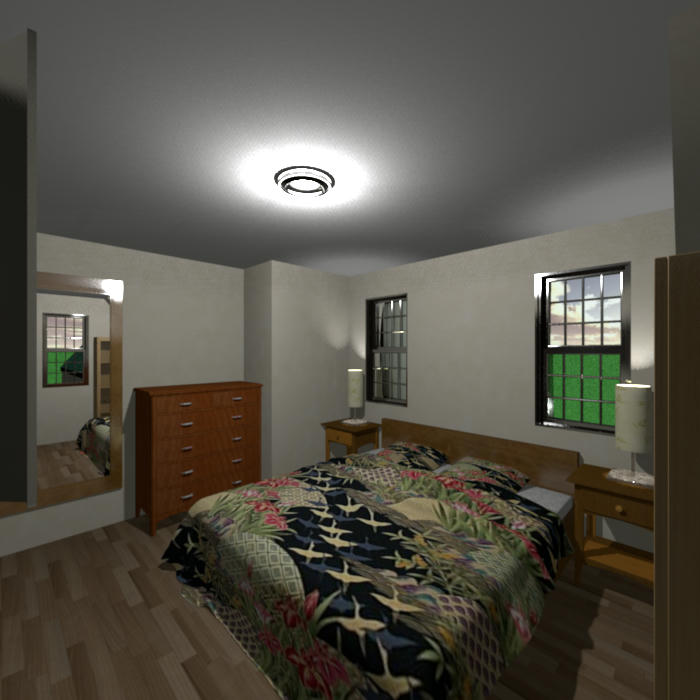
Bedroom 2, two different angles. This is the larger of the back bedrooms. It's still decorated as the Master Bedroom. I've added that triangle to that weird roof angle area here too. I also took out the wardrobe and put in a second matching closet, and added that closed bookcase. Oh, and I changed out the nightstands... I think those are all the changes I made here...
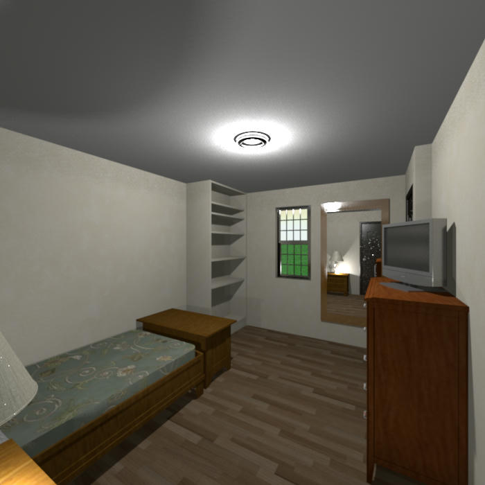
Bedroom 3, taken from near the door. I added the bookcase to that one bumped out wall, and I think that I changed the TV... and I think that's all that I did in this room...
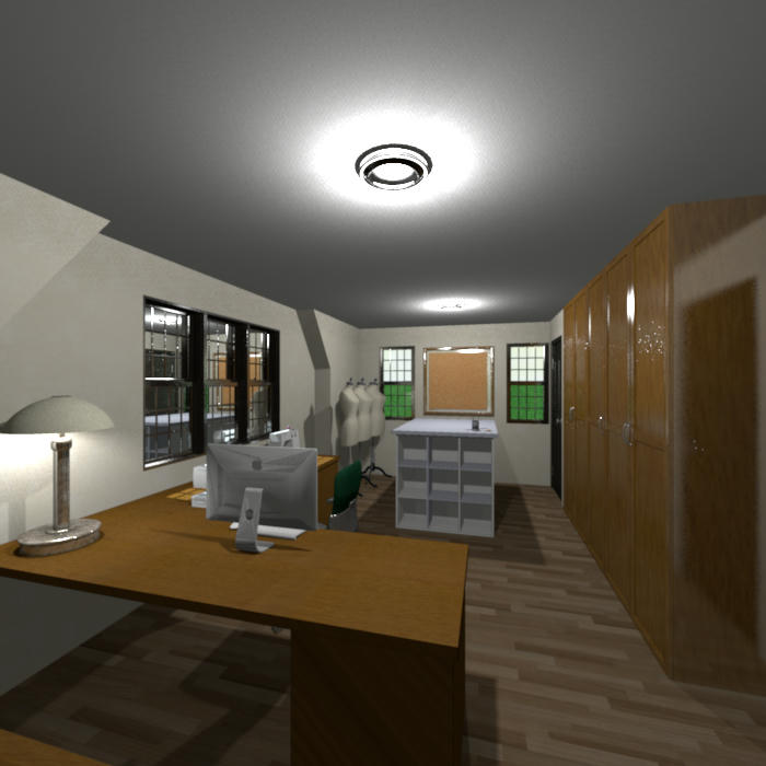
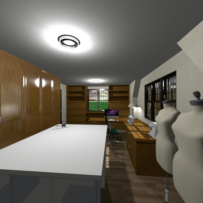
The front 'chamber' that I have decorated as my Sewing Room but could be the Master Bedroom or a Family Room in the house for those who don't sew, taken from two different angles. I've added the computer and changed the sizes of the two sewing machines, oh and that triangle to those two weird roof angle areas too... I think that's all that I changed here...
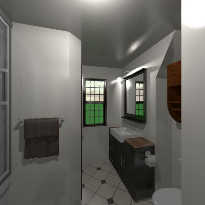
The one and only Bathroom, taken from near the door. I changed out the bath for a glass enclosed one, added the towel rack, a bathmat, the light above the vanity, and the triangle wall piece to cover the roof angle... I think that's all the changes that I made here...
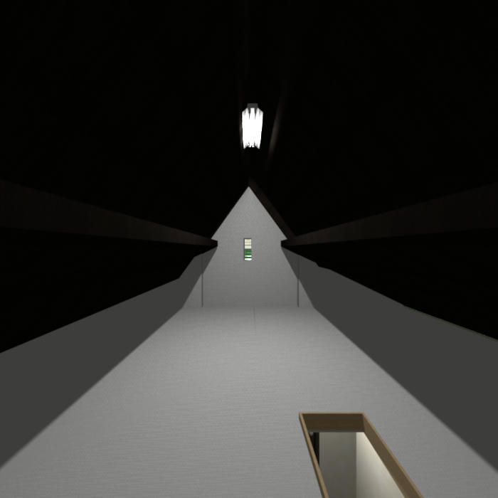
Attic space. I realize that the space looks a little strange; that's because of my placement of the roofing originally.
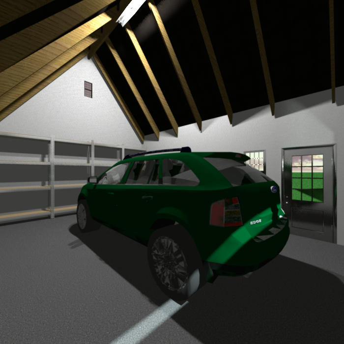
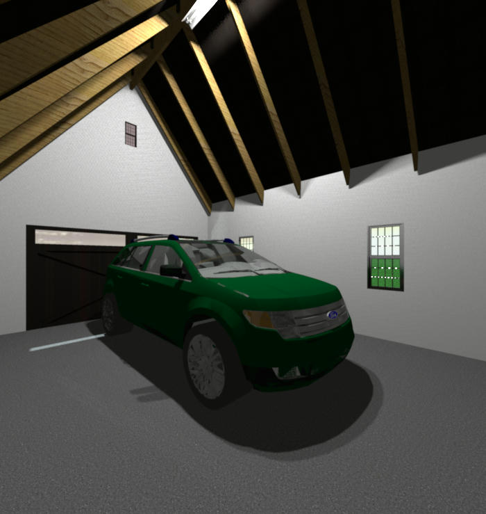
The detached 1-Car Garage, two different angles. I'm not sure I have enough lighting in here... but then again it's a garage, it doesn't really need much lighting...
And I believe that's it for this house, for now anyway. Maybe in another year or so I'll revisit it again... [:D]
I found that I had 'The Chesapeake' saved onto this computer, and saw that the pictures that I'd previously posted on it were no longer available because of that one website. So, I went to take new pictures of it, but I decided to make a few changes to it; I couldn't help myself. I started updating this just after posting about that 'new' house that I'd found that I'd created 10 months ago ; I've been working on these changes and picture renderings on and off for the past 2 weeks so some of the changes I don't remember clearly, as I will mention below.
Here's the updated file.
The Chesapeake
And here's a reminder of the original advertisement from inside the Catalog.
And here are the updated pictures.
Front aerial. As you can see I've added some railing near the front porch, as well as a detached garage (it looks like in the original advertisement that there was a driveway to one, but of course that would've been something sold separately). I've taken out that front window near the peak of the roof, mainly because I didn't include access to that small space and figured that it looked odd there, and replaced it with a gable vent. I did however put the window to the next front peak because I was able to put an attic space there with access from the top floor hallway. I'm sure that there should be a border wall and a decorated backyard space, but I didn't do either of those... yet anyway... [;)]
Front, Virtual Visitor view, taken from the sidewalk looking toward the front entrance. Now that I look at this picture, it looks like I have some odd issues with those front steps... maybe I'll get to those later too...
Front Entrance, taken from on the front porch. You can see that I modified that little privacy wall on the side there; shortened it and added some of that railing... and maybe I should add one of those lights over the French doors into the Living Room... and I think that I'd forgotten to add a mailbox as well...
Back Aerial. Here's a bit of a closer view of the detached garage. Also I'd added some more of that railing here on the back porch; if I'd been able to find a similar railing to put on the steps I would have I think... and I see that I have a bit of an issue with the alignment on the Attic wall... yikes! I'm finding quite a few issues...
Back, Virtual Visitor view, taken from in front of the garage.
Back Entrance, taken from on the back porch. A pretty good view of the railing.
Side Aerial. More of the detached garage is visible... and it looks like I have a bit of an issue with the little roof over the water heater... and I just realized that I'd forgotten the water heater was there and put one in the laundry room... oh, good grief!... I guess that's another thing to fix...
Side Entrance. Yeah, my adding that little bump-out here was silly in the first place; it's going the first chance I get...
Reception hall, taken from the front door. As usual the staircase didn't render properly; it's supposed to be dark wood with those rounded sections of rug... maybe I'll just switch out that for the dark wood... boring but then I probably wouldn't have that rendering problem. I think that I'd made the light a bit brighter.
Reception hall, taken from the doorway to the kitchen.
Living Room, two different angles. I'd changed out the 2-seat sofa for a smaller byte-sized one (I think that I did that for the 3-seat sofa as well but I don't remember), and the fireplace for an Art Deco style one. Oh, and I decorated those two matching tables surrounding the fireplace with the White Lilies and a cat figurine... and I'm not happy with the way the coffee table rendered either...
Dining Room, two different angles. If I remember correctly there'd been a door to the kitchen. I changed that so that there was an arched doorway instead, hopefully to bring in more light. I'd also added more lighting, changed the sideboard, and added the tea set. Oh, and I changed the pattern on the rug, as well as the back of the big china cabinet.
Kitchen, two different angles. I regretfully took out the antique style stove/oven for a more modern but not tiny one, mainly so that I'd have some more storage space next to it as well as a prep counter. I also moved some of the accessories around on the counters... I don't remember what other changes that I did here...
Laundry/Utility Room. As you can see I took out that outside door that had let out onto the back porch, just so that I'd have some more room. I rearranged what I had in there, added the laundry sink, a drying rack above said laundry sink, and the aforementioned second water heater... and moved the window.
Back Porch, taken from the back door, looking toward the new garage. It's a 1-car garage...
Top floor Hallway. Once again the stairway rendered badly... and I think that I might lengthen that hanging lamp in there... You can see the Attic stairs (they're retractable of course).
Bedroom 1, taken from the door. This is the smaller of the back bedrooms. I'd found a triangle that I could use to cover that one corner where the roof pitch is visible. I don't think that I made any other changes here...
Bedroom 2, two different angles. This is the larger of the back bedrooms. It's still decorated as the Master Bedroom. I've added that triangle to that weird roof angle area here too. I also took out the wardrobe and put in a second matching closet, and added that closed bookcase. Oh, and I changed out the nightstands... I think those are all the changes I made here...
Bedroom 3, taken from near the door. I added the bookcase to that one bumped out wall, and I think that I changed the TV... and I think that's all that I did in this room...
The front 'chamber' that I have decorated as my Sewing Room but could be the Master Bedroom or a Family Room in the house for those who don't sew, taken from two different angles. I've added the computer and changed the sizes of the two sewing machines, oh and that triangle to those two weird roof angle areas too... I think that's all that I changed here...
The one and only Bathroom, taken from near the door. I changed out the bath for a glass enclosed one, added the towel rack, a bathmat, the light above the vanity, and the triangle wall piece to cover the roof angle... I think that's all the changes that I made here...
Attic space. I realize that the space looks a little strange; that's because of my placement of the roofing originally.
The detached 1-Car Garage, two different angles. I'm not sure I have enough lighting in here... but then again it's a garage, it doesn't really need much lighting...
And I believe that's it for this house, for now anyway. Maybe in another year or so I'll revisit it again... [:D]
-
bdfd

- Posts: 2614
- Joined: Sat Mar 29, 2014 7:17 am
- Country: LILLE, Les Hauts de France, Western Europa
Re: 1928 Home Builders Catalog Co. house plans
Great work Aeowyn ! [=D>]
.
.
Evil progresses when good people do nothing!
---
SH3D 7.1 and nothing else - W11 64b in 4K
---
SH3D 7.1 and nothing else - W11 64b in 4K
-
AeowynFraser
- Posts: 557
- Joined: Wed Oct 08, 2014 1:02 am
- Country: Lancaster, CA, USA
Re: 1928 Home Builders Catalog Co. house plans
So, I've made the adjustments (and a few additional yet minor changes).
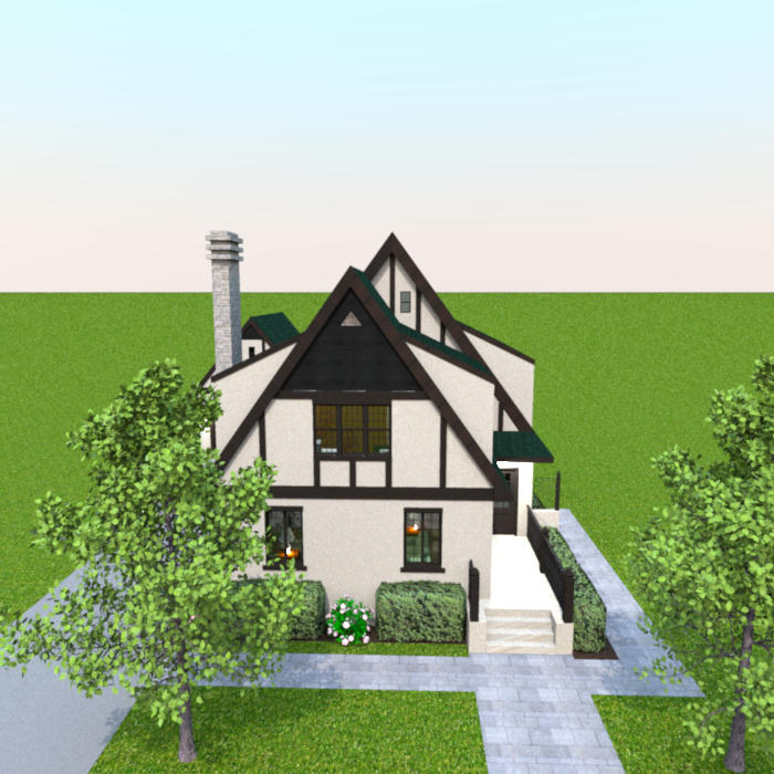
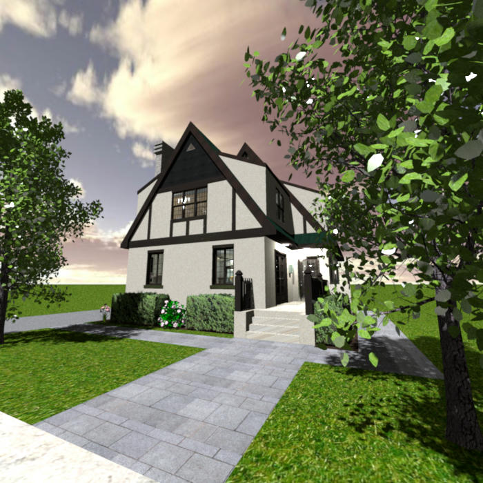
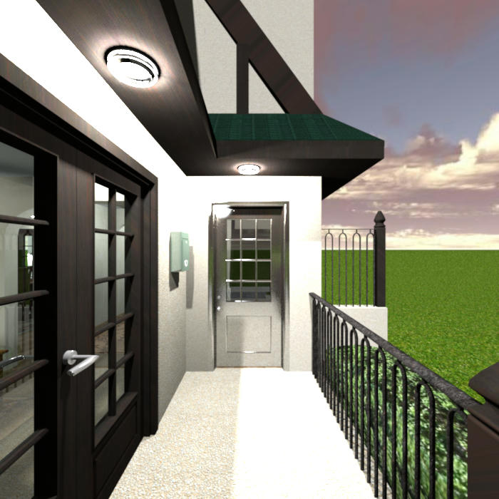
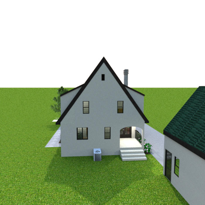
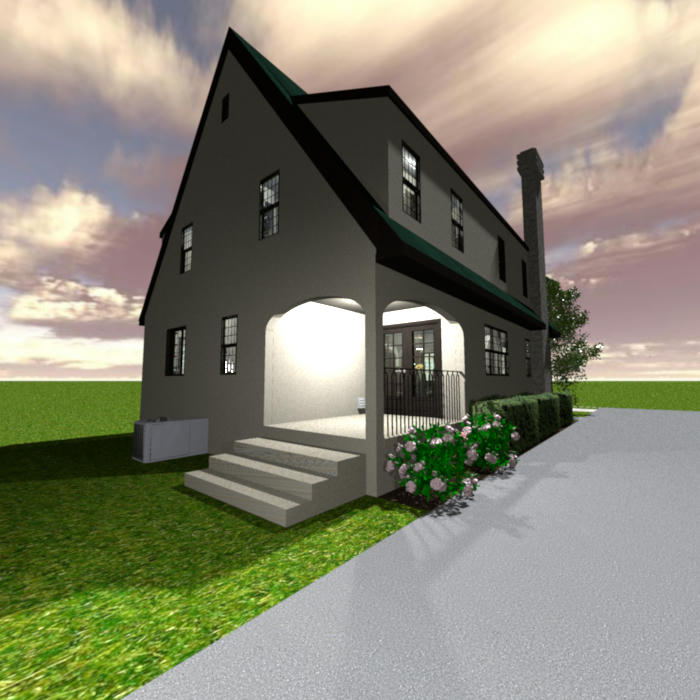
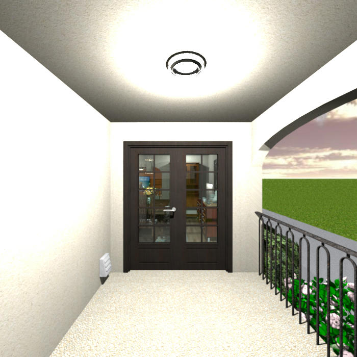
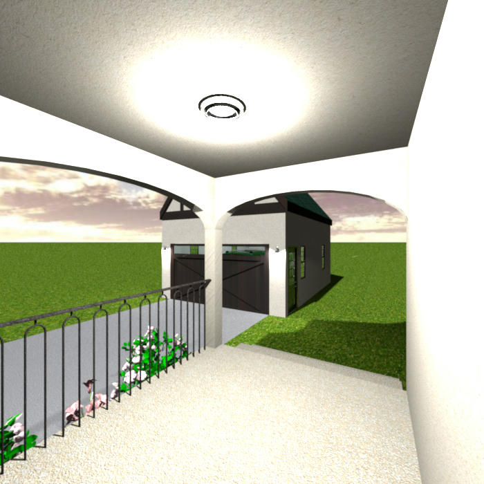
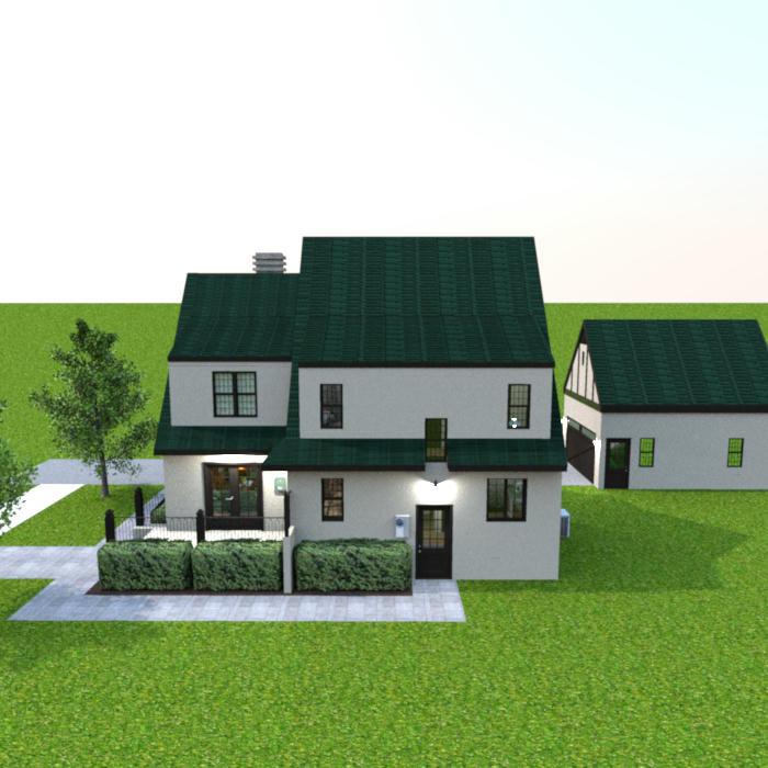
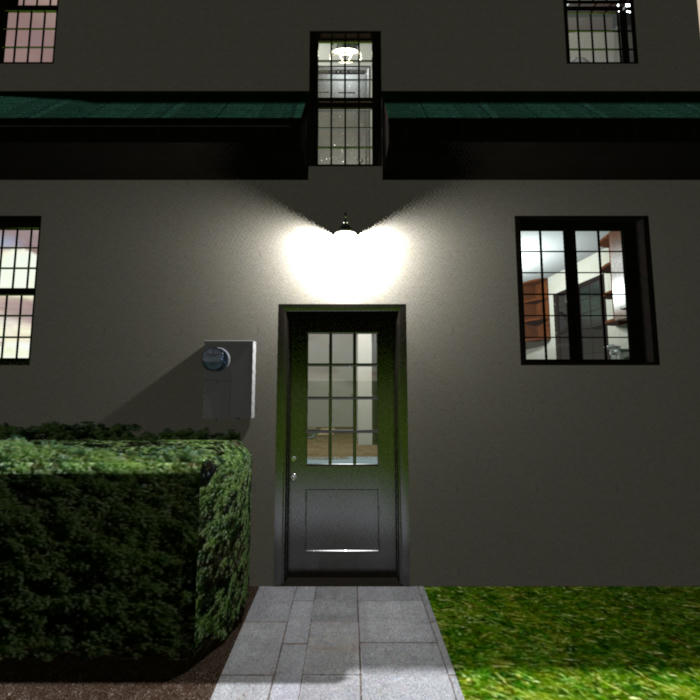
I've added the trees to the front yard, raised the Attic windows about a foot, fixed the front steps, changed the wall texture from the White Roughcast with Stones to a similar colored stucco (except for the front and back steps and porches), shortened one of the front bushes so that I could add some of the lilies at the front corner, added the additional light and mailbox to the front porch, fixed the back wall, removed the little 'bump out' for the now unnecessary water heater, and made the side door not so shiny so that it no longer reflects the grass and background as much anymore.
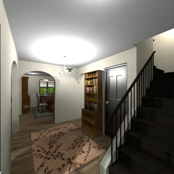
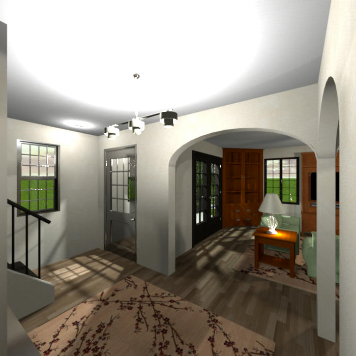
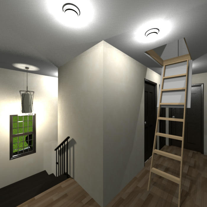
I switched the rug texture to the dark wood texture on the stairs, and adjusted the size of the hanging lamp.
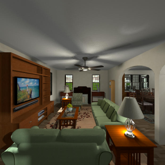
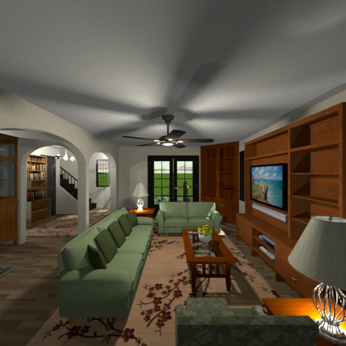
I changed some of the textures on the fireplace, fixed the textures on the coffee table so that it rendered better, and changed the texture on the round bowl holding the roses on the
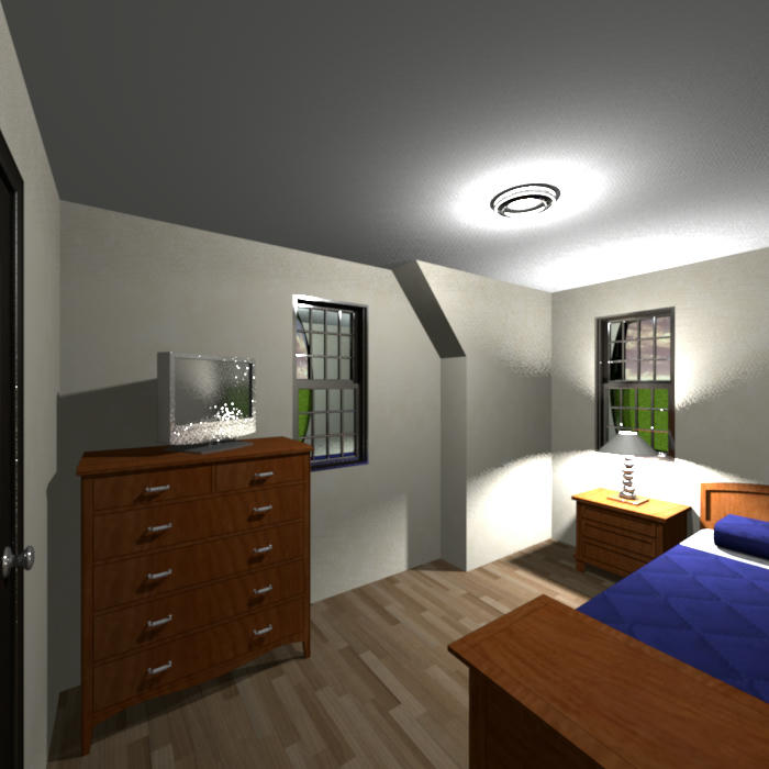
And finally, I changed out the wall-mounted TV in the smaller back bedroom with a smaller one on top of the dresser.
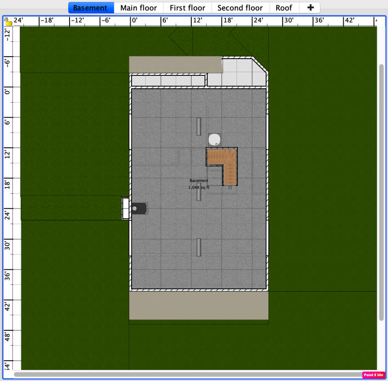
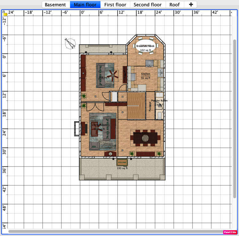
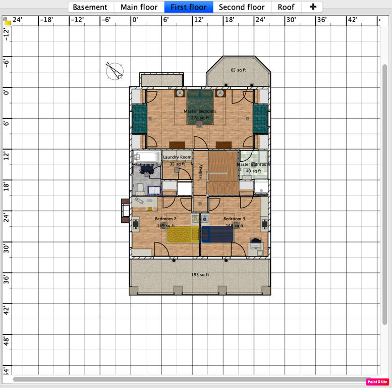
I also realized that I'd forgotten to include the screenshots of each floor's floor plan, so here they are.
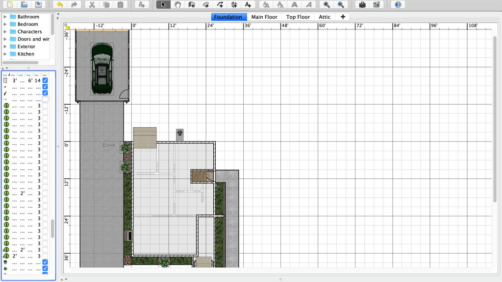
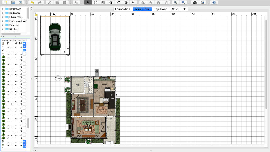

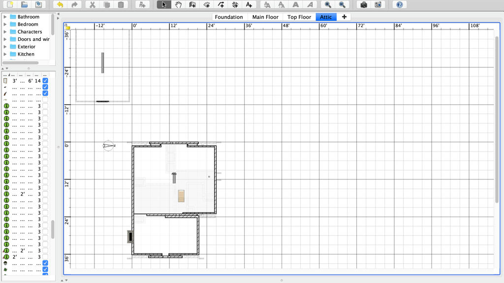
I figured that since I originally did the roofing strangely (no, I haven't fixed that) that there when I looked at it again that there would be (if I did adjust the roofing) a small crawlway between the large open area (that has the foldaway stairs) and the smaller area over the front 'chamber' so now that part is accessible... sort of I guess...
I've added the trees to the front yard, raised the Attic windows about a foot, fixed the front steps, changed the wall texture from the White Roughcast with Stones to a similar colored stucco (except for the front and back steps and porches), shortened one of the front bushes so that I could add some of the lilies at the front corner, added the additional light and mailbox to the front porch, fixed the back wall, removed the little 'bump out' for the now unnecessary water heater, and made the side door not so shiny so that it no longer reflects the grass and background as much anymore.
I switched the rug texture to the dark wood texture on the stairs, and adjusted the size of the hanging lamp.
I changed some of the textures on the fireplace, fixed the textures on the coffee table so that it rendered better, and changed the texture on the round bowl holding the roses on the
And finally, I changed out the wall-mounted TV in the smaller back bedroom with a smaller one on top of the dresser.
I also realized that I'd forgotten to include the screenshots of each floor's floor plan, so here they are.
I figured that since I originally did the roofing strangely (no, I haven't fixed that) that there when I looked at it again that there would be (if I did adjust the roofing) a small crawlway between the large open area (that has the foldaway stairs) and the smaller area over the front 'chamber' so now that part is accessible... sort of I guess...
Re: 1928 Home Builders Catalog Co. house plans
Thank you for sharing your work AeowynFraser, I absolutely love your 1928 Home Builders Catalog Co. houses and the Chesapeake is my favourite!
-
AeowynFraser
- Posts: 557
- Joined: Wed Oct 08, 2014 1:02 am
- Country: Lancaster, CA, USA
-
AeowynFraser
- Posts: 557
- Joined: Wed Oct 08, 2014 1:02 am
- Country: Lancaster, CA, USA
Re: 1928 Home Builders Catalog Co. house plans
I almost forgot to mention, but I’ve been updating and plan on rendering new pictures of “The Daviston” (previously misspelled as “The Davidston”, or something like that). Hopefully I can have them done in a few days.
The updates are mostly changing out furnishings that were large bit sized for smaller bit sized, but I also replaced the stairs for a set that I think work better (which meant a little rearranging of the walls around it), opened up the entryway/living room/dining room spaces, and added a garage. I believe that there one or two other changes not mentioned, but I think that I’ll leave it/them as a surprise (to you and me, since I’m writing this on my phone).
The updates are mostly changing out furnishings that were large bit sized for smaller bit sized, but I also replaced the stairs for a set that I think work better (which meant a little rearranging of the walls around it), opened up the entryway/living room/dining room spaces, and added a garage. I believe that there one or two other changes not mentioned, but I think that I’ll leave it/them as a surprise (to you and me, since I’m writing this on my phone).
Who is online
Users browsing this forum: No registered users and 1 guest