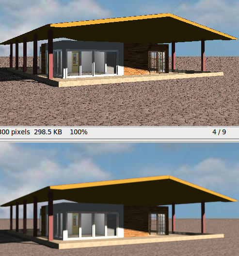
Below is a render of an old model I made. Both renders are made with v3.0-11. The top render is much sharper in the vertical lines than the bottom render; the desert floor texture also looks sharper.
The strange part is that the top render is made with quality setting 2, and the bottom render with quality setting 3 (Best). It looks as if it's not in focus.
The best quality setting computes some anti aliasing to avoid the wrong effect that appears on the roof border. The problem is that anti aliasing is useless on horizontal and vertical lines...
Maybe should I try an other anti aliasing filter, that would improve the rendering of oblique lines without bluring vertical and horizontal lines...
"box" has a coarse gradient in the lowest green bar.
"triangle" is clearly better, and although suggested as preview quality, it comes very close to the others.
"sinc" clearly has a slight "shadow" at the right hand side of the yellow blobs.
"catmull-rom" suffers from the same problem, but to a lesser degree.
"lanczos" clearly has ragged edges at the right hand side of the yellow blobs.
Many others have a yellow shadow at the left hand side of the red blobs: "bspline" and "blackman-harris" suffer most, but in "catmull-rom", "mitchell", "gaussian" and even in "sinc" a small yellow shadow is visible.
"gaussian" looks good, a bit fuzzy, and the dark bar at the top misses the dark-red colour.
So, it's not an easy choice, especially when you have to choose from such small pictures. The three choices of the middle row seem best tome, with a small preference for "catmull-rom" because of its crisp look.
If necessary I'd be happy to test whatever you throw at me, setting up a few simple scenes with textures, circles, diagonals and horizontals and verticals in a slightly more "normal" colour palette.