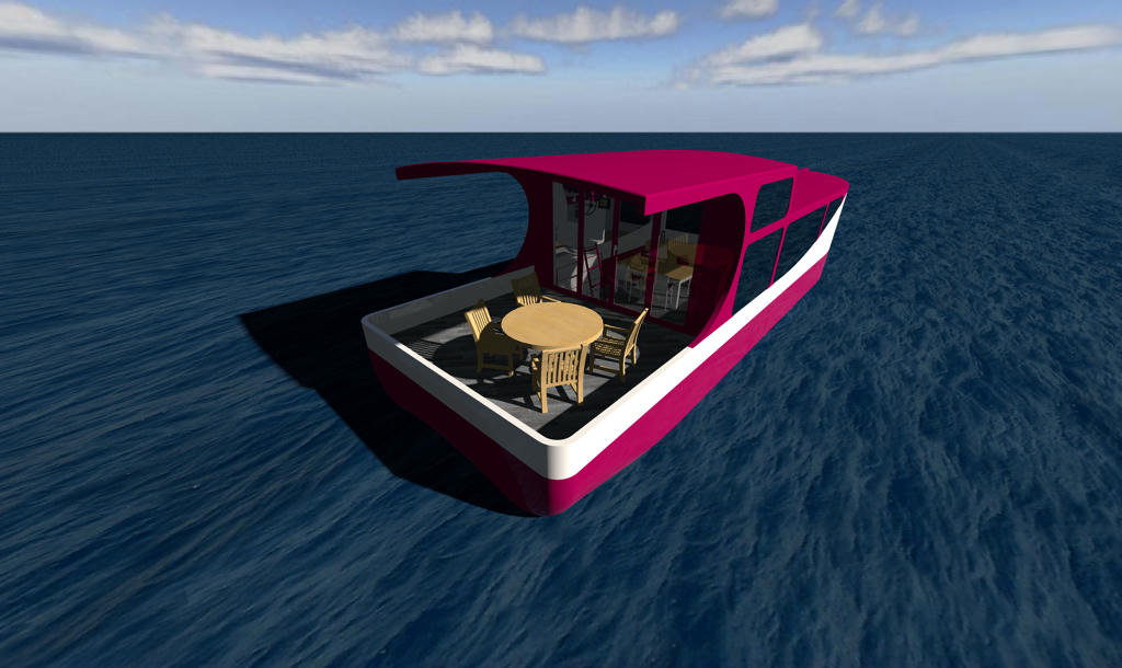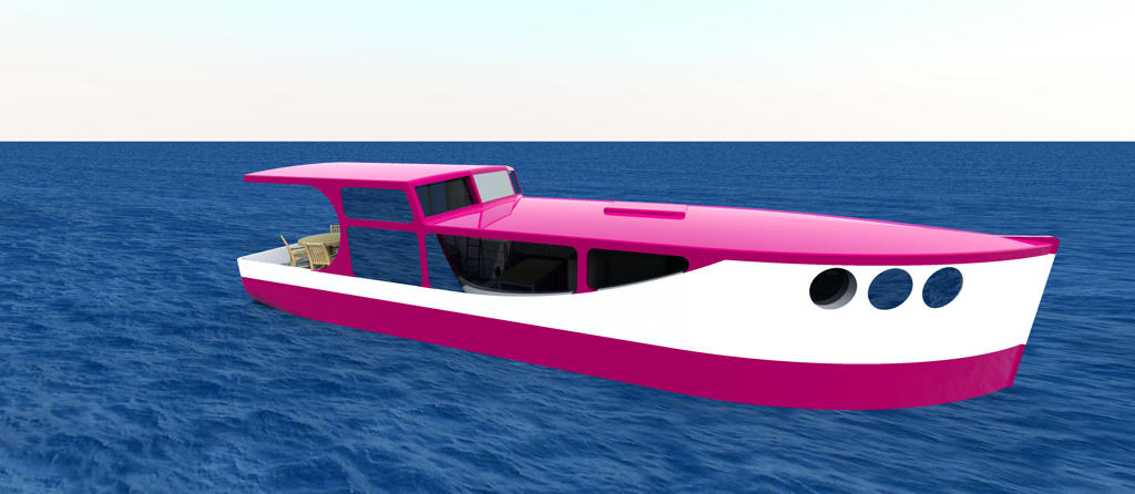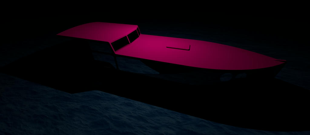
As in the lower levels, I select the colors, read them from a picture or compare them with a pattern.
When rendering in the upper levels, the colors are too bright and far away from what I chose.
I've tried so much and I do not know how to continue. Is there a workaround?
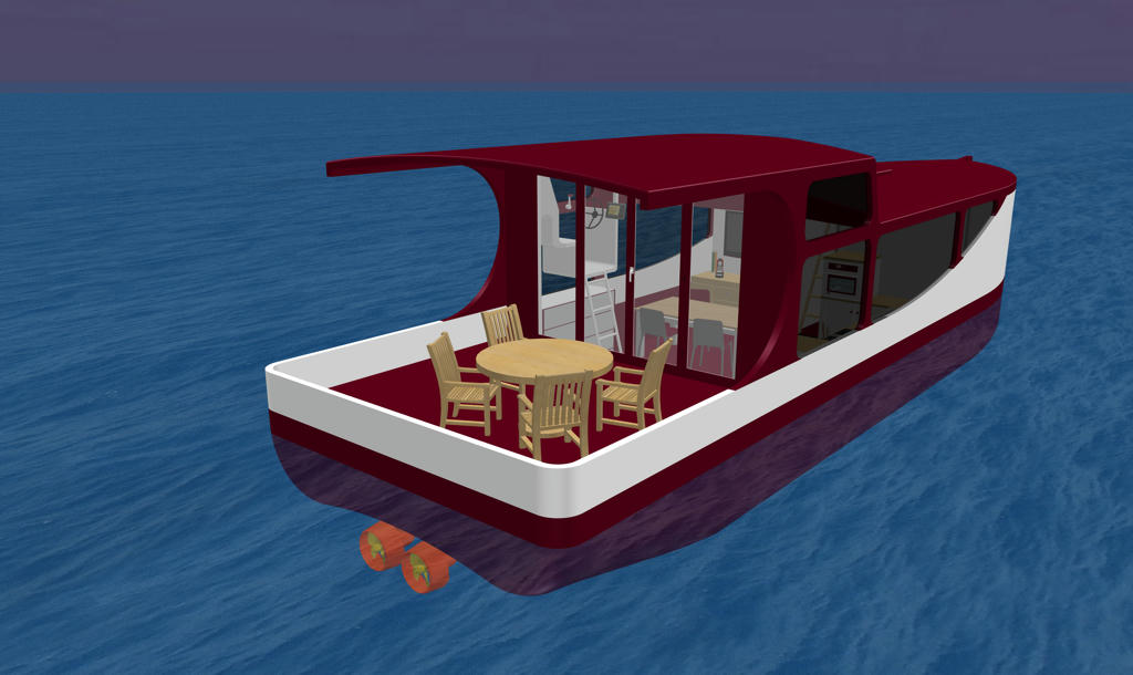
Level 1 - How I wish it should be (Red)
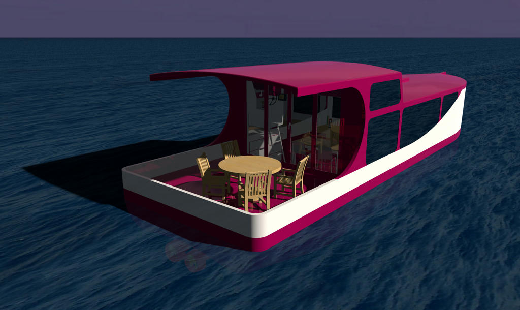
Level 3 - How it turns out (Red)
I would be so grateful for a solution ...